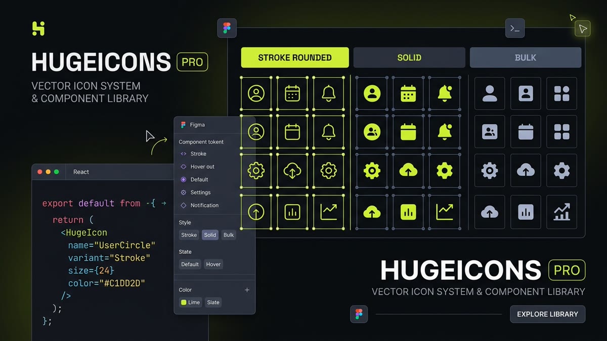
Executive Engineering Summary: Hugeicons has emerged as one of the premier vector design systems in modern software engineering, with 5,115 free open-source MIT icons indexed on IconStash.
- Decoupled Component Pattern: The
@hugeicons/reactrendering wrapper is separated from@hugeicons/core-free-iconsdata definitions, enabling zero duplicate bundle bloat. - Style Versatility: Stroke Rounded (1.5px lines with rounded joints), Stroke Sharp, Solid, Bulk (layered translucency), Duotone, and Twotone.
- Interactive State Switching: Native support for the
altIconprop allows single-component toggling between outline and solid states on hover or active selection. - Full Ecosystem Support: Dedicated packages for React, Vue 3 (Composition API), Svelte, React Native, and Figma component variants.
1. What is Hugeicons? Scale, Licensing & Philosophy
In modern interface engineering, visual inconsistency is a common disease: development teams frequently combine multiple disparate icon packs, resulting in clashing stroke weights, mismatched terminal cap radii, and broken baseline optical alignments. Hugeicons was architected from the ground up to eliminate this problem.
With 5,115 free vector icons indexed in IconStash under the permissive MIT License, Hugeicons provides one of the broadest open-source design systems available. Across its broader commercial ecosystem, Hugeicons spans over 60,000 icons covering fintech, artificial intelligence, multimedia, developer tooling, healthcare, and enterprise commerce.
Every glyph is standardized upon a rigorous 24x24 pixel grid with a default 1.5px optical stroke weight. Rounded terminals are precisely radiused to round stroke-linecap and round stroke-linejoin, ensuring harmonious alignment with modern sans-serif typography like Inter, Geist, and SF Pro.
2. The Decoupled Architecture Pattern
Most icon libraries distribute monolithic packages where each icon is a complete React or Vue component containing its own wrapper element, default props, and SVG markup. While straightforward, this monolithic pattern causes significant bundle overhead when multiple icons are rendered on a page, as React generates redundant wrapper code for every symbol.
Hugeicons pioneers a decoupled component architecture:
- Wrapper Component (
@hugeicons/react): A single, highly optimized rendering engine that manages props (size,color,strokeWidth,className,altIcon) and accessibility attributes. - Pure Vector Data (
@hugeicons/core-free-icons): Lightweight JavaScript tuples containing only raw SVG path coordinate strings.
Because the vector data file exports pure object literals without JSX component functions, your bundler (Vite, Rollup, Webpack 5, Turbopack) tree-shakes unused icons cleanly. Each imported Hugeicon adds only ~450 bytes of minified JavaScript to your application bundle.
3. Deep Dive into Hugeicons Visual Styles
Hugeicons offers an impressive range of stylistic expressions designed for distinct UX requirements:
The primary workhorse of Hugeicons. Features 1.5px geometric outlines with soft rounded corners and caps. Perfect for modern SaaS dashboards and web apps.
High-contrast, filled silhouettes designed for active navigation states, callout badges, and selected toggle buttons.
Innovative layered vectors combining a primary solid foreground with a 20% to 30% translucent background silhouette, creating visual depth.
Features 90-degree mitered sharp vertices. Excellent for brutalist, architectural, or technical hardware monitoring interfaces.
4. Interactive Hugeicons Component Sandbox
Interact with the live Hugeicons sandbox below to inspect Stroke Rounded, Solid, and Bulk representations with live code output:
// Decoupled React Implementation
import { HugeiconsIcon } from '@hugeicons/react';
import { Home01Icon, Calendar01Icon } from '@hugeicons/core-free-icons';

export function NavigationBar() {
  return (
    <HugeiconsIcon icon={Home01Icon} size={24} color="currentColor" strokeWidth={1.5} />
  );
}
5. React & Next.js 15 RSC Setup: Code & Benchmarks
To implement Hugeicons in a React or Next.js application, install both the wrapper and the free icon library:
npm install @hugeicons/react @hugeicons/core-free-icons
# or using pnpm
pnpm add @hugeicons/react @hugeicons/core-free-icons
# or using bun
bun add @hugeicons/react @hugeicons/core-free-icons
In your components, import HugeiconsIcon from the wrapper package and specific named icons from the core package:
import React from 'react';
import { HugeiconsIcon } from '@hugeicons/react';
import {
  Home01Icon,
  Search01Icon,
  Notification01Icon,
  UserCircle02Icon
} from '@hugeicons/core-free-icons';

export function AppNavBar() {
  return (
    <nav className="flex items-center justify-between px-6 py-3 border-b border-zinc-800 bg-zinc-950">
      <div className="flex items-center gap-2">
        <HugeiconsIcon icon={Home01Icon} size={24} color="#C1DD2D" strokeWidth={1.5} />
        <span className="font-bold text-white">SaaS Console</span>
      </div>

      <div className="flex items-center gap-3">
        <button aria-label="Search" className="p-2 text-zinc-400 hover:text-white">
          <HugeiconsIcon icon={Search01Icon} size={20} />
        </button>
        <button aria-label="Notifications" className="p-2 text-zinc-400 hover:text-white">
          <HugeiconsIcon icon={Notification01Icon} size={20} />
        </button>
        <HugeiconsIcon icon={UserCircle02Icon} size={28} className="text-zinc-200" />
      </div>
    </nav>
  );
}By default, HugeiconsIcon contains zero browser-only lifecycle methods. In Next.js 15 Server Components, it renders purely static HTML vector tags during server streaming, eliminating hydration mismatches and contributing 0 bytes of client-side runtime JS.
6. Dynamic State Toggling with the altIcon Prop
One of the most ergonomic features of @hugeicons/react is the altIcon prop. In interactive user interfaces, buttons frequently toggle from an outline state to a filled active state when selected. Rather than using ternary JSX operations:
// Traditional cumbersome pattern:
{isActive ? <BookmarkSolidIcon /> : <BookmarkOutlineIcon />}

// Modern Hugeicons pattern using altIcon:
import { useState } from 'react';
import { HugeiconsIcon } from '@hugeicons/react';
import { Bookmark01Icon } from '@hugeicons/core-free-icons';

export function BookmarkToggle() {
  const [bookmarked, setBookmarked] = useState(false);

  return (
    <button
      onClick={() => setBookmarked(!bookmarked)}
      aria-pressed={bookmarked}
      aria-label="Save to bookmarks"
      className="p-2 rounded-lg bg-zinc-900 hover:bg-zinc-800 transition"
    >
      <HugeiconsIcon
        icon={Bookmark01Icon}
        size={24}
        color={bookmarked ? '#C1DD2D' : 'currentColor'}
        strokeWidth={1.5}
      />
    </button>
  );
}
7. Vue 3 & Nuxt 3 Composition API Setup
For Vue 3 and Nuxt 3 developers, Hugeicons maintains an official companion package: @hugeicons/vue.
npm install @hugeicons/vue @hugeicons/core-free-iconsInside any single-file component using <script setup>:
<script setup lang="ts">
import { HugeiconsIcon } from '@hugeicons/vue';
import { DashboardSquare01Icon, Analytics01Icon } from '@hugeicons/core-free-icons';
</script>

<template>
  <aside class="dashboard-sidebar">
    <nav>
      <a href="#dashboard" class="nav-item">
        <HugeiconsIcon :icon="DashboardSquare01Icon" :size="20" color="#C1DD2D" />
        <span>Overview</span>
      </a>
      <a href="#analytics" class="nav-item">
        <HugeiconsIcon :icon="Analytics01Icon" :size="20" color="currentColor" />
        <span>Metrics</span>
      </a>
    </nav>
  </aside>
</template>
8. Figma Workflow & Design Token Synchronization
Hugeicons was constructed hand-in-hand with the official Figma Community plugins. In production design systems, Hugeicons components integrate seamlessly:
- Component Variants: Every icon contains properties for
Style(Stroke, Solid, Bulk, Duotone), allowing designers to swap visual treatments with one click. - Swap Preservation: Instance swaps retain overrides for bounding frame constraints, optical alignments, and color variables.
- Variable Token Binding: All vector paths bind to semantic color tokens (e.g.,
color/icon/primaryandcolor/icon/muted) directly matching frontend CSS tokens.
9. Hugeicons vs Lucide vs Phosphor Comparative Benchmark
A technical comparison between Hugeicons and the foremost developer icon libraries on IconStash:
| Library | Free Icons | Architecture Pattern | Avg Minified Weight | License | Key Advantage |
|---|---|---|---|---|---|
| Hugeicons | 5,115 | Decoupled (Wrapper + Core Data) | ~450 B / icon | MIT | Decoupled bundle efficiency & altIcon toggling |
| Lucide | 1,979 | Monolithic React Components | ~850 B / icon | ISC | Ubiquitous shadcn/ui community defaults |
| Phosphor | 9,198 | Component Context Provider | ~950 B / icon | MIT | 6 continuous optical line weights |
| Solar Icons | 7,410 | Subpath Style Imports | ~800 B / icon | CC BY 4.0 | Fintech squircle geometry & Broken stencils |
| Tabler Icons | 6,324 | Direct SVG Component Exports | ~1.1 KB / icon | MIT | Massive coverage of enterprise domain concepts |
10. Production ARIA & Accessibility Doctrine
To ensure WCAG 2.2 AA and Section 508 compliance when shipping Hugeicons:
- Decorative Contexts: When an icon is rendered alongside descriptive text, mark it with
aria-hidden="true":<button className="btn"> <HugeiconsIcon icon={Download01Icon} size={18} aria-hidden="true" /> <span>Export Report</span> </button> - Icon-Only Interactive Triggers: Provide accessible naming either on the parent trigger button (
aria-label) or directly via the component:<button aria-label="Toggle navigation drawer" className="p-2"> <HugeiconsIcon icon={Menu01Icon} size={24} aria-hidden="true" /> </button> - Color Contrast: When rendering Hugeicons in
Stroke Roundedstyle, ensure the stroke color against its container background satisfies the minimum 3:1 non-text contrast ratio required by WCAG 1.4.11.
11. Frequently Asked Questions
What is Hugeicons, and how does its decoupled architecture work?
Hugeicons is a modern vector icon system featuring 5,115 free MIT-licensed icons indexed on IconStash (and over 60,000 across its full ecosystem). It uses a decoupled architecture where a core rendering component (@hugeicons/react or @hugeicons/vue) is separated from pure icon vector definitions (@hugeicons/core-free-icons). This separation prevents duplicate component boilerplate and enables flawless tree-shaking.
How do I install and use Hugeicons in a React or Next.js application?
Install the core wrapper and free icon packages with npm install @hugeicons/react @hugeicons/core-free-icons. In your component, import the HugeiconsIcon component from @hugeicons/react and specific named icon objects (such as Home01Icon or Settings01Icon) from @hugeicons/core-free-icons. Render with <HugeiconsIcon icon={Home01Icon} size={24} color='currentColor' strokeWidth={1.5} />.
How does Hugeicons handle active and hover state toggling via altIcon?
The HugeiconsIcon React and Vue components provide built-in state toggling support via the altIcon prop. You can supply a stroke icon as the primary icon and a solid variant as the altIcon. The component can dynamically switch between outline and solid representations based on hover, focus, or component state without mounting multiple SVG DOM nodes.
Are Hugeicons free for commercial use without attribution?
Yes. The 5,115 free icons in Hugeicons Core Free Icons indexed on IconStash are licensed under the MIT License. You can freely use, modify, embed, and ship them in commercial SaaS platforms, client projects, and mobile apps with zero royalties and no mandatory attribution.
What visual styles does Hugeicons offer, and how do Stroke Rounded vs Bulk differ?
Hugeicons spans multiple visual styles including Stroke Rounded (1.5px lines with rounded caps on a 24px grid), Stroke Sharp (mitered corners), Solid (filled silhouettes), Bulk (multi-tone layered fills with 20% opacity depth), Duotone, and Twotone. The Bulk style creates rich layered illustrations without requiring external raster images.
Where can I search, preview, and download Hugeicons for free?
You can search, compare, customize, and export all 5,115 free Hugeicons directly on IconStash at https://iconstash.io/library/hugeicons/. IconStash provides instant live search, light and dark background previews, and one-click copy to clean SVG, PNG, and React JSX.