The Icon & SVG Glossary: 50+ Terms Explained
Every icon design and SVG term you'll encounter as a developer or designer — explained in plain English with practical context. No jargon without explanation.
This glossary covers the terminology you'll encounter when working with icons in web development — from SVG internals to icon design principles to build optimization. Use it as a reference when reading documentation, reviewing icon libraries, or discussing icon systems with your team.
A
- Accessibility (a11y)
aria-* - The practice of making icons perceivable to screen readers. Decorative icons get
aria-hidden="true"; meaningful standalone icons getaria-label="description". Without this, icons are invisible or confusing to assistive technology users. - Example: <button aria-label="Delete"><TrashIcon /></button>
- Aspect Ratio
- The proportional relationship between an icon's width and height. UI icons are almost always 1:1 (square). Brand logos may be wider (e.g., 3:1). Maintaining aspect ratio prevents distortion when scaling.
- Artboard
- The canvas boundary in design tools (Figma, Illustrator, Sketch) where an icon is drawn. Typically matches the icon grid size (e.g., 24×24px). Exported artboards become the SVG's width/height attributes.
B
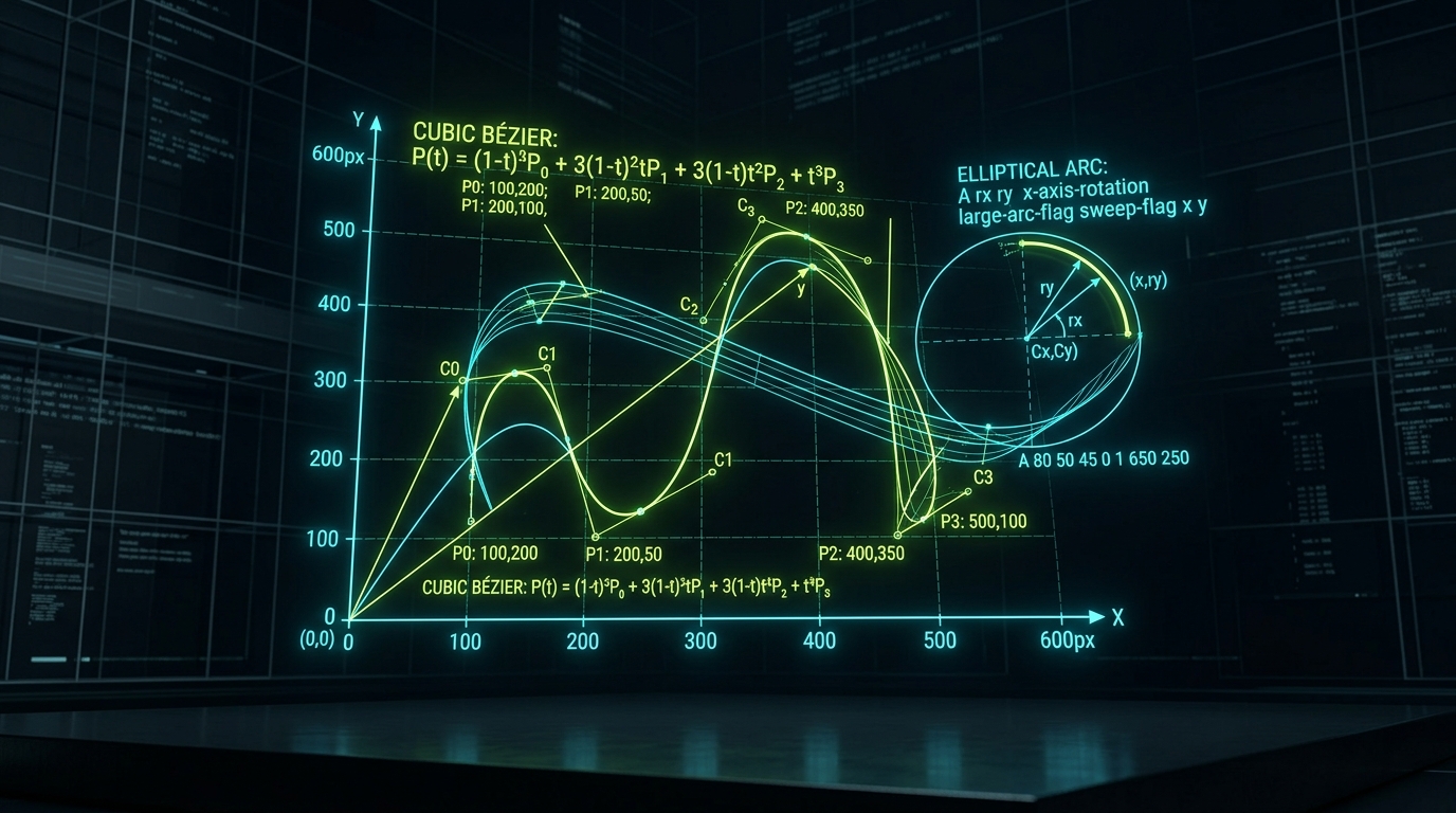
- Bézier Curve
- A mathematical curve defined by control points, used to create smooth paths in SVGs. The
C(cubic) andQ(quadratic) commands in SVG path data define Bézier curves. Most icon curves are cubic Béziers with two control points. - Example: M 4 12 C 4 7.6 7.6 4 12 4 (a quarter-circle arc)
- Bounding Box
- The smallest rectangle that completely contains an icon's visual elements. Used for optical alignment — icons with different shapes but the same bounding box appear consistently sized when placed side by side.
- Bundle Size
- The total file weight of JavaScript/CSS delivered to the browser. Icons contribute to bundle size — 50 tree-shaken Lucide icons add ~18KB gzipped. Without tree-shaking, the same library could add 200KB+.
C
- Cap (stroke-linecap)
- How the ends of open paths are rendered.
roundadds a semicircle cap (friendly),buttcuts flat (technical),squareextends past the endpoint (bold). Most icon libraries useroundcaps. - currentColor
- A CSS keyword that inherits the element's
colorproperty. When an SVG usesfill="currentColor"orstroke="currentColor", it automatically matches the surrounding text color — enabling dark mode and theming without extra CSS. - Example: <svg stroke="currentColor"> inherits color from parent's CSS
- Code Splitting
- Splitting your JavaScript bundle into smaller chunks loaded on demand. Icon-heavy routes (admin panels with 200+ icons) should be code-split so visitors to your landing page don't download admin icons they'll never see.
D
- Design Token
- A named variable representing a design decision (e.g.,
--icon-size: 20px,--icon-color: #64748b). Tokens decouple icon styling from implementation, enabling theme switching and design system consistency. - Duotone
- An icon style using two tones: a primary stroke/fill and a secondary semi-transparent fill. Creates visual depth without full color. Phosphor Icons and Heroicons (v3) offer duotone variants.
- DPI (Dots Per Inch)
- Screen pixel density. SVG icons are resolution-independent — they render crisply at any DPI (1x, 2x Retina, 3x). This is the primary advantage of SVG over PNG icons, which blur on high-DPI screens.
F
- Fill
- The interior color of an SVG shape.
fill="none"means transparent interior (outline icon).fill="currentColor"means solid shape matching text color. Fill-based icons appear bolder than stroke-based ones. - Figma Component
- A reusable design element in Figma. Icon libraries distribute Figma components so designers can drag-and-drop icons into mockups. IconStash links each icon to its source library's Figma file.
- Font Icon (Icon Font)
- Icons packaged as glyphs in a custom font file (e.g., FontAwesome's .woff2). Legacy approach — renders as text, can't be multi-colored, causes FOUT (flash of unstyled text). SVG components are the modern replacement.
G
- Grid (Icon Grid)
- The underlying pixel matrix (16px, 20px, or 24px) that all icons in a library are designed on. The grid ensures optical consistency — a circle icon and a square icon on the same grid appear the same visual weight.
- Example: Lucide uses a 24×24 grid with 2px padding (20px live area)
- Glyph
- A single visual representation of a character or symbol. In icon fonts, each icon is a glyph mapped to a Unicode codepoint. In SVG, each icon is a standalone vector graphic — no font rendering involved.
I
- Icon Component
- A framework-specific wrapper (React, Vue, Svelte) that renders an SVG as a reusable component with props for size, color, and stroke width. Example:
<Camera size={20} color="red" />in React. - Icon System
- A comprehensive set of standards governing icon usage in a product: grid size, stroke weight, corner radius, naming conventions, file format, and distribution method. A design system's icon subsystem.
- Inline SVG
- SVG markup placed directly in HTML rather than loaded as an external file. Enables CSS styling, JavaScript interaction, and currentColor inheritance. Trade-off: increases HTML size and can't be cached separately.
J
- JSX (JavaScript XML)
- React's syntax extension allowing HTML-like markup in JavaScript. Icon libraries ship JSX components:
import { Camera } from 'lucide-react'gives you a ready-to-use<Camera />component. - Join (stroke-linejoin)
- How corners between path segments are rendered.
roundcreates smooth corners (most icon libraries),mitercreates sharp points,bevelcreates flat cuts. Affects the icon's perceived friendliness.
L
- Lazy Loading
- Deferring icon loading until they're needed (e.g., when scrolled into view or when a route is visited). Reduces initial page weight. Implemented via
React.lazy(),loading="lazy", or Intersection Observer. - Live Area
- The drawable region within an icon's artboard, excluding padding. On a 24px grid with 2px padding, the live area is 20×20px. Icons should stay within the live area to maintain consistent visual spacing.
- LTR / RTL
- Left-to-Right / Right-to-Left text direction. Directional icons (arrows, navigation) must be mirrored for RTL languages (Arabic, Hebrew). Non-directional icons (search, settings) stay the same.
M
- Monochrome
- Single-color icons that use only one hue (usually currentColor). The vast majority of UI icon libraries are monochrome — they inherit text color and adapt to themes automatically. Opposite of multi-color/polychrome icons.
- MIT License
- The most permissive open-source license. Allows unlimited commercial use, modification, and distribution with zero attribution requirements. All IconStash-indexed libraries use MIT or Apache 2.0.
N
- Named Import
- Importing specific icons by name:
import { Camera, User } from 'lucide-react'. Enables tree-shaking. Opposite of namespace import (import * as Icons) which ships the entire library. - NPM Package
- The distribution format for icon libraries in JavaScript ecosystems. Install via
npm install lucide-react. Packages include SVG source, framework components, TypeScript types, and tree-shaking metadata.
O
- Optical Alignment
- Adjusting icon positioning to appear visually centered rather than mathematically centered. A play button (triangle) needs to shift right to look centered in a circle. Icon libraries pre-compensate for this.
- Optical Size
- Adjusting icon proportions for different display sizes. At 16px, icons need thicker strokes and simpler shapes. At 48px, they can be more detailed. Material Symbols has a variable optical size axis.
- Outline (Stroke) Style
- Icons drawn with strokes (lines) rather than fills (solid shapes). Creates a lighter, more modern aesthetic. Examples: Lucide, Tabler, Heroicons Outline, Feather. Typically 1.5px or 2px stroke width.
P
- Path (SVG <path>)
- The fundamental SVG drawing element. Uses a mini-language of commands: M (move), L (line), C (curve), Z (close). Every icon is composed of one or more paths. Example:
<path d="M12 2L2 7v10l10 5 10-5V7z"/> - Pixel Grid (Pixel Fitting)
- Aligning path coordinates to whole pixels so edges render crisply at 1x resolution. A 2px stroke on a 24px grid should sit on integer coordinates. Sub-pixel positioning causes anti-aliasing blur.
- PNG Export
- Rasterizing SVG icons to PNG for contexts that don't support SVG (email clients, some native apps, favicons). Export at 2x or 3x resolution for Retina displays. IconStash exports PNGs at any size from 16–512px.
S
- Solid (Fill) Style
- Icons drawn as filled shapes rather than outlines. Bolder, higher contrast, better at very small sizes (12–16px). Examples: Heroicons Solid, Phosphor Fill, Material Filled. Often paired with outline variants.
- Sprite (SVG Sprite)
- A single SVG file containing multiple
<symbol>definitions. Referenced via<use href="#icon-name">. Benefits: one HTTP request, browser caching, no JS required. Trade-off: no tree-shaking, no per-icon code splitting. - Example: <svg><use href="/sprite.svg#camera" /></svg>
- Stroke Width
- The thickness of an icon's outline paths, measured in grid units. Standard values: 1.5px (elegant), 2px (standard — Lucide, Tabler, Feather), 2.5px (bold). Consistent stroke width across a library ensures visual harmony.
- SVG (Scalable Vector Graphics)
- An XML-based vector image format for the web. Resolution-independent (crisp at any size), styleable with CSS, scriptable with JavaScript, and typically 50-80% smaller than equivalent PNGs for icons. The standard format for web icons in 2026.
- SVGO
- The standard SVG optimization tool. Removes metadata, editor artifacts, redundant attributes, and optimizes path data. Reduces icon file size by 20-60% without visual changes. Run on every icon before shipping.
- SVGR
- A build tool that transforms SVG files into optimized React components. Converts
camera.svginto a<Camera />component with props for size, color, and title. Integrates with Webpack, Vite, and Babel. - Symbol (<symbol>)
- An SVG element that defines a reusable graphic without rendering it. Used inside sprites: define once with
<symbol id="camera">, use many times with<use href="#camera">. Supports its own viewBox independent of the parent SVG.
T
- Tree-Shaking
- A build-time dead-code elimination technique. For icon libraries, it removes unused icons from your bundle. Requires: ES module imports, named imports (not namespace), and a compatible bundler (Vite, Webpack 5+, Rollup). Reduces a 1,979-icon library to just the 20 you use.
- Example: import { Camera } from 'lucide-react' → only Camera in bundle
- Two-Tone
- An icon style combining a primary stroke with a secondary lighter fill. Creates visual hierarchy within a single icon. Ant Design and Phosphor offer two-tone variants. More expressive than pure outline, lighter than full solid.
- TypeScript Types
- Type definitions (.d.ts files) that provide autocomplete and type-checking for icon components. Ensures you can't misspell an icon name or pass invalid props. All major 2026 icon libraries ship TypeScript-first.
V
- viewBox
- An SVG attribute defining the internal coordinate system:
viewBox="min-x min-y width height". AviewBox="0 0 24 24"means the icon is drawn on a 24×24 unit canvas. The rendered size (width/height attributes or CSS) scales this coordinate system proportionally. - Example: viewBox="0 0 24 24" + width="48" = icon drawn at 24 units, displayed at 48px
- Vector
- A graphic defined by mathematical paths (points, lines, curves) rather than pixels. Infinitely scalable without quality loss. SVG is the web's vector format. Opposite of raster (PNG, JPEG) which is pixel-based and blurs when enlarged.
- Visual Weight
- The perceived "heaviness" of an icon relative to others. A filled circle has more visual weight than an outlined circle. Consistent visual weight across an icon set ensures no single icon dominates when displayed alongside others.
W
- Web Component
- A framework-agnostic custom HTML element. Some icon libraries (Ionicons, Material Symbols) ship as Web Components:
<ion-icon name="camera"></ion-icon>. Works in any framework or no framework. - Weight (Icon Weight)
- The visual thickness of an icon's strokes or fills. Phosphor offers 6 weights (thin, light, regular, bold, fill, duotone). Material Symbols has a variable weight axis (100–700). Heavier weights suit bold UIs; lighter weights suit elegant interfaces.
X
- XML Namespace
- The
xmlns="http://www.w3.org/2000/svg"declaration required in standalone SVG files. Tells the browser to interpret the markup as SVG rather than HTML. Not needed for inline SVG in HTML5 documents.
Z
- ZIP Export
- Batch downloading multiple icons as a compressed archive. IconStash offers multi-resolution ZIP packs (16, 24, 32, 48, 64, 128, 256, 512px PNGs) for teams that need raster versions at every size.