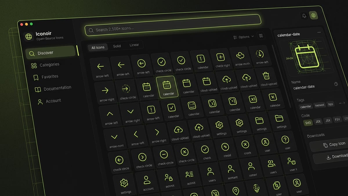
Executive Summary: Iconoir is one of the cleanest open-source icon ecosystems available today. With over 2,020 outline icons indexed on IconStash, this guide provides complete architecture for:
- Design Geometry: Strict 24x24 optical grid, uniform 1.5px stroke caliper, and zero commercial paywalls (100% MIT).
- React & React Native: Complete setup with
iconoir-reactandiconoir-react-native, tree-shaking, and SVG props. - Vue 3 & Svelte 5: Native modern component libraries without legacy wrappers or runtime bloat.
- Zero-JS CSS Masks: Stenciling icons via
iconoir.cssand CSSmask-imagefor pure stylesheet theming. - Figma Handoff: Syncing icon components between Figma Community files and code repositories without coordinate shifts.
1. Introduction to Iconoir
In modern web and mobile product design, consistency is paramount. A user interface that combines heavy 2px strokes from one library with delicate 1px lines from another feels fragmented and unpolished. Furthermore, developers are often frustrated by commercial icon libraries that offer a modest free tier but gate the most critical glyphs (cloud storage, AI sparkles, battery states, enterprise integrations) behind recurring subscription paywalls.
Iconoir was created to solve both problems. It is an open-source, community-driven icon library created by Luca Burgio featuring over 2,020 meticulously crafted vector icons. Every single icon in Iconoir is drawn on the exact same 24x24 pixel grid using a consistent 1.5px stroke weight, rounded terminals, and balanced negative space.
There are no "Pro" tiers, no locked SVGs, no email signups, and no artificial restrictions. The entire collection is licensed under the permissive MIT License and fully indexed on IconStash's Iconoir Library Hub.
2. Design Philosophy: The 24x24 & 1.5px Stroke Standard
Iconoir stands out for its visual balance. Many icon libraries adopt either a chunky 2px stroke (like Lucide and Feather) which can feel heavy in minimal, typography-forward interfaces, or an ultra-fine 1px stroke which loses clarity on standard DPI monitors. Iconoir selected 1.5px on a 24x24 canvas as the ideal golden ratio.
| Geometric Attribute | Iconoir Specification | Visual Effect & Technical Advantage |
|---|---|---|
| Canvas Grid | 24 x 24 px |
Standard modern viewport canvas matching iOS and Android touch targets and desktop SaaS menus. |
| Optical Padding | 2px bounding margin |
Prevents edge clipping when strokes are thickened or when drop-shadow filters are applied. |
| Default Stroke Caliper | 1.5px |
Provides crisp definition on 1x displays while looking refined and sophisticated on Retina screens. |
| Cap & Join Style | stroke-linecap: roundstroke-linejoin: round |
Eliminates sharp needle corners; delivers a friendly, modern visual rhythm across all glyphs. |
3. React & React Native Setup
Iconoir provides first-class support for React through iconoir-react and for mobile apps through iconoir-react-native. Both libraries export tree-shakeable SVG components with full TypeScript support.
React Installation
npm install iconoir-reactBasic Component Usage in React
import React from 'react';
import { Calendar, CheckCircle, Search, Shield } from 'iconoir-react';

export function NavigationToolbar() {
  return (
    <nav className="flex items-center gap-4">
      <button type="button" className="btn-icon" aria-label="Search">
        <Search width={20} height={20} strokeWidth={1.5} />
      </button>
      <button type="button" className="btn-icon" aria-label="Calendar events">
        <Calendar width={20} height={20} strokeWidth={1.5} />
      </button>
    </nav>
  );
}
Global Theming with IconoirProvider
If you prefer not to pass strokeWidth, color, or width props to every individual icon in your application, you can wrap your root component with IconoirProvider:
import { IconoirProvider, Bell, Settings, User } from 'iconoir-react';

export function App() {
  return (
    <IconoirProvider
      iconProps={{
        color: 'currentColor',
        strokeWidth: 1.75,
        width: '1.25em',
        height: '1.25em'
      }}
    >
      <header>
        <Bell />
        <Settings />
        <User />
      </header>
    </IconoirProvider>
  );
}
React Native Integration
For cross-platform mobile apps built with Expo or React Native CLI, install iconoir-react-native alongside react-native-svg:
npm install iconoir-react-native react-native-svgimport React from 'react';
import { View, StyleSheet } from 'react-native';
import { Shield, CheckCircle } from 'iconoir-react-native';
export function SecurityBadge() {
return (
<View style={styles.container}>
<Shield width={24} height={24} color="#C1DD2D" strokeWidth={1.5} />
</View>
);
}4. Vue 3 & Svelte 5 Integration
Iconoir avoids framework favoritism by providing official, independently published packages for Vue 3 and Svelte 5.
Vue 3 Setup (iconoir-vue)
npm install iconoir-vue<script setup>
import { Calendar, Search, Shield } from 'iconoir-vue';
</script>
<template>
<div class="toolbar">
<Search :stroke-width="1.5" width="20" height="20" />
<Calendar :stroke-width="1.5" width="20" height="20" />
<Shield :stroke-width="1.5" width="20" height="20" />
</div>
</template>Svelte 5 Setup
npm install iconoir-svelte<script>
import { CheckCircle, ArrowRight } from 'iconoir-svelte';
</script>
<button class="cta-button">
<span>Get Started</span>
<ArrowRight strokeWidth={1.5} size={20} />
</button>5. Zero-JS CSS Mask Icons (iconoir.css)
One of Iconoir's most powerful yet underutilized features is its pure CSS package: iconoir.css. This approach uses the modern CSS property mask-image to display icons with zero client-side JavaScript execution.
Installation
npm install iconoirOr import via CDN directly into your HTML document:
<link rel="stylesheet" href="https://cdn.jsdelivr.net/gh/iconoir-icons/iconoir@main/css/iconoir.css">How CSS Mask Icons Work
Instead of injecting heavy inline SVGs or managing font glyphs, the CSS mask pattern loads the SVG as an alpha stencil. The browser paints whatever background-color is active through the visible stencil lines:
/* Inside iconoir.css */
.iconoir-calendar {
  display: inline-block;
  width: 24px;
  height: 24px;
  background-color: currentColor;
  -webkit-mask-image: url('data:image/svg+xml;utf8,...');
  mask-image: url('data:image/svg+xml;utf8,...');
  -webkit-mask-size: contain;
  mask-size: contain;
  -webkit-mask-repeat: no-repeat;
  mask-repeat: no-repeat;
}
Because background-color is set to currentColor, you can recolor the icon instantly with any typography utility in Tailwind CSS or standard CSS:
<!-- Instant recoloring via text color -->
<i class="iconoir-calendar text-emerald-500 hover:text-emerald-400"></i>
<i class="iconoir-shield text-rose-500"></i>
6. Dynamic Stroke Customization & Accessibility
Because all Iconoir assets use native vector stroke paths rather than pre-baked filled outlines, you can alter the line weight dynamically across responsive breakpoints or interaction states.
Hover Micro-Interactions
You can create playful micro-interactions where an icon thickens from 1.5px to 2.25px when hovered:
.interactive-icon {
  stroke-width: 1.5;
  transition: stroke-width 150ms cubic-bezier(0.4, 0, 0.2, 1);
}

.interactive-icon:hover {
  stroke-width: 2.25;
}When thickening stroke on hover, ensure the icon element includes vector-effect: non-scaling-stroke if parent containers are subject to CSS scale transforms. This prevents strokes from blowing out on high-DPI displays.
7. Iconoir vs. Other Popular Icon Libraries
Here is how Iconoir compares to Lucide, Feather, Tabler, and Phosphor in 2026:
| Feature | Iconoir | Lucide Icons | Feather Icons | Tabler Icons |
|---|---|---|---|---|
| Icon Count | 2,020+ icons | 1,979 icons | 286 icons | 6,324 icons |
| Default Stroke | 1.5px | 2.0px | 2.0px | 2.0px |
| Grid Dimensions | 24 x 24 | 24 x 24 | 24 x 24 | 24 x 24 |
| CSS Mask Support | Official (iconoir.css) | Unofficial plugins | No | Unofficial plugins |
| License | MIT (100% Free) | ISC (100% Free) | MIT | MIT |
| Maintenance Status | Actively updated (2026) | Actively updated | Deprecated / Archived | Actively updated |
8. Frequently Asked Questions
What is Iconoir, and why is it considered one of the purest open-source icon libraries?
Iconoir is an open-source SVG icon library featuring over 2,020 icons drawn on a 24x24 grid with a consistent 1.5px stroke weight. Unlike many commercial sets that gate essential glyphs behind 'Pro' paywalls, Iconoir is 100% free under the MIT License with no premium tiers, logins, or restricted assets.
What grid and default stroke specifications does Iconoir use?
Iconoir is built on a 24x24 pixel grid with an optical 2px internal padding and a baseline stroke-width of 1.5px. Its stroke-linecap and stroke-linejoin are round by default, creating a warm, modern aesthetic that fits minimalist SaaS and consumer mobile applications.
How do I install and use Iconoir in React and Next.js with tree-shaking?
Install the package with npm install iconoir-react. Import icons as named components, for example: import { Calendar, CheckCircle, Search } from 'iconoir-react'. Modern bundlers (Vite, Webpack, Next.js 15) automatically tree-shake unused icons, keeping your final JavaScript bundle lean.
Does Iconoir support zero-JS CSS mask-image implementation?
Yes. Iconoir provides an official CSS package via npm install iconoir. It maps icons as CSS mask-image stencils. You can render icons purely through CSS classes (e.g., <i class='iconoir-calendar'></i>) and tint them dynamically using the CSS background-color property.
Can I dynamically customize the stroke-width of Iconoir components in React?
Yes. All iconoir-react components accept standard SVG presentation attributes. You can override the default 1.5px stroke weight by passing strokeWidth={2} or strokeWidth={1} directly to the component, or by wrapping your app in the IconoirProvider context.
Where can I search, recolor, and download Iconoir icons?
You can search, filter, and inspect all 2,020 Iconoir icons directly on IconStash at https://iconstash.io/library/iconoir/. IconStash provides instant keyword search, live dark/light canvas preview, and one-click export to clean SVG, PNG, and React JSX components.