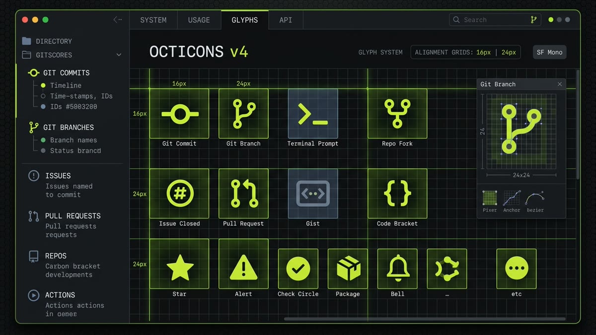
Executive Summary: GitHub Octicons is the visual language of modern software development. With over 929 vector icons indexed on IconStash, this guide provides complete architecture for:
- Optical Grid System: Understanding the distinct 16px and 24px pixel-perfect hand-drawn vectors and subpixel rasterization.
- React & Next.js 15: Production integration via
@primer/octicons-reactwith zero-runtime tree-shaking and TypeScript typing. - Zero-JS SVG Sprites: Using native SVG
<use>tags for lightning-fast server-rendered developer portals. - Primer Token Theming: Binding Octicons to GitHub's semantic color system (
fg.default,accent.fg,danger.fg) and dark mode tokens. - Accessibility & WCAG: ARIA patterns for commit graphs, issue lists, code review comments, and action bars.
1. Introduction to GitHub Octicons
Software development has its own dedicated visual vocabulary. When developers navigate an interface, they look for instant, unambiguous signals: a branching tree for Git forks, a colored circular node for commits, a merge arrow for pull requests, and a dotted circle for open issues. Standard consumer icon libraries often lack these metaphors entirely or represent them with generic tree charts and document badges.
GitHub Octicons is the official icon system created and maintained by GitHub as part of the Primer Design System. Every icon on GitHub.com—from the repository navigation bar to code review diff comment markers and GitHub Actions workflows—relies on Octicons.
Unlike icon sets that treat icons as generic illustrations, Octicons was built specifically for high-information-density developer consoles. It prioritizes razor-sharp readability at small sizes, mathematical alignment with monospaced and sans-serif typefaces, and strict pixel-grid alignment.
Every single icon is licensed under the permissive MIT License and indexed with instant search on IconStash's Octicons Library Hub.
2. The Dual Optical Grid: 16px vs 24px
A common mistake frontend developers make when implementing icons is assuming that an SVG can be scaled freely to any size without visual compromise. While vector geometry scales infinitely without pixelation, human perception and screen rasterization do not.
When an icon drawn on a 24px grid is scaled down to 16px via CSS width="16", path coordinates land on fractional subpixels (e.g., 10.67px). The browser graphics rasterizer applies antialiasing blur across adjacent physical pixels, muddying internal counters and softening sharp edges. Conversely, scaling a 16px icon up to 24px makes strokes appear disproportionately thin and leaves awkward empty padding.
GitHub solved this problem by drawing two distinct vector files for every icon:
| Optical Grid | viewBox | Target UI Placement | Internal Geometry Characteristics |
|---|---|---|---|
| 16px Grid | 0 0 16 16 |
Inline code reviews, file tree lists, issue status badges, commit logs | Simplified internal counters, thickened line stems, strict whole-integer pixel grid snapping |
| 24px Grid | 0 0 24 24 |
Top navigation bars, hero headers, modal action headers, empty state illustrations | Full geometric fidelity, nuanced curve radii, delicate interior details, balanced negative space |
In the official package @primer/octicons-react, the component automatically selects the correct underlying SVG asset based on the size prop you pass. If you request size={16} or size="small", it loads the 16px asset. If you request size={24} or size="medium", it loads the 24px asset.
3. React & Next.js 15 Integration
GitHub distributes Octicons for React through the official npm package @primer/octicons-react. This package exports fully typed TypeScript components with built-in accessibility fallbacks and automatic optical size selection.
Installation
npm install @primer/octicons-reactBasic Component Usage
Icons can be imported directly as named exports. In modern bundling environments like Vite, Webpack 5, and Next.js 15, ECMAScript module tree-shaking will prune all unimported icons from your production client bundle.
import React from 'react';
import {
  GitBranchIcon,
  GitCommitIcon,
  GitPullRequestIcon,
  StarIcon,
  EyeIcon
} from '@primer/octicons-react';

export function RepositoryHeader({ repoName, stars, defaultBranch }) {
  return (
    <header className="repo-header">
      <div className="branch-selector">
        <GitBranchIcon size={16} className="text-muted" aria-hidden="true" />
        <span>{defaultBranch}</span>
      </div>

      <div className="repo-actions">
        <button type="button" className="btn-star" aria-label={`Star ${repoName}`}>
          <StarIcon size={16} aria-hidden="true" />
          <span>Star</span>
          <span className="counter">{stars}</span>
        </button>
      </div>
    </header>
  );
}
Next.js 15 App Router & Server Components
Because Octicons components are pure SVG renderers without client-side state, event listeners, or browser window bindings, they render as Zero-Runtime React Server Components (RSC). When rendered on the server in Next.js 15, the icons output flat HTML vector markup without shipping a single byte of JavaScript to the browser client.
// app/repositories/[id]/page.tsx (React Server Component)
import { GitPullRequestIcon, CheckCircleIcon } from '@primer/octicons-react';

export default async function PullRequestPage({ params }: { params: { id: string } }) {
  const pr = await fetchPullRequest(params.id);

  return (
    <div className="pr-status-banner">
      {pr.isMerged ? (
        <span className="badge badge-merged">
          <CheckCircleIcon size={16} aria-hidden="true" /> Merged
        </span>
      ) : (
        <span className="badge badge-open">
          <GitPullRequestIcon size={16} aria-hidden="true" /> Open
        </span>
      )}
      <h1>{pr.title}</h1>
    </div>
  );
}
4. Zero-JS SVG Sprites for High-Performance Portals
For developer portals, static documentation engines (Astro, Eleventy, Hugo), or platforms with strict Core Web Vitals performance budgets, bundling dozens of individual React components or embedding repeated inline SVGs causes unnecessary DOM bloat.
You can compile Octicons into an external SVG Symbol Sprite. Every icon is wrapped in a <symbol> element with an explicit ID, and pages reference it via the native <use href="..."> element.
Sprite Sheet Structure (octicons-sprite.svg)
<svg xmlns="http://www.w3.org/2000/svg" style="display: none;">
  <symbol id="octicon-git-branch-16" viewBox="0 0 16 16">
    <path d="M9.5 3.25a2.25 2.25 0 1 1 .5 1.43v5.64a2.25 2.25 0 1 1-1.5 0V7.5a1 1 0 0 0-1-1H5.5v1.82a2.25 2.25 0 1 1-1.5 0V3.75a2.25 2.25 0 1 1 1.5 0v1.75h2a2.5 2.5 0 0 1 2.5 2.5v1.07a2.25 2.25 0 0 1-.5.18Z" fill="currentColor" />
  </symbol>
  <symbol id="octicon-repo-16" viewBox="0 0 16 16">
    <path d="M2 2.5A2.5 2.5 0 0 1 4.5 0h8.75a.75.75 0 0 1 .75.75v12.5a.75.75 0 0 1-.75.75h-2.5a.75.75 0 0 1 0-1.5h1.75v-2h-8a1 1 0 0 0-.714 1.7.75.75 0 1 1-1.072 1.05A2.495 2.495 0 0 1 2 11.5Zm10.5-1h-8a1 1 0 0 0-1 1v6.708A2.486 2.486 0 0 1 4.5 9h8ZM5 12.25a.25.25 0 0 1 .25-.25H12v1.5H5.25a.25.25 0 0 1-.25-.25Z" fill="currentColor" />
  </symbol>
</svg>
HTML Reference
<!-- Lightweight 0-byte JS reference -->
<svg class="octicon octicon-git-branch" width="16" height="16" aria-hidden="true">
  <use href="/assets/octicons-sprite.svg#octicon-git-branch-16" />
</svg>Because the SVG sprite file is an external HTTP asset, the browser caches it indefinitely across page transitions. Subsequent pages render icons instantaneously without HTML download overhead.
5. Theming & Primer Design Tokens
In GitHub's Primer Design System, iconography colors are never hardcoded with hexadecimal values (like #58a6ff or #238636). Instead, Octicons are colored using functional design tokens mapped through CSS custom properties and currentColor.
| Primer Semantic Token | CSS Variable | Default Dark | Default Light | Usage Context |
|---|---|---|---|---|
fg.default |
--color-fg-default |
#f0f6fc |
#1f2328 |
Primary navigation icons, focused controls |
fg.muted |
--color-fg-muted |
#9198a1 |
#656d76 |
Secondary labels, commit timestamps, file icons |
accent.fg |
--color-accent-fg |
#4493f8 |
#0969da |
Selected tabs, branch indicators, active links |
success.fg |
--color-success-fg |
#3fb950 |
#1a7f37 |
Passing CI tests, open issues, merged PRs |
danger.fg |
--color-danger-fg |
#f85149 |
#d1242f |
Failed builds, closed pull requests, alerts |
CSS Implementation Pattern
.octicon {
  display: inline-block;
  vertical-align: text-bottom;
  fill: currentColor;
}

.octicon-accent {
  color: var(--color-accent-fg, #4493f8);
}

.octicon-success {
  color: var(--color-success-fg, #3fb950);
}

.octicon-danger {
  color: var(--color-danger-fg, #f85149);
}
6. Accessibility & WCAG Best Practices
Developer tools often contain information-dense screens where icons convey critical state (build passed, review required, branch diverged). Providing correct accessible names is required under WCAG 2.2 guidelines.
Pattern A: Decorative Icons (Adjacent to Text)
When an icon is accompanied by visible textual labels, assistive technology must ignore the icon to prevent redundant voiceover repetition (e.g. avoiding "Graphic branch, main, branch button").
<button type="button" className="btn-branch">
  <GitBranchIcon size={16} aria-hidden="true" />
  <span>main</span>
</button>
Pattern B: Standalone Icon-Only Buttons
When an icon is the only element inside a button (e.g., a copy-to-clipboard button or issue filter icon), the interactive element must provide an accessible name via aria-label.
<button
  type="button"
  className="btn-icon"
  aria-label="Copy commit SHA to clipboard"
>
  <CopyIcon size={16} aria-hidden="true" />
</button>
Pattern C: Status Indicators with Live Regions
For asynchronous build pipelines (GitHub Actions runners), combine status icons with screen-reader text inside role="status" containers:
<div className="build-status" role="status">
  <CheckCircleIcon size={16} className="text-success" aria-hidden="true" />
  <span className="sr-only">Build succeeded on commit 8f9b2d</span>
</div>
7. Octicons vs. Other Icon Systems for Developer UIs
How does GitHub Octicons compare to general-purpose web icon libraries when building developer tools, SaaS consoles, and documentation sites?
| Metric / Feature | GitHub Octicons | Lucide Icons | Carbon Icons | Heroicons |
|---|---|---|---|---|
| Total Icon Count | 929 icons | 1,979 icons | 2,644 icons | 1,297 icons |
| Optical Sizing Grids | Dual 16px & 24px | Single 24px | 16 / 20 / 24 / 32px | 16 / 20 / 24px |
| Domain Specialization | Git, dev tools, CI/CD, code review | General SaaS, web UI | Enterprise cloud, telemetry | Tailwind UI, web apps |
| License | MIT | ISC | Apache 2.0 | MIT |
| Stroke Style | Solid filled glyphs & precision paths | 2px outline with rounded terminals | Industrial geometric paths | Outline & solid states |
If your project is a developer platform, IDE extension, Git visualizer, or technical documentation site, Octicons provides unmatched recognition and familiarity for software engineers.
8. Frequently Asked Questions
What is GitHub Octicons, and how does it fit into the Primer Design System?
Octicons is GitHub's official iconography system built into the Primer Design System. With over 920 icons indexed on IconStash, Octicons provides domain-specific developer symbols including Git branches, commits, pull requests, issue workflows, releases, and terminal actions designed specifically for high-clarity developer interfaces.
Why does Octicons provide dual 16px and 24px optical size grids rather than a single scalable vector?
Octicons uses dual 16px and 24px optical grids because scaling a 24px icon down to 16px causes subpixel blur and illegible internal counters, while scaling a 16px icon up to 24px looks sparse. GitHub hand-draws separate vector coordinates for 16px (dense line items, tables, code reviews) and 24px (marketing pages, navigation bars, modal dialogs) to ensure pixel-perfect rendering.
How do I install and use Octicons in React and Next.js with tree-shaking?
Install the official package with npm install @primer/octicons-react. You can import individual named icons such as import { GitPullRequestIcon, RepoIcon } from '@primer/octicons-react'. Modern bundlers (Vite, Webpack, Next.js 15) automatically tree-shake unused icons, resulting in zero bloat and adding less than 1KB per icon to your bundle.
What license governs GitHub Octicons, and can I use them in commercial SaaS software?
GitHub Octicons is licensed under the MIT License. You are completely free to use, modify, distribute, and embed Octicons in commercial SaaS applications, developer tooling, documentation portals, and open-source software without royalty fees.
How should accessibility (ARIA) be configured when using Octicons in interactive buttons?
If an Octicon is used inside an interactive element with visible text (e.g. a 'Star' button with count), mark the icon as decorative with aria-hidden='true'. If the Octicon is used in an icon-only button (e.g. a branch picker icon), pass an explicit aria-label='Choose branch' to the button or use the aria-label prop directly on the Octicon component.
Where can I search, preview, and download Octicons for free?
You can search, compare, customize, and export all 929 GitHub Octicons directly on IconStash at https://iconstash.io/library/octicons/. IconStash provides instant search, light and dark background previews, 16px vs 24px optical views, and one-click export to clean SVG, PNG, and React JSX.