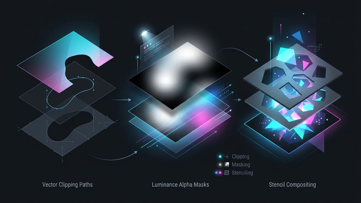
Executive Summary & Core Distinctions: Clipping, masking, and blend compositing are the three fundamental pillars of modern visual styling in SVG and CSS. While frequently conflated, they operate on completely distinct mathematical pipelines:
- Clipping (<clipPath>): A 1-bit binary stencil. Every pixel is either 100% visible or 100% hidden. Zero intermediate opacity, minimal GPU raster overhead.
- Masking (<mask>): An 8-bit multi-channel transparency stencil. Modulates pixel opacity smoothly from 0.0 to 1.0 using luminance or alpha values.
- Compositing (blend modes): Calculates mathematical color blending between overlapping graphics using Porter-Duff formulas and color channels.
<clipPath> stencil. Pixels outside r=60 are discarded with zero feathering.
<clipPath id="...">The primary SVG container element defining a clipping boundary. Everything inside the geometry is rendered; everything outside is clipped away. It cannot contain visual styling attributes like fills, strokes, or opacity.
clip-path: url(#id)The CSS and presentation attribute applied to a graphic or DOM container referencing an SVG <clipPath> element. Hardware-accelerated in modern browser compositing engines.
clip-rule="nonzero | evenodd"Specifies the ray-intersection winding rule used to determine the interior of intersecting shapes inside a <clipPath>. Defaults to nonzero.
nonzeroCalculates interior regions by casting a ray from a point to infinity and tracking the direction of crossing path segments. If clockwise and counter-clockwise crossings do not cancel out to zero, the pixel is clipped inside.
evenoddCalculates interior regions by counting total path segment crossings. Odd counts are interior (visible); even counts are exterior (cutout holes). Indispensable for compound icons with hollow cutouts (like donut and padlock icons).
clipPathUnits="userSpaceOnUse | objectBoundingBox"Defines the coordinate system governing the shapes inside <clipPath>. Defaults to userSpaceOnUse.
userSpaceOnUseCoordinates inside the clip path correspond directly to pixel units in the current SVG user viewport, maintaining fixed absolute scale regardless of target size.
objectBoundingBoxCoordinates inside the clip path are treated as fractional values between 0.0 and 1.0 relative to the target element's bounding box, automatically scaling proportionally as the target resizes.
<mask id="...">An SVG container element creating a soft-edged 8-bit transparency mask. Child shapes can have varying colors, opacities, and gradients to create sophisticated fade effects.
mask-type="luminance | alpha"A CSS property and SVG 2 attribute dictating whether the mask computes transparency from luminance (brightness) or the alpha channel. Defaults to luminance in SVG 1.1 and alpha in CSS masking specifications.
mask-type: luminanceDerives transparency from the perceptual brightness of RGB colors using the ITU-R BT.709 relative luminance formula. Pure white (#FFFFFF) is 100% opaque; pure black (#000000) is 100% transparent; middle grey (#808080) is 50% translucent.
mask-type: alphaDerives transparency strictly from the alpha channel of the mask image. RGB colors are completely ignored: a solid black circle with opacity="1" renders 100% opaque, unlike in luminance mode.
maskUnits="userSpaceOnUse | objectBoundingBox"Defines the coordinate system governing the boundary rectangle (x, y, width, height) of the <mask> element itself. Defaults to objectBoundingBox with standard margins x="-10%" y="-10%" width="120%" height="120%".
maskContentUnits="userSpaceOnUse | objectBoundingBox"Defines the coordinate system governing graphic child elements placed inside the <mask> container. Defaults to userSpaceOnUse.
mask-image: url(...)The modern CSS property for applying SVG masks or raster gradient masks directly to HTML elements, replacing older browser-prefixed -webkit-mask-image properties.
mask-mode="match-source | luminance | alpha"A CSS masking property instructing the browser whether to infer mask type automatically from the source format (match-source) or force luminance or alpha interpretation.
mask-composite: add | subtract | intersect | excludeControls how multiple CSS mask image layers are combined together using Porter-Duff compositing operators. Enables boolean geometric operations directly in CSS.
addComputes the union of two mask layers: regions visible in either mask remain visible (Porter-Duff Source Over).
subtractCuts the second mask layer out from the first mask layer (Porter-Duff Source Out), creating dynamic stencil cutouts.
intersectOnly retains regions where both mask layers overlap (Porter-Duff Source In).
excludeComputes the XOR symmetric difference: regions covered by only one mask are visible; overlapping regions are completely punched out.
mask-size: contain | cover | <length>Specifies the sizing dimensions of mask image layers, behaving identically to background-size in CSS.
mask-position: center | <position>Sets the spatial placement of mask layers relative to the mask origin box.
mask-repeat: no-repeat | repeatGoverns tiling behavior for raster or vector mask layers across the target element boundary.
mask-clip: border-box | padding-box | content-boxDetermines which box model boundary limits the mask execution area.
mask-origin: border-box | padding-box | content-boxSpecifies the reference box from which mask-position coordinates are calculated.
mix-blend-mode: <blend-mode>Specifies how an element's colors blend with background colors behind it. Standard modes include multiply, screen, overlay, darken, lighten, color-dodge, and difference.
background-blend-mode: <blend-mode>Blends multiple background images or gradient layers defined on the same element.
isolation: isolateCreates a new CSS stacking context, restricting mix-blend-mode calculations strictly to elements within this component tree and preventing blending from leaking onto global body canvases.
will-change: clip-pathPromotes a clipped or masked element to its own independent GPU compositing texture, preventing expensive software repaint cycles during continuous scroll or transform animations.
drop-shadow()While box-shadow is sliced off by clip-path, applying filter: drop-shadow() casts a shadow conforming precisely to the clipped vector contour.
clip-path: polygon(...)Defines a polygonal clipping boundary using coordinate pairs. Widely used for angled banners, geometric badges, and hexagon avatars.
clip-path: path('M ... Z')Accepts an arbitrary SVG path string directly in CSS, allowing complex vector silhouettes to clip standard HTML elements without embedding an inline SVG tag.
clip-path: inset(10px round 8px)Defines an inset rectangular clipping box with optional border radii, perfect for smooth card reveal animations.
clip-path: circle(50% at center)Creates a circular clipping region parameterized by radius and center coordinate anchors.
clip-path: ellipse(50% 30% at 50% 50%)Creates an elliptical clipping mask with distinct horizontal and vertical radii.
Frequently Asked Questions
What is the key technical difference between SVG clipping (clipPath) and masking (mask)?
SVG clipping (<clipPath>) is a 1-bit binary operation: a pixel is either 100% inside the clip region (visible) or 100% outside (hidden). It cannot produce semi-transparent gradients or soft feathered edges. SVG masking (<mask>) is an 8-bit multi-level transparency operation: it supports fractional alpha values between 0.0 and 1.0, allowing soft shadows, gradients, and antialiased feathering.
How does mask-type: luminance differ from mask-type: alpha?
mask-type: luminance calculates pixel opacity from the relative luminance of the mask image colors using the Rec. 709 formula (white #FFF is 100% opaque, black #000 is 100% transparent, and 50% grey #808080 is 50% translucent). mask-type: alpha completely ignores RGB color values and computes transparency purely from the image's alpha channel.
Why do CSS box-shadow and drop-shadow fail on elements with clip-path applied?
When clip-path is applied to an element, the browser clips the entire element box, which includes any CSS box-shadow cast outside the element perimeter. To display a shadow around a clipped shape, either apply filter: drop-shadow() to a parent container element wrapping the clipped child, or apply filter: drop-shadow() directly if supported.
What is the difference between userSpaceOnUse and objectBoundingBox in clipPathUnits?
userSpaceOnUse interprets coordinates in absolute user space units (such as pixels on the SVG canvas). If the target element moves or resizes, the clip path does not automatically scale with it. objectBoundingBox interprets coordinates as normalized fractions between 0.0 and 1.0, automatically scaling the clip path proportionally to the target element's bounding box dimensions.
What does isolation: isolate do when using SVG blend modes in CSS?
isolation: isolate establishes a new stacking context on the target element. This confines any descendant mix-blend-mode operations (such as multiply or screen) strictly within that element's boundary, preventing the blending calculations from interacting with or bleeding into the page's root background.
How do nonzero and evenodd clip-rules work in self-intersecting vector paths?
clip-rule: nonzero casts an imaginary ray from a point to infinity and counts how many path segments cross it and their direction (clockwise vs counter-clockwise). If the net sum is non-zero, the point is inside. clip-rule: evenodd counts the total number of path crossings regardless of direction: if the count is odd, the point is inside; if even, it is outside, creating cutout holes in overlapping donut shapes.