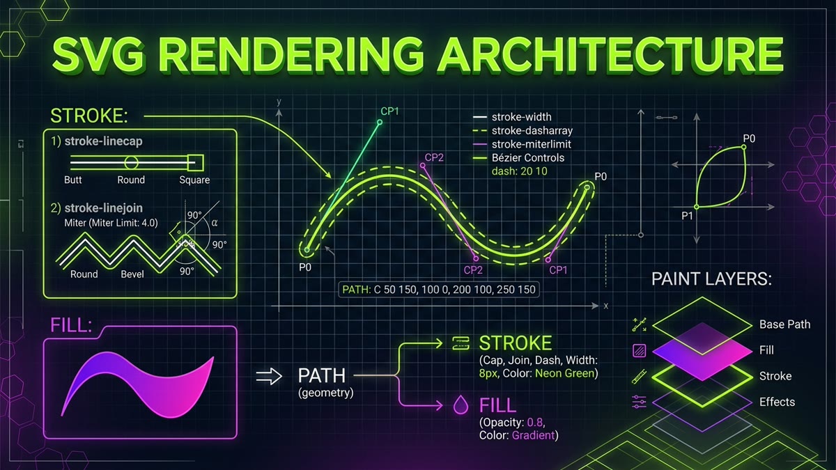
Executive Summary & Painting Pipeline: In the W3C SVG 2 Specification, Chapter 13 defines the formal painting architecture of vector graphics. When a vector element renders, it passes through distinct calculation phases:
- Path Trajectory Calculation: Bézier curve geometry and coordinate vertices are resolved in user space.
- Stroking & Joint Extrusion: Line caps, miter limits, and dash offsets are extruded perpendicularly to the path spine.
- Interior Ray-Casting: Fill rules (nonzero vs. evenodd) calculate polygon interior topology.
- Compositing Sequence: The
paint-orderproperty orchestrates whether fill, stroke, or markers rasterize first.
stroke-linecap: round; stroke-linejoin: miter; stroke-width: 12px; paint-order: normal;
stroke="<paint>"The primary presentation attribute and CSS property that applies paint along the vector path perimeter. Accepts named colors, hex codes, RGB/HSL/HWB, modern P3 color gamuts, gradients (url(#gradId)), or currentColor.
stroke-width="<length>"Defines the thickness of the stroke applied to path coordinates. Measurement is calculated symmetrically outward from the center trajectory of the path line.
stroke-linecap="butt | round | square"Specifies the geometric cap rendered at open path terminal vertices and the extremities of dashed line segments. Crucial for matching optical icon family weights.
buttTerminates paths cleanly at the exact coordinates of the endpoint. No stroke geometry projects beyond the vertex coordinate. Default W3C behavior.
roundAppends a half-circle cap with a radius equal to half the stroke width to the endpoint. Provides modern, tactile warmth in icon packs like Feather and Lucide.
squareProjects a square block past the terminal vertex by half the stroke width. Snaps endpoints cleanly to orthogonal grid lines in technical diagrams.
stroke-linejoin="miter | round | bevel | arcs | miter-clip"Controls the geometry rendered where two intersecting path lines meet at an angle. Prevents visual spikes and distortion at sharp corners.
miterExtends the outer edges of intersecting lines until they meet at a sharp point. When the angle is acute, the miter length can spike outward excessively.
roundRounds off the outer corner with a smooth circular fillet centered on the vertex point. Eliminates harsh corner spikes in interface icons.
bevelSlices off the corner with a flat diagonal line connecting the outer edges of the two intersecting strokes. Produces industrial, chiseled corners.
arcs (SVG 2)An SVG 2 feature producing curved fillets that follow the mathematical curvature of intersecting curved path segments rather than flat lines.
miter-clip (SVG 2)Clips the miter spike flat at the exact miter-limit boundary line rather than abruptly collapsing into a full bevel.
stroke-miterlimit="<number>"The maximum ratio allowed between the miter length (corner spike length) and the stroke width. When the ratio exceeds this threshold, the corner snaps into a bevel cut.
stroke-dasharray="<dash> <gap> ..."A sequence of lengths defining repeating dashes and spaces. Odd numbers of values repeat twice to complete the full on-off cycle.
stroke-dashoffset="<length>"The distance into the dash pattern at which stroking starts. Crucial for SVG self-drawing stroke animations in CSS and JavaScript.
pathLength="100"Declares an author-specified path length that overrides the browser's complex Bézier calculation, normalizing dasharray percentages or values to exactly 1 or 100.
stroke-dashcorner (SVG 2)An SVG 2 proposal providing algorithms to adjust dash lengths so that a solid dash segment centers symmetrically on polygon vertices, avoiding awkward corner gaps.
fill="<paint>"The presentation attribute and CSS property specifying the interior paint applied inside a vector boundary. Can be set to none for pure outline icons.
fill-opacity="0.0 – 1.0"Sets the transparency of the fill paint without affecting the stroke outline. Used extensively in duotone icon sets (e.g., Phosphor Duotone 20% opacity).
fill-rule="nonzero | evenodd"The ray-intersection algorithm that determines whether points fall inside or outside self-intersecting or compound path contours.
nonzeroDefault W3C rule. Casts a ray from a point and counts the directional orientation of crossing path segments. If clockwise and counter-clockwise crossings do not cancel out, the region is filled.
evenoddEvaluates interior parity by simply counting crossing segments. An odd number of crossings means interior (filled); an even number means exterior (cutout hole). Indispensable for icons with hollow cutouts.
fill-boxA CSS transform-box and reference box keyword aligning coordinate origins to the tight bounding box of an element's filled geometry, excluding stroke width.
context-fill (SVG 2)Enables nested elements inside <marker> or <use> tags to inherit the computed fill paint of the referring element.
context-stroke (SVG 2)Enables arrowhead markers and symbols to inherit the stroke color of the parent path dynamically.
paint-order: fill stroke markersControls the rasterization sequence of fill, stroke, and markers. By default, fill is drawn first and stroke on top, cutting into text glyph counters.
stroke fillDraws the stroke behind the fill. This preserves razor-sharp text stems and thin vector icon contours while casting a heavy outline behind the shape.
vector-effect: none | non-scaling-strokeSpecifies vector processing transformations performed prior to coordinate rasterization.
non-scaling-strokeLocks the visual thickness of strokes to constant physical screen pixels regardless of zoom factors, viewBox aspect ratios, or CSS scale transforms.
stroke-alignmentWhile design tools like Figma allow Inner and Outer strokes, the W3C SVG specification strictly centers strokes on path boundaries. Inner stroke can be emulated using clipPath or paint-order: stroke fill.
<marker id="...">An SVG definition element containing graphics (like arrowheads, dots, or crosshairs) to be placed at vertices of paths, lines, and polylines.
marker-start="url(#id)"Attaches an SVG marker symbol to the initial starting vertex of a path.
marker-mid="url(#id)"Attaches markers to all intermediate vertices between start and end on multi-segment paths and charts.
marker-end="url(#id)"Attaches a marker symbol (such as an arrowhead) to the final terminal vertex of a vector path.
strokeWidth | userSpaceOnUseControls whether marker dimensions scale with the path's stroke-width or remain fixed in user coordinate units.
orientRotates the marker symbol automatically to align tangentially with the incoming direction of the path line at the attachment vertex.
auto | optimizeSpeed | crispEdges | geometricPrecisionDirects the browser rasterization engine to prioritize speed, geometric curve precision, or pixel-aligned sharpness.
crispEdgesTurns off antialiasing on orthogonal edges and snaps lines to physical screen pixels, eliminating blurry 1px borders in tables and pixel art.
currentColorA CSS keyword inheriting the active typography color token, making vector icons adapt instantly across dark and light themes.
visiblePaintedRestricts mouse and touch event hit testing solely to regions where fill or stroke is visibly rendered and non-transparent, preventing phantom clicks on empty bounding boxes.
7. Frequently Asked Questions
What is the difference between fill-rule: nonzero and fill-rule: evenodd?
fill-rule: nonzero casts a ray from a point to infinity and tracks the direction (clockwise vs counter-clockwise) of crossing path segments. If the net sum is non-zero, the point is filled. fill-rule: evenodd simply counts the total number of crossing path lines: odd counts are filled (interior), while even counts remain unfilled (hollow cutout holes). evenodd is crucial for compound icons like donuts and padlocks.
How does vector-effect: non-scaling-stroke work in responsive SVG icons?
By default, SVG stroke-width scales proportionally with viewBox transformations and CSS scale transforms. Applying vector-effect: non-scaling-stroke instructs the browser rendering engine to compute the stroke after coordinate transformations, keeping the stroke thickness perfectly constant (e.g. 1.5px) regardless of how large or small the SVG is scaled.
Why is paint-order: stroke fill used in typography and icon design?
By default in SVG, fill is painted first, followed by stroke painted on top. Because strokes are centered on path boundaries, half of the stroke bleeds into the interior, eating away thin font stems and small glyph counters. Setting paint-order: stroke fill paints the entire stroke behind the fill, ensuring text and icons remain crisp and legible.
What does stroke-miterlimit calculate, and why do sharp vector corners spike?
When two path segments meet at an acute angle with stroke-linejoin: miter, the outer corner points spike outward dramatically. The miter length divided by stroke-width equals 1 / sin(θ / 2). stroke-miterlimit establishes a numeric cap (default 4); when the spike ratio exceeds this threshold, the browser automatically clips the spike to a flat bevel joint.
How does stroke-dashoffset enable SVG path drawing animations in CSS?
By setting stroke-dasharray equal to the total path length (obtained via getTotalLength() or pathLength="1") and setting stroke-dashoffset equal to that same length, the entire path is pushed into the empty gap phase. Animating stroke-dashoffset to 0 smoothly draws the visible stroke onto the screen.
Can SVG markers inherit the stroke color of the path they attach to?
In modern browsers conforming to SVG 2, setting fill="context-stroke" or fill="currentColor" on the marker graphic allows arrowhead and end markers to dynamically inherit the computed stroke color of the parent path without duplicating marker definitions.