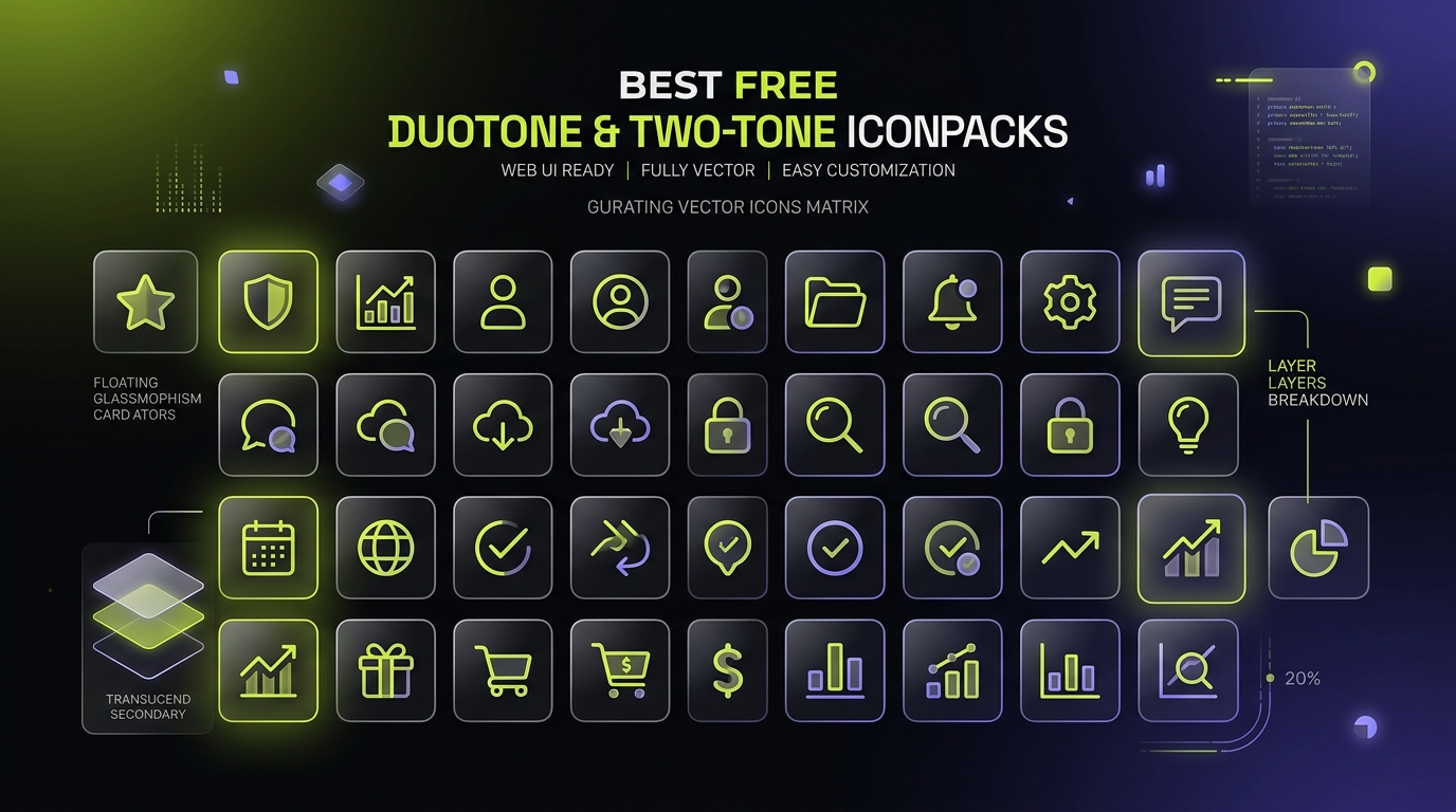
Overview: While minimal monochrome line icons remain an industry staple, modern SaaS dashboards, fintech platforms, and mobile apps increasingly demand duotone (two-tone) iconography. By pairing a solid primary outline (100% opacity) with a translucent secondary fill (15% to 30% opacity), duotone icons provide optical depth, semantic contrast, and branded sophistication without the weight of 3D renders.
We tested and benchmarked dozens of vector icon libraries across five engineering criteria to rank the 12 best free duotone icon sets available in 2026:
- Permissive Licensing: Must be 100% free for commercial SaaS products (MIT, Apache 2.0, or CC BY 4.0).
- Vector Architecture: Normalized viewBox, clean layer grouping, and CSS
currentColor/ variable themability. - Ecosystem Tooling: Official React, Vue, SVG sprite, or Figma component libraries.
The Engineering of Duotone SVG Icons
Before diving into the rankings, it helps to understand how professional duotone icons work under the hood. In clean vector production, an icon contains two distinct element groups:
<svg viewBox="0 0 24 24" width="24" height="24" fill="currentColor">
  <!-- Secondary translucent fill layer (20% opacity) -->
  <path d="..." opacity="0.2"/>

  <!-- Primary crisp foreground stroke / outline (100% opacity) -->
  <path d="..."/>
</svg>
Because both layers use fill="currentColor" or stroke="currentColor", setting a single CSS color rule (or Tailwind class like text-indigo-500) automatically tints both layers in harmony. The secondary fill inherits the exact same hue at an automatic 20% opacity, creating an effortless dual-density visual hierarchy.
The 12 Best Free Duotone Icon Packs Ranked
The Undisputed King of Modern Duotone: Phosphor Icons features over 1,250 distinct concepts meticulously drawn in its dedicated Duotone weight (part of its complete 6-weight system). Created by Helena Zhang and Toby Fried, every glyph features a 2px stroke outline paired with an underlying 20% opacity fill.
Phosphor offers first-class packages for React (@phosphor-icons/react), Vue (@phosphor-icons/vue), and Svelte, plus complete Figma component libraries with instant variant switching. It is 100% MIT licensed and safe for zero-attribution commercial distribution.
Browse Phosphor Icons on IconStash → | Read Complete Developer Guide →
The Fintech & Mobile Darling: Solar Icons by 480 Design is one of the most stylish modern icon packs in existence. It features two remarkable two-tone variants: Bold Duotone (solid shapes with complementary secondary tints) and Linear Broken (clean geometric line paths with distinctive gaps and floating dot accents).
Widely adopted by cryptocurrency apps, fintech wallets, and neobanks, Solar brings an ultra-modern aesthetic that feels bespoke. Licensed under Creative Commons CC BY 4.0 (commercial use with attribution).
The Enterprise SaaS Standard: Built as the official icon engine of Ant Design (Alibaba's enterprise design system), Ant Design Icons offers a dedicated Two-Tone family. What makes Ant Design unique is its native two-color API: you can pass twoToneColor="#1890ff" in React, and the component mathematically computes the primary outline and secondary pastel fill.
Fully MIT licensed, tree-shakable, and battle-tested across millions of enterprise financial and cloud management consoles worldwide.
Massive Scope & AI-Ready Precision: Hugeicons delivers thousands of meticulously aligned icons across stroke, solid, and two-tone styles. Its two-tone icons feature refined geometric angles, subtle interior fills, and extensive coverage of developer tools, AI workflows, and cloud infrastructure concepts.
The free open-source tier includes comprehensive React and Figma kits under the MIT license.
Friendly Web & Dashboard Utility: Created by Atisa, Boxicons provides a clean, approachable visual style with rounded outer vertices. Its two-tone glyphs pair crisp silhouettes with gentle 20% alpha fills, making them ideal for web portals, education apps, and admin tables.
Boxicons supports Web Components, CSS classes, and direct SVG export under the MIT license.
ByteDance's Dynamic Multi-Color Powerhouse: Developed by the ByteDance design team, IconPark features an advanced architecture allowing real-time customization of four distinct color channels (primary, secondary, success, error) in SVG code. Its two-tone mode allows setting separate hex colors or opacity values for outlines versus fills.
Licensed under Apache 2.0 with official React, Vue 3, and SVG sprite transformers.
Microsoft's Comprehensive Enterprise Giant: Microsoft's official Fluent UI System Icons is the largest icon library in IconStash with over 20,000 glyphs. While famous for its Regular outline and Filled variants, Fluent includes rich multi-color and two-tone assets that power Windows 11, Microsoft 365, and Azure portals.
MIT licensed, highly consistent across optical sizing grids (16px to 48px), and completely royalty-free.
The Open-Source UI Veteran: Remix Icon is one of the most widely used icon sets in web development. While strictly offering Line and Fill versions for every icon, developers routinely combine both paths inside a single SVG wrapper or use CSS pseudo-elements to produce custom duotone compositions with 100% alignment.
Apache 2.0 licensed, pixel-perfect, and fully zero-attribution compliant.
Mobile-First Polish for iOS & Android: Built by the Ionic Framework team, Ionicons has powered thousands of hybrid and mobile applications. Its clean outlines and solid shapes translate effortlessly into dual-tone stateful icons for bottom sheets and navigation bars.
MIT licensed and fully integrated with modern web standards.
Living, Breathing Vector Animations: Line MD by Vjacheslav Trushkin brings pure SVG path animations to the Material Design style. In duotone mode, primary line paths draw dynamically via stroke-dashoffset while the secondary fill fades in smoothly with CSS transitions, producing striking loading and micro-interaction states.
MIT licensed with zero external runtime dependencies.
Custom Stroke Adaptability: Tabler Icons provides over 6,300 stroke-adjustable icons. By pairing Tabler's filled variants with its 1px or 1.5px outline strokes, frontend engineers frequently construct custom duotone components that match bespoke brand palettes.
MIT licensed with over 2.7M weekly npm downloads.
Variable Font Multi-Axis Depth: Google's Material Symbols supports variable font axes for FILL (0 to 1), wght (100 to 700), and GRAD (-25 to 200). By styling layered glyphs with CSS font settings, developers can build responsive, dual-density state transitions.
Apache 2.0 licensed, Google supported, and completely free.
Definitive 12-Pack Duotone Comparison Matrix
Compare icon counts, primary license terms, grid sizes, and custom theming capabilities across all 12 featured libraries:
| Icon Pack | Icon Count | License | Grid Base | Framework Support | Secondary Opacity Control |
|---|---|---|---|---|---|
| Phosphor Duotone | 9,198 (1,250+ Duo) | MIT | 24×24 | React, Vue, Svelte, Web | Built-in (20% opacity path) |
| Solar Icons | 7,410 | CC BY 4.0 | 24×24 | SVG, Figma, CSS | Two-tone layer groups |
| Ant Design Two-Tone | 1,870 | MIT | 16×16 | React, Vue, Angular | twoToneColor prop API |
| Hugeicons Two-Tone | 5,115 | MIT | 24×24 | React, Vue, Figma | Dual-path fills |
| Boxicons Two-Tone | 3,389 | MIT | 24×24 | Web Components, CSS | 20% alpha fill |
| IconPark Two-Tone | 2,600+ | Apache 2.0 | 48×48 | React, Vue, SVG | 4-channel color tokens |
| Fluent UI Two-Tone | 20,170 | MIT | 16/20/24/48 | React, iOS, Android | Multi-layer paths |
| Remix Icon Compound | 3,244 | Apache 2.0 | 24×24 | React, Vue, Fonts | Line/Fill composition |
| Ionicons Two-Tone | 2,607 | MIT | 512×512 | Web Components, React | Dual SVG paths |
| Line MD Animated | 1,279 | MIT | 24×24 | SVG, Vue, React | Animated stroke + fill |
| Tabler Filled | 6,324 | MIT | 24×24 | React, Vue, Svelte | Stroke/Fill layering |
| Material Symbols | 18,547 | Apache 2.0 | 24×24 | Web Font, SVG | Variable FILL axis |
How to Theme Duotone Icons with Tailwind CSS & CSS Variables
In modern web applications, you can create a reusable duotone icon component that accepts separate colors for the outline and fill layers using CSS variables:
import React from 'react';

interface DuotoneIconProps {
  primaryColor?: string;   // e.g. '#FFFFFF' or 'currentColor'
  secondaryColor?: string; // e.g. '#C1DD2D'
  secondaryOpacity?: number; // e.g. 0.25
  size?: number;
  children: React.ReactNode;
}

export function DuotoneWrapper({
  primaryColor = 'currentColor',
  secondaryColor = '#C1DD2D',
  secondaryOpacity = 0.25,
  size = 24,
  children,
}: DuotoneIconProps) {
  return (
    <div
      style={{
        display: 'inline-flex',
        color: primaryColor,
        ['--duotone-secondary' as any]: secondaryColor,
        ['--duotone-opacity' as any]: secondaryOpacity,
        width: size,
        height: size,
      }}
      className="[&_path[opacity]]:![fill:var(--duotone-secondary)] [&_path[opacity]]:![opacity:var(--duotone-opacity)]"
    >
      {children}
    </div>
  );
}
Frequently Asked Questions
What is a duotone or two-tone SVG icon?
A duotone or two-tone SVG icon separates vector artwork into two distinct visual layers: a primary high-contrast line or silhouette (100% opacity) and a secondary translucent fill (typically 15% to 30% opacity). This creates visual depth and richness without the rendering overhead of raster textures or 3D models.
How do you change the colors of a duotone SVG icon in CSS?
Most duotone icons inherit the CSS color property via currentColor on both layers while applying opacity='0.2' to the secondary fill. You can customize the secondary layer independently by targeting the path with opacity in CSS (e.g., svg path[opacity='0.2'] { fill: var(--brand-accent); }) or using CSS custom properties for dual-color themes.
Which duotone icon pack has the largest selection of free icons?
Phosphor Icons offers the largest collection of dedicated duotone icons, featuring over 1,250 unique symbols in its Duotone style (part of its 9,198 icon library), followed by Solar Icons with over 7,410 icons spanning Bold Duotone and Broken styles.
Are all the duotone icon sets on this list free for commercial use?
Yes. 11 of the 12 sets are licensed under MIT or Apache 2.0 (zero attribution required). Solar Icons is licensed under CC BY 4.0, which allows free commercial use with a simple attribution note.
Can duotone icons be animated with CSS or SVG stroke animations?
Yes. Because duotone icons are standard SVG path elements, you can animate stroke-dashoffset on the primary outline while pulsing or fading the opacity of the secondary fill layer using CSS keyframe animations or Web Animations API.