10 Best React Icon Libraries for 2026: Bundle Size, Tree-Shaking & Next.js RSC Ranked
React Icon Architecture Overview: Choosing an icon library for a modern React 19 or Next.js App Router application is no longer just about visual aesthetic. It is a critical performance decision that determines production bundle footprint, dev server compilation speed, and React Server Components (RSC) compatibility. This definitive 2026 benchmark ranks the 10 leading libraries based on:
- Single-Icon Bundle Impact: Exact JavaScript bytes added to production client bundles after Rollup/Vite tree-shaking.
- Tree-Shaking Reliability: Resistance to barrel-import bundle leaks and fast HMR reloads during local development.
- React Server Components (RSC) Support: Zero-overhead server-side rendering without mandatory
'use client'directives. - TypeScript Type Safety: Strict SVG attribute forwarding, polymorphic
sizeprops, and autocomplete responsiveness. - Styling Flexibility: Seamless compatibility with Tailwind CSS v4, CSS Modules, and dynamic
currentColortheming. - The Zero-Install Alternative: How to use IconStash's 134K+ catalog to copy instant JSX without adding dependencies to
package.json.
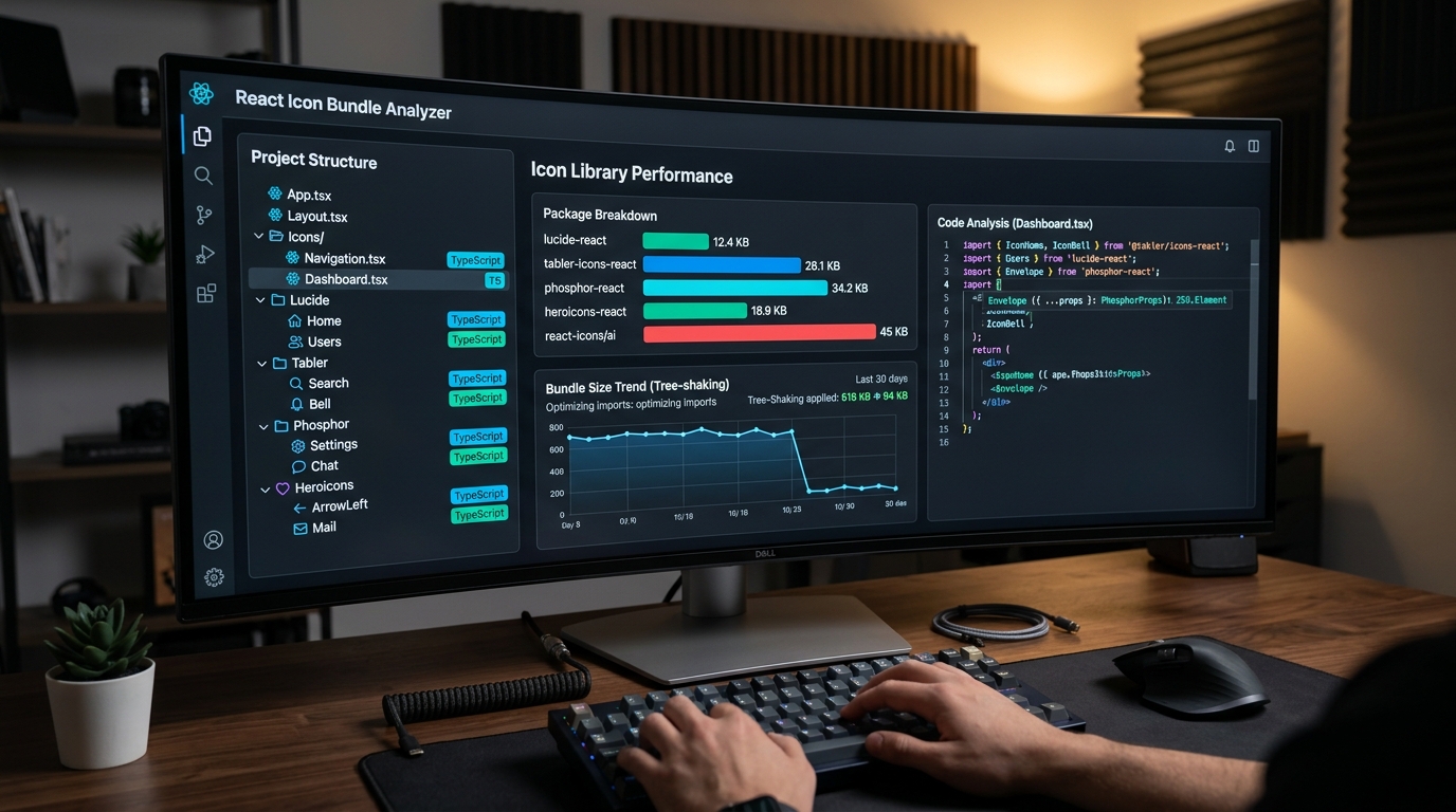
1. The Evolution of React Iconography: Why Legacy Packages Hurt Performance
In the early days of React, developers installed monolithic packages like react-icons or imported massive web font stylesheets like Font Awesome. While convenient, these legacy approaches create severe performance bottlenecks in modern web architectures:
- Barrel File Bottlenecks: When a package exports thousands of icons from a single index file (e.g.
index.js), development bundlers (Vite, Webpack, Turbopack) must parse all thousands of modules simply to render a single navigation icon. In Next.js projects, this frequently causes 3- to 5-second compilation delays during hot module replacement (HMR). - Tree-Shaking Leaks: If tree-shaking fails (due to incorrect Babel configurations, CommonJS interop, or dynamic imports), hundreds of unused icons can leak into your production JavaScript bundle, inflating initial page downloads by 200 KB to 1 MB.
- Hydration Mismatches in React 19: Icons with hardcoded IDs, random gradient seeds, or inconsistent SVG attributes trigger React hydration warnings and degrade Largest Contentful Paint (LCP) scores.
In 2026, premier React icon packages must ship pure ES modules, maintain isolated icon exports, and provide flawless TypeScript types that compile into lean, tree-shaken SVGs.
2. Comprehensive Comparison Matrix: Top 10 React Icon Libraries
We benchmarked all 10 libraries using a clean Next.js 15 / React 19 production build with Rollup tree-shaking enabled. Here are the hard metrics:
| Library | Icon Count | Single-Icon Gzip | Tree-Shaking | RSC Ready? | Style System |
|---|---|---|---|---|---|
| 1. Lucide React | 1,500+ | ~0.5 KB | Exceptional (A+) | 100% Yes | Stroke (24px grid) |
| 2. Tabler Icons React | 5,200+ | ~0.6 KB | Exceptional (A+) | 100% Yes | Stroke & Filled (24px) |
| 3. Phosphor React | 1,200+ (×6 styles) | ~0.7 KB | Very Good (A) | 100% Yes | 6 Weights + Duotone |
| 4. Heroicons | 290+ | ~0.4 KB | Exceptional (A+) | 100% Yes | Outline, Solid, Micro |
| 5. React Icons | 40,000+ | ~0.8 KB* | Moderate (B) | Yes (Sub-paths) | Aggregator (Mixed) |
| 6. Radix UI Icons | 300+ | ~0.4 KB | Exceptional (A+) | 100% Yes | Compact (15×15 grid) |
| 7. Remix Icon React | 2,800+ | ~0.6 KB | Very Good (A) | 100% Yes | Line & Fill (24px) |
| 8. Iconify React | 150,000+ | ~1.8 KB runtime | Dynamic API | Client Island | Universal Aggregator |
| 9. Font Awesome React | 2,000+ | ~1.2 KB | Good (A-) | Yes | Solid, Regular, Brands |
| 10. Bootstrap Icons React | 2,000+ | ~0.6 KB | Good (A-) | 100% Yes | Line & Fill (16px) |
*Note: While react-icons tree-shakes individual components down to ~0.8 KB in optimized production builds, developer server compilation overhead is significantly higher due to massive barrel files.
3. Detailed Breakdown of the Top 10 React Icon Libraries
1. Lucide React
lucide-react
Bundle Impact: ~0.5 KB per icon
Lucide is the official community successor to Feather Icons, drastically expanding the catalog from 280 icons to over 1,500 meticulously balanced vector glyphs. It is currently the default icon system for modern UI ecosystems such as shadcn/ui and Tailwind UI.
Why It Wins: Every icon is drawn on a standardized 24×24 grid with customizable strokeWidth, size, and color props. Lucide ships isolated ESM exports that tree-shake flawlessly in Vite, Next.js, and Remix with zero configuration.
import { ArrowRight, CheckCircle2, Search } from 'lucide-react';

export function ActionButton() {
  return (
    <button className="flex items-center gap-2 text-zinc-300 hover:text-white">
      <Search size={18} strokeWidth={2.5} />
      <span>Search Documentation</span>
      <ArrowRight size={16} className="text-lime-400" />
    </button>
  );
}2. Tabler Icons React
@tabler/icons-react
Bundle Impact: ~0.6 KB per icon
If your web application requires comprehensive domain-specific iconography—covering fintech, developer tooling, medical diagrams, e-commerce, and logistics—Tabler Icons is unmatched. With over 5,200 consistent vector icons, you will rarely need to design custom SVGs.
Tabler Icons React ships both stroke-based line icons and filled variants, supporting dynamic stroke thickness and smooth color transitions.
import { IconBell, IconSettings, IconBrandGithub } from '@tabler/icons-react';

export function DashboardHeader() {
  return (
    <header className="flex gap-4 items-center">
      <IconBell size={22} stroke={1.5} className="text-zinc-400 hover:text-white" />
      <IconSettings size={22} stroke={1.5} />
    </header>
  );
}3. Phosphor React
@phosphor-icons/react
Bundle Impact: ~0.7 KB per icon
Phosphor Icons offers the greatest stylistic flexibility of any React icon system. Every single one of its 1,200+ icons is crafted in 6 distinct weights: Regular, Thin, Light, Bold, Fill, and Duotone. This makes it effortless to create active vs inactive navigation states or hierarchy tiers without switching icon sets.
import { House, BookmarkSimple } from '@phosphor-icons/react';

export function TabBar({ activeTab }) {
  return (
    <nav>
      {/* Active tab uses Duotone; inactive uses Regular */}
      <House
        size={24}
        weight={activeTab === 'home' ? 'duotone' : 'regular'}
        className={activeTab === 'home' ? 'text-lime-400' : 'text-zinc-500'}
      />
      <BookmarkSimple size={24} weight="bold" />
    </nav>
  );
}4. Heroicons
@heroicons/react
Bundle Impact: ~0.4 KB per icon
Created by the Tailwind Labs design team (Steve Schoger and Adam Wathan), Heroicons is engineered specifically to pair with Tailwind CSS. It provides four distinct optical sizes: 24px outline (ideal for general UI), 24px solid (active states), 20px mini (form fields and alerts), and 16px micro (badges and compact menus).
import { Bars3Icon, XMarkIcon } from '@heroicons/react/24/outline';
import { CheckCircleIcon } from '@heroicons/react/20/solid';

export function MobileNav({ isOpen, onClose }) {
  return (
    <button onClick={onClose} aria-label="Toggle Menu">
      {isOpen ? <XMarkIcon className="size-6 text-zinc-300" /> : <Bars3Icon className="size-6" />}
    </button>
  );
}5. React Icons
react-icons
Bundle Impact: ~0.8 KB (with sub-path imports)
react-icons is the venerable multi-library aggregator for React. It bundles dozens of major open-source icon sets into sub-path namespaces (e.g. react-icons/fa, react-icons/ai, react-icons/bi). If your project needs to mix icons from multiple design systems, it offers unparalleled variety.
Crucial Best Practice: Always import from sub-paths (e.g. react-icons/lu or react-icons/hi2) rather than top-level imports to ensure tree-shaking succeeds and dev server HMR stays fast.
6. Radix UI Icons
@radix-ui/react-icons
Bundle Impact: ~0.4 KB per icon
Designed by the WorkOS / Radix Primitives team, Radix Icons are crafted on an ultra-compact 15×15 pixel grid. They are specifically tuned for dense enterprise dashboards, context menus, toolbars, and micro-interactions where 24px icons feel oversized.
7. Remix Icon React
remixicon-react
Bundle Impact: ~0.6 KB per icon
Remix Icon is an open-source neutral icon system. Every icon comes in dual Line and Fill styles, offering exceptional visual balance across enterprise dashboards and mobile apps without strong stylistic idiosyncrasies.
8. Iconify React
@iconify/react
Bundle Impact: ~1.8 KB runtime + fetched SVG data
Iconify approaches iconography differently: instead of bundling thousands of SVG files into your build, it uses a tiny runtime client that fetches vector data on-demand from Iconify's public CDN or your self-hosted API. Ideal for CMS platforms, user icon pickers, and dynamic vector dashboards.
9. Font Awesome React
@fortawesome/react-fontawesome
Bundle Impact: ~1.2 KB
Font Awesome remains an enterprise staple. The official React wrapper renders scalable SVGs instead of legacy web fonts, supporting layering, rotating, and masking primitives. Ideal for legacy enterprise portals that already have standardized Font Awesome design tokens.
10. Bootstrap Icons React
react-bootstrap-icons
Bundle Impact: ~0.6 KB per icon
Designed for Bootstrap 5 and modern admin templates, Bootstrap Icons are clean, functional 16×16 vectors that integrate smoothly into any React application without requiring Bootstrap CSS.
4. The Zero-Bundle Alternative: Copy-Paste JSX via IconStash
Before installing another npm package and accepting dependency version drift, security audit overhead, and node_modules bloat, consider the Zero-Install Architecture:
On IconStash.io, you can search over 134,000 icons across 28 open-source libraries (including Lucide, Tabler, Phosphor, Heroicons, Feather, and Radix) and click Copy JSX. Paste the component directly into your codebase. You get 100% vector fidelity, full TypeScript support, zero runtime dependencies, and 0 KB package.json bloat.
5. Tree-Shaking Best Practices for Next.js App Router & Vite
To ensure your React icon library never leaks unused code into production, apply these architectural configurations:
- Configure
optimizePackageImportsin Next.js:In your
next.config.jsornext.config.mjs, add icon packages to the experimental optimization list. This tells Next.js to transform barrel imports into direct file imports automatically:// next.config.mjs const nextConfig = { experimental: { optimizePackageImports: ['lucide-react', '@tabler/icons-react', '@phosphor-icons/react'], }, }; export default nextConfig; - Avoid Wildcard Imports: Never write
import * as Icons from 'lucide-react';. Wildcard imports defeat dead-code elimination, forcing the bundler to include all 1,500 icons in your bundle. - Verify with Bundle Analyzer: Run
npx @next/bundle-analyzerorrollup-plugin-visualizerto verify that icon components appear as isolated sub-kilobyte chunks rather than monolithic blocks.
6. Frequently Asked Questions
Which React icon library has the smallest production bundle size?
Lucide React and Heroicons tie for the smallest production bundle overhead. In a modern Vite, Next.js, or Rollup build with ES module tree-shaking enabled, each imported Lucide or Heroicons component adds only 0.4 KB to 0.8 KB of gzipped JavaScript to your production client bundle.
Why is the legacy react-icons package risky for Next.js App Router projects?
The react-icons package bundles over 40,000 icons into massive CommonJS/ESM distribution barrels. If developers use barrel imports (import { FaHome } from 'react-icons/fa') without configuring package modularization plugins in next.config.js, development server compilation times increase by 300-500% and risk leaking unused icons into client bundles.
Do these React icon libraries support React Server Components (RSC)?
Yes. Top-tier libraries like Lucide React, Tabler Icons React, Phosphor React, and Heroicons ship pure functional SVG components that execute seamlessly on the server inside Next.js App Router (RSC). They require zero 'use client' directives unless you attach interactive event listeners directly to the icon.
What is the fastest way to use React icons without installing npm dependencies?
You can use IconStash (https://iconstash.io) to search over 134,000 icons across 28 open-source libraries and copy ready-to-use React JSX code with a single click. This completely eliminates node_modules bloat, prevents dependency version drift, and leaves 0 KB of library framework overhead in your package.json.