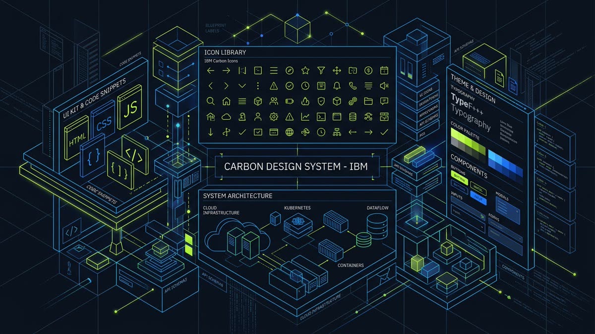
Executive Summary: The IBM Carbon Design System is an industry benchmark for enterprise product engineering. With over 2,644 meticulously crafted vector icons indexed on IconStash, this guide provides complete architecture for:
- Optical Grid System: Hand-crafted 16px, 20px, 24px, and 32px grids engineered for high-density SaaS consoles.
- Framework Ecosystem: Official zero-dependency component packages across React 19, Angular 18+, Vue 3, and Svelte 5.
- High-Information Density UI: Resolving visual clutter in telemetry tables, terminal monitors, and cloud infrastructure graphs.
- Tree-Shaking & Performance: Subpath imports and SVG sprite optimization under the Apache 2.0 open-source license.
1. Introduction to IBM Carbon Icons
Enterprise software represents the most demanding environment for user interface design. Unlike consumer mobile apps with sparse screens and generous whitespace, enterprise products—such as cloud infrastructure consoles, cybersecurity event visualizers, financial trading terminals, and database engines—must display hundreds of data points simultaneously.
In high-density views, consumer-oriented icon libraries fail. Their playful rounded corners, non-standard optical centers, and arbitrary line thicknesses create distracting visual noise. The IBM Carbon Design System solves this with an industrial, grid-snapped icon philosophy based on 90-degree and 45-degree angles, fixed stroke terminals, and systematic optical scale tiers.
Every single icon is licensed under the permissive Apache License 2.0 and fully indexed on IconStash's Carbon Library Hub.
2. The 4 Optical Grid Tiers: 16px, 20px, 24px, 32px
Carbon does not treat icons as elastic stamps. Instead, IBM designers developed four discrete optical size grids to handle specific spatial hierarchies:
| Optical Grid | Stroke & Geometry Rules | Primary Interface Use Case |
|---|---|---|
| 16×16 px | 1px stroke weight, simplified inner counters, removed secondary strokes | Data tables, compact select options, tree view expanders, inline breadcrumbs |
| 20×20 px | 1.5px stroke weight, standard padding (2px inset) | Form input field icons, action buttons, table header sorting triggers |
| 24×24 px | 2px stroke weight, full geometric expression | Main side navigation rails, modal headers, standard toolbar utilities |
| 32×32 px | 2px stroke weight with enlarged open counter balance | Dashboard metric cards, empty state illustrations, landing pages |
By specifying the optical size at import time (such as Cloud16 vs Cloud24), enterprise applications eliminate blurry subpixel interpolation on standard 1080p and 1440p enterprise office monitors.
3. Installation & Framework Support (React, Vue, Svelte, Angular)
The Carbon ecosystem maintains first-party npm packages for all major web frameworks:
# For React 18 & 19
npm install @carbon/icons-react

# For Vue 3
npm install @carbon/icons-vue

# For Svelte 5
npm install carbon-icons-svelte

# For Angular 18+
npm install @carbon/icons-angular
React Usage Pattern
Every icon component accepts standard SVG HTML attributes, custom size numbers (16, 20, 24, 32), and accessible title props:
import React from 'react';
import { Cloud16, Terminal20, Analytics24 } from '@carbon/icons-react';

export const EnterpriseDashboardHeader = () => {
  return (
    <header className="flex items-center justify-between p-4 bg-zinc-900 border-b border-zinc-800">
      <div className="flex items-center gap-2 text-zinc-100 font-semibold">
        <Cloud16 aria-hidden="true" className="text-lime-400" />
        <span>Cloud Cluster: US-East-1</span>
      </div>

      <div className="flex items-center gap-3">
        <button
          type="button"
          aria-label="Launch Cloud Terminal"
          className="p-2 rounded bg-zinc-800 text-zinc-300 hover:text-white"
        >
          <Terminal20 aria-hidden="true" />
        </button>
        <button
          type="button"
          aria-label="View Telemetry Analytics"
          className="p-2 rounded bg-zinc-800 text-zinc-300 hover:text-white"
        >
          <Analytics24 aria-hidden="true" />
        </button>
      </div>
    </header>
  );
};
4. Production Tree-Shaking & Subpath Optimization
Because the total Carbon collection spans over 2,600 icons across multiple sizes (resulting in over 9,000 compiled exports), bundle optimization is vital:
If your project utilizes legacy Webpack 4 or tools without robust package exports resolution, import directly via subpath: import Cloud16 from '@carbon/icons-react/lib/cloud/16';. In modern Vite 6 and Next.js 15 setups, top-level named imports import { Cloud16 } from '@carbon/icons-react'; tree-shake automatically to < 850 bytes per icon.
5. Theming, currentColor & Enterprise Color Tokens
Every Carbon icon glyph renders paths using fill="currentColor". In enterprise SaaS architectures, color represents semantic state rather than mere decoration:
| Semantic Token | Hex (Dark Theme) | Hex (Light Theme) | Enterprise Meaning |
|---|---|---|---|
$icon-primary |
#F4F4F4 | #161616 | High-emphasis interactive elements and active titles |
$icon-secondary |
#C6C6C6 | #525252 | Supporting navigation actions and inactive toolbars |
$support-success |
#42BE65 | #24A148 | Healthy cluster status, passing CI/CD pipelines |
$support-warning |
#F1C21B | #F1C21B | High memory pressure, pending security reviews |
$support-error |
#FF8389 | #DA1E28 | Node outage, database connection failure, blocked build |
6. Accessibility & Screen Reader Semantics
Carbon Design System enforces rigorous accessibility standards under WCAG 2.2 AA / Section 508. The React components provide built-in title handling:
{/* Standalone Icon with Screen Reader Announcer */}
<Security16 title="System Protected with Mutual TLS" aria-label="System Protected" />

{/* Decorative Icon beside visible text */}
<button type="button" className="btn-save">
  <Save16 aria-hidden="true" />
  <span>Deploy Changes</span>
</button>
7. Head-to-Head Comparison: Carbon Icons vs. Competitors
How does Carbon Icons compare to other premier enterprise and frontend icon sets?
| Icon Set | Total Icons | Grid Sizing | License | Ecosystem Fit |
|---|---|---|---|---|
| IBM Carbon Icons | 2,644+ | 16, 20, 24, 32px | Apache 2.0 | Enterprise SaaS, Cloud Consoles, Data Analytics |
| Microsoft Fluent UI | 20,170+ | 16, 20, 24, 28, 32, 48px | MIT | Enterprise Office/Windows, Consumer SaaS |
| Lucide Icons | 1,970+ | Single 24px grid | ISC | Modern Web Apps, Next.js, Indie SaaS |
| Google Material Symbols | 18,500+ | Variable font axes | Apache 2.0 | Mobile, Android, Consumer Web |
8. Frequently Asked Questions
What is IBM Carbon Icons, and what makes it distinct from general-purpose icon packs?
Carbon Icons is the official iconography system of the IBM Carbon Design System, engineered specifically for enterprise software, cloud consoles, cybersecurity, and data-dense dashboards. Rather than generic playful glyphs, Carbon Icons features mathematically strict geometry, industrial line weights, and four discrete optical grids (16, 20, 24, and 32px) tailored for complex workflows.
How are the four optical size grids (16px, 20px, 24px, 32px) structured in Carbon Icons?
In Carbon Icons, each size tier is an independently drawn vector asset. 16px is optimized for dense table cells and dropdown menus with simplified internal geometry; 20px aligns with standard body text and form inputs; 24px provides foundational navigation clarity; and 32px delivers rich visual accents for hero banners and empty state illustrations.
How do I install Carbon Icons in React with zero bundle overhead?
Install the package with npm install @carbon/icons-react. Always import icons via direct named imports such as import { Cloud, Terminal, Analytics } from '@carbon/icons-react' or specific size subpaths. In modern bundlers (Vite, Webpack 5, Next.js), tree-shaking discards unused icons, ensuring each component adds under 1KB to your final bundle.
What license governs Carbon Icons, and can it be used in commercial SaaS products?
IBM Carbon Icons is licensed under the permissive Apache License 2.0. You are fully permitted to use, modify, distribute, and embed Carbon Icons in commercial SaaS products, internal tools, and open-source applications without royalty fees.
Does Carbon Icons offer official packages for Vue, Svelte, and Angular?
Yes. In addition to @carbon/icons-react, IBM maintains official sister packages including @carbon/icons-vue for Vue 3, carbon-icons-svelte for Svelte 5, and @carbon/icons-angular for Angular 18+. IconStash also indexes all 2,644 raw SVG assets for zero-dependency usage.
How can I search and copy Carbon Icons on IconStash?
You can search, filter, and inspect all 2,644 IBM Carbon Icons at https://iconstash.io/library/carbon/. IconStash provides live previewing across dark and light backgrounds, optical size comparisons, and instant one-click export to clean SVG, PNG, and React JSX components.