How to Align & Center SVG Icons with Text in CSS: The Complete 2026 Guide
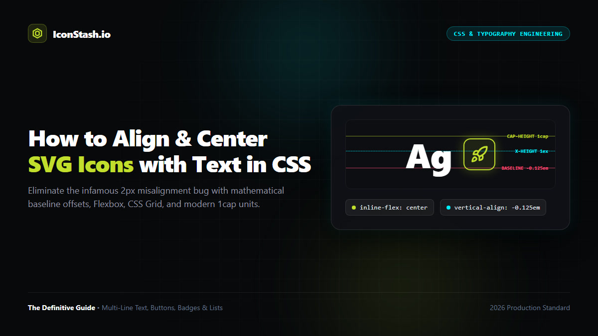
The Core Problem: Every web developer encounters the infamous "2px icon misalignment bug." An SVG placed alongside a button label or heading appears slightly elevated or sunken, refusing to sit on the visual center of the text. This is not a browser defect—it is a mathematical collision between font metric line boxes and SVG viewport geometry.
em units (for flowing copy), CSS Grid (for multi-line text wraps), Modern CSS 1cap units, and CSS Mask Image stencils.To permanently solve icon misalignment, you must understand how browsers assemble inline content. In CSS, text does not sit inside a simple rectangular box; it lives inside a complex typographical line box calculated from font tables:
H, T, X) and flat lowercase letters (like x, z) rest.g, j, p, q, y). In most modern sans-serif fonts (Inter, Roboto, SF Pro), this accounts for 15% to 25% of total font size.When you drop an <svg> tag into HTML next to a text node, the browser treats the SVG as an inline replaced element. By CSS specification, its bottom boundary snaps to the baseline. Because the baseline sits 3px to 5px above the bottom of the line box, the SVG appears visibly pushed upwards compared to the overall block bounding box.
Developers frequently apply vertical-align: middle hoping for a quick fix. However, the CSS specification defines vertical-align: middle as: "Align the vertical midpoint of the element with the baseline of the parent box plus half the x-height of the parent." Since button labels almost always begin with uppercase letters or Title Case, aligning to the middle of lowercase letters places the icon 1.5px to 2.5px below the visual center of the button label!
For standalone controls such as buttons, navigation pills, chip badges, and menu triggers, Inline Flexbox is the undisputed gold standard in modern web development. It extracts the icon and text from inline line-box typography rules and aligns them along an independent cross-axis.
/* Modern Button with Pixel-Perfect Icon Centering */
.btn-primary {
  display: inline-flex;
  align-items: center;
  justify-content: center;
  gap: 0.5rem; /* 8px spacing */
  padding: 0.625rem 1.25rem;
  font-family: 'Inter', sans-serif;
  font-size: 0.9375rem; /* 15px */
  font-weight: 600;
  line-height: 1; /* Eliminates asymmetrical font leading */
  border-radius: 0.5rem;
  background-color: #C1DD2D;
  color: #0A0A0A;
  border: none;
  cursor: pointer;
  text-decoration: none;
}

.btn-primary svg {
  width: 1.125rem;  /* 18px */
  height: 1.125rem;
  flex-shrink: 0;   /* Prevents flexbox compression in constrained containers */
  fill: currentColor;
  stroke: currentColor;
}Crucial Rule: Always set line-height: 1 (or a tight line height like 1.2) on flex buttons. Standard line heights of 1.5 or 1.6 add silent leading padding above capital letters, tilting the perceived optical balance even when flexbox centers the geometric boxes perfectly.
When an icon is inserted directly inside a flowing paragraph of text (such as an external link indicator, inline badge, or inline status marker), using Flexbox would force the paragraph to break or disrupt natural line wrapping. In these scenarios, you must keep the icon inline and counteract the baseline offset using relative em units.
/* Inline Flow Icon for Paragraphs & Articles */
p.article-body svg.inline-icon {
  display: inline-block;
  width: 1em;
  height: 1em;
  vertical-align: -0.125em; /* Mathematical baseline adjustment */
  margin-right: 0.25em;
  margin-left: 0.15em;
  fill: currentColor;
  stroke: currentColor;
}Setting vertical-align: -0.125em drops the icon by exactly 1/8th of its font size. At a standard 16px font size, this lowers the icon by precisely 2px, absorbing the descender void and aligning the vertical center of the icon directly with the optical center of lowercase and uppercase text alike.
By defining width, height, and vertical offset in em units, the icon scales automatically with any font changes. If the paragraph size increases to 24px on desktop, the offset automatically expands to -3px without touching a single line of CSS.
A classic UI bug occurs in feature lists, notification toasts, and FAQ accordions where text spans multiple lines. If you use display: flex; align-items: center;, adding a second line of text causes the icon to slide down into the vertical center between line 1 and line 2, creating an awkward, floating appearance.
To lock the icon to the first line of text while allowing subsequent lines to wrap cleanly underneath, use CSS Grid with align-items: start:
/* Multi-Line List Item with First-Line Icon Alignment */
.feature-list-item {
  display: grid;
  grid-template-columns: auto 1fr;
  align-items: start;
  gap: 0.75rem; /* 12px horizontal gutter */
  margin-bottom: 1rem;
}

.feature-list-item svg {
  width: 1.25rem; /* 20px */
  height: 1.25rem;
  /* Align icon center with the first line's cap-height */
  margin-top: 0.15em;
  color: #C1DD2D;
}

.feature-list-item p {
  margin: 0;
  font-size: 1rem;
  line-height: 1.5; /* 24px line box */
  color: #D4D4D4;
}
By pairing grid-template-columns: auto 1fr with margin-top: 0.15em, the icon stays pinned to the top line regardless of whether the paragraph spans two lines or twelve lines.
The CSS Values and Units Module Level 4 introduces font-relative dimensions that eliminate manual pixel guessing entirely:
1cap: Equal to the exact height of capital letters in the current font.1ex: Equal to the exact x-height of lowercase letters.1lh: Equal to the computed line-height of the element./* Cutting-Edge 2026 Icon Sizing Using CSS cap Units */
.cap-aligned-icon {
display: inline-block;
width: 1cap;
height: 1cap;
vertical-align: 0; /* Sits exactly on baseline with cap height */
margin-inline: 0.25cap;
fill: currentColor;
}
/* Fallback for legacy environments */
@supports not (height: 1cap) {
.cap-aligned-icon {
width: 0.75em;
height: 0.75em;
vertical-align: -0.05em;
}
}Supported across all modern evergreen browsers (Chrome, Edge, Safari, Firefox), 1cap guarantees that an SVG icon shares the identical physical height as an uppercase A or T.
Another high-performance pattern is using CSS masks rather than inline DOM SVG nodes. When using CSS masks, an empty <span class="icon"> is styled with background color and a mask image. Because the element is a standard inline-block HTML span, it inherits typographical rules seamlessly:
/* Pure CSS Mask Icon Alignment */
.mask-icon {
  display: inline-block;
  width: 1em;
  height: 1em;
  vertical-align: -0.125em;
  background-color: currentColor;
  -webkit-mask-size: contain;
  mask-size: contain;
  -webkit-mask-repeat: no-repeat;
  mask-repeat: no-repeat;
  -webkit-mask-position: center;
  mask-position: center;
  -webkit-mask-image: url("data:image/svg+xml,%3Csvg xmlns='http://www.w3.org/2000/svg' viewBox='0 0 24 24' fill='none' stroke='black' stroke-width='2'%3E%3Cpath d='M5 12h14'/%3E%3Cpath d='m12 5 7 7-7 7'/%3E%3C/svg%3E");
  mask-image: url("data:image/svg+xml,%3Csvg xmlns='http://www.w3.org/2000/svg' viewBox='0 0 24 24' fill='none' stroke='black' stroke-width='2'%3E%3Cpath d='M5 12h14'/%3E%3Cpath d='m12 5 7 7-7 7'/%3E%3C/svg%3E");
}Mathematical centering is not always optical centering. The human eye evaluates visual mass and center of gravity rather than bounding box dimensions. Certain icon geometries require subtle manual compensation:
| Icon Type | Geometric Flaw | Optical Fix | Recommended CSS Adjustment |
|---|---|---|---|
| Play Button (Triangle) | Visual weight concentrated heavily on left flat edge | Shift 1px–2px to the right | transform: translateX(1.5px); |
| Right Chevron (Arrow) | Pointed vertex lacks visual counter-balance | Shift 0.5px–1px forward | transform: translateX(1px); |
| Heart / Star | Top lobes create dense mass compared to pointed bottom | Shift 0.5px downward | transform: translateY(0.5px); |
| Information / Exclamation | Tall central stem visually dominates line box | Ensure stroke-linecap="round" matches text weight |
Keep geometric center; tune stroke width |
| Method | Best Use Case | Multi-Line Support | Typography Scaling | Browser Support |
|---|---|---|---|---|
| Inline Flexbox | Buttons, Badges, Nav Menus | Poor (Centers entire block) | High (Via rem / em) | 100% (Universal) |
| CSS Grid | Feature lists, FAQs, Alerts | Outstanding (Locks to line 1) | High (Via em / calc) | 100% (Universal) |
| vertical-align: -0.125em | Inline running paragraphs | Native (Flows with text) | Automatic (1em = font-size) | 100% (Universal) |
| CSS 1cap Units | Capitalized titles & buttons | Good | Exact font match | 97%+ (Modern evergreen) |
| CSS Mask Image | Zero-DOM CSS icon systems | Native (Inline-block) | Automatic (Via em) | 98%+ |
By default, inline SVG elements are treated as replaced elements and align to the typographical baseline of the surrounding font. Because fonts contain ascenders, descenders, and internal leading, the baseline sits roughly 20% to 25% above the bottom of the line box. Furthermore, setting vertical-align: middle aligns the center of the SVG with the x-height of lowercase letters, which rarely aligns optically with capital letters.
The cleanest, most robust modern technique is display: inline-flex; align-items: center; gap: 0.5rem; on the button container, accompanied by line-height: 1 or line-height: 1.25. Setting flex-shrink: 0 and explicit dimensions on the SVG prevents flex compression.
Use CSS Grid with display: inline-grid; grid-template-columns: auto 1fr; align-items: start; gap: 0.75rem;. Then apply a subtle margin-top: 0.15em on the SVG to align its top edge with the cap-height of the first line of text.
Set width: 1em; height: 1em; on the SVG element. Because the em unit is relative to the parent element's computed font-size, changing font-size on headers, body copy, or buttons will automatically scale the SVG in exact proportion.
In CSS Values and Units Module Level 4, 1cap equals the exact height of capital letters in the active font. Setting height: 1cap; width: 1cap; and aligning with the font's cap-height enables subpixel-accurate mathematical alignment without manual guesswork.