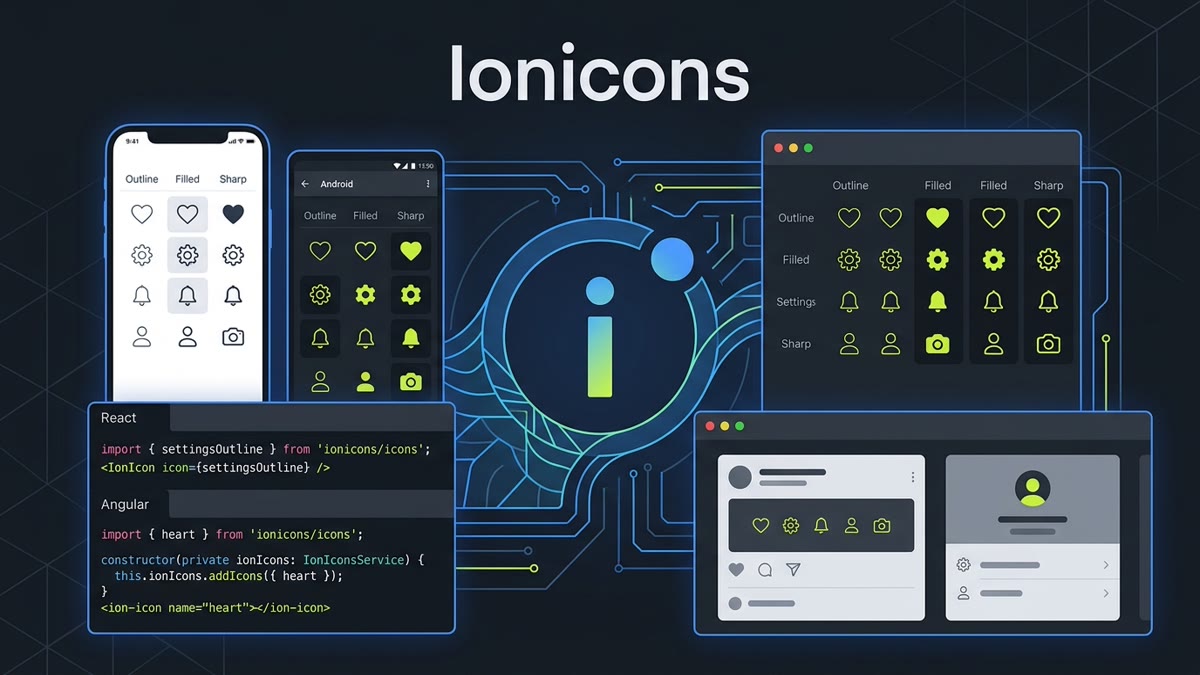
Executive Architectural Takeaway: With over 800,000+ weekly downloads on npm and more than 1,300+ meticulously handcrafted symbols, Ionicons remains the gold standard for cross-platform iconography bridging native mobile (iOS/Android) and modern responsive web applications. Built by the Ionic Framework engineering team, Ionicons delivers three specialized visual modes per symbol, zero-overhead Web Components, and strict tree-shaking support across React, Vue, and Angular.
- 3 Distinct Visual Styles: Outline (iOS rounded curves), Filled (solid contrast states), and Sharp (Android angular geometry).
- Decoupled Architecture: Usable as standard Web Components, framework components, or raw SVG vectors without installing Ionic Framework.
- Framework-Native Packages: Zero-bloat subpath imports in
ionicons/iconsfor React, Vue 3, and Angular standalone components. - 100% Permissive Open Source: Fully licensed under the MIT License for commercial and open-source software.
1. Introduction: The Power of Cross-Platform Native Iconography
Building applications that simultaneously target mobile devices (via Capacitor, React Native, or PWAs) and responsive desktop browsers requires an icon system that respects conflicting operating system design conventions. While iOS interfaces emphasize smooth continuous fillets, subtle 1.5px/2px stroke outlines, and gentle tap feedback, Android Material Design favors bold, geometric silhouette fills and crisp sharp vertices.
Ionicons solves this fundamental design dichotomy by crafting every single concept into three synchronized, independent vector glyphs:
- Outline (
-outline): Delicate 32px stroke-based outlines featuring circular corner joints, perfectly harmonizing with Apple HIG (Human Interface Guidelines). - Filled (default): High-density solid silhouettes, ideal for active bottom-tab selections, pressed states, and primary callouts.
- Sharp (
-sharp): Squared-off vector joints and unfilleted geometric boundaries tailored to Google's Material Design principles.
On IconStash, you can browse all 1,300+ vector paths in the Ionicons Library, copy clean SVG code directly, or export optimized React JSX components.
2. The Three Architectural Styles: Outline, Filled, and Sharp
Understanding the geometric differences between Ionicons styles is essential for creating cohesive design systems:
Constructed on a 512x512 coordinate canvas with 32px standard stroke width, rounded line caps (stroke-linecap="round"), and rounded line joins (stroke-linejoin="round"). The default choice for modern, minimal iOS navigation.
Solid filled silhouettes sharing identical outer contours with the Outline version. When toggling between unread and read status, or active and inactive sidebar links, switching to Filled preserves exact optical volume without shifting surrounding text.
Features zero corner radii on interior and exterior joints (stroke-linejoin="miter"). Designed specifically to match the architectural feel of Android Material UI components and brutalist web aesthetics.
3. Interactive Tri-Style Icon Switcher & Code Generator
Toggle between the three Ionicons variants below to inspect their underlying vector geometry in real time. Notice how the stroke joints and fills adapt, and view the live-generated React, Angular, and HTML code snippets:
4. Vanilla HTML & Web Components: The <ion-icon> Custom Element
Ionicons was engineered from day one around the W3C Web Components standard. The custom element <ion-icon> uses Shadow DOM to fetch and render raw SVGs asynchronously on demand. This provides automatic lazy loading, ensuring that only the SVGs actually visible in the DOM are downloaded over the network.
<!-- Include Ionicons Web Component Runtime via CDN -->
<script type="module" src="https://unpkg.com/[email protected]/dist/ionicons/ionicons.esm.js"></script>
<script nomodule src="https://unpkg.com/[email protected]/dist/ionicons/ionicons.js"></script>

<!-- Render icons by string name -->
<ion-icon name="heart-outline" style="font-size: 24px; color: #C1DD2D;"></ion-icon>
<ion-icon name="settings-sharp" size="large"></ion-icon>

<!-- Platform-Adaptive Mode: iOS renders outline, Android renders sharp -->
<ion-icon ios="heart-outline" md="heart-sharp"></ion-icon>
The size attribute accepts "small" (16px) or "large" (32px), while standard sizing is driven directly through CSS font-size and color via color (which inherits currentColor).
5. React & Next.js 15 Integration: Subpath Tree-Shaking
In React and Next.js applications, passing raw string names to web components can cause hydration mismatches in Server-Side Rendering (SSR). Instead, use the official React wrapper @ionic/react with direct subpath imports from ionicons/icons:
// 1. Install dependencies
// npm install @ionic/react ionicons

import React from 'react';
import { IonIcon } from '@ionic/react';
// Direct subpath import guarantees 100% tree-shaking
import {
  homeOutline,
  home,
  analyticsOutline,
  settingsOutline
} from 'ionicons/icons';

interface SidebarItemProps {
  label: string;
  icon: string;
  activeIcon: string;
  isActive: boolean;
}

export function SidebarItem({ label, icon, activeIcon, isActive }: SidebarItemProps) {
  return (
    <a className={`flex items-center gap-3 px-4 py-2.5 rounded-lg text-sm font-medium transition-colors ${
      isActive ? 'bg-zinc-800 text-lime-400' : 'text-zinc-400 hover:text-white'
    }`}>
      <IonIcon
        icon={isActive ? activeIcon : icon}
        style={{ fontSize: '20px' }}
        aria-hidden="true"
      />
      <span>{label}</span>
    </a>
  );
}
6. Angular Modern Architecture: Standalone Components & addIcons()
Modern Angular (v17+) uses Standalone Components and strict signal-based reactivity. Ionicons provides the optimized addIcons() registry pattern to prevent bloat in enterprise Angular production bundles:
// app-header.component.ts
import { Component } from '@angular/core';
import { CommonModule } from '@angular/common';
import { IonHeader, IonToolbar, IonTitle, IonButtons, IonButton, IonIcon } from '@ionic/angular/standalone';
import { addIcons } from 'ionicons';
import { heartOutline, settingsSharp, personOutline } from 'ionicons/icons';

@Component({
  selector: 'app-header',
  standalone: true,
  imports: [CommonModule, IonHeader, IonToolbar, IonTitle, IonButtons, IonButton, IonIcon],
  template: `
    <ion-header>
      <ion-toolbar>
        <ion-title>Enterprise Dashboard</ion-title>
        <ion-buttons slot="end">
          <ion-button aria-label="Favorites">
            <ion-icon name="heart-outline"></ion-icon>
          </ion-button>
          <ion-button aria-label="Settings">
            <ion-icon name="settings-sharp"></ion-icon>
          </ion-button>
        </ion-buttons>
      </ion-toolbar>
    </ion-header>
  `
})
export class AppHeaderComponent {
  constructor() {
    // Explicit registration guarantees exact Rollup tree-shaking
    addIcons({
      'heart-outline': heartOutline,
      'settings-sharp': settingsSharp,
      'person-outline': personOutline
    });
  }
}
7. Vue 3 Integration: Composition API & Vite Optimization
For Vue 3 and Nuxt 3 applications, Ionicons integrates seamlessly with the Composition API:
<!-- components/NavBar.vue -->
<template>
  <nav class="nav-container">
    <button @click="toggleActive" class="icon-btn" aria-label="Bookmark">
      <ion-icon :icon="isActive ? bookmark : bookmarkOutline" class="nav-icon"></ion-icon>
    </button>
  </nav>
</template>

<script setup lang="ts">
import { ref } from 'vue';
import { IonIcon } from '@ionic/vue';
import { bookmarkOutline, bookmark } from 'ionicons/icons';

const isActive = ref(false);
const toggleActive = () => {
  isActive.value = !isActive.value;
};
</script>

<style scoped>
.nav-icon {
  font-size: 24px;
  color: #C1DD2D;
  transition: transform 150ms ease;
}
.nav-icon:hover {
  transform: scale(1.1);
}
</style>
8. Mobile Cross-Platform Workflows: Capacitor, iOS & Android Adaptation
When developing mobile apps using Capacitor or React Native, displaying platform-authentic iconography significantly improves user satisfaction and App Store review ratings. Apple users expect thin, rounded outlines, while Android users expect geometric Material fills.
Ionicons provides automated platform detection out of the box. By setting both the ios and md attributes on any <ion-icon>, the component inspects navigator.userAgent (or the Capacitor device platform bridge) and dynamically selects the correct visual treatment:
<!-- Automatically serves heart-outline on iOS and heart-sharp on Android -->
<ion-icon ios="heart-outline" md="heart-sharp"></ion-icon>

<!-- Automatically serves share-outline on iOS and share-social-sharp on Android -->
<ion-icon ios="share-outline" md="share-social-sharp"></ion-icon>
9. Comprehensive Library Benchmark Comparison
Here is how Ionicons measures up against other top-tier icon systems in 2026:
| Feature | Ionicons | Lucide Icons | Material Symbols | Font Awesome 6 |
|---|---|---|---|---|
| Total Icon Count | 1,300+ icons | 1,500+ icons | 3,300+ glyphs | 2,000+ free |
| Visual Styles | Outline, Filled, Sharp | Clean Outline | Outlined, Rounded, Sharp | Solid, Regular, Brands |
| Weekly NPM Downloads | ~800,000+ | ~2,500,000+ | ~400,000+ | ~2,000,000+ |
| Primary Grid Size | 512x512 (scaled to 24px) | 24x24 (2px stroke) | 24x24 / 20x20 | 16x16 / 32x32 |
| License | MIT | MIT | Apache 2.0 | CC BY 4.0 / SIL OFL |
| Best Fit Use-Case | Mobile apps, Capacitor, PWAs, Angular/React | Next.js, Tailwind, shadcn/ui web dashboards | Google Material Design 3, Android, Cloud | General web development & legacy CMS |
Frequently Asked Questions
What makes Ionicons distinct from other open-source icon libraries?
Ionicons is specifically architected for cross-platform hybrid and web applications. Every icon is handcrafted in three distinct visual styles: Outline (iOS aesthetic with smooth rounded strokes), Filled (active and solid state), and Sharp (Android Material Design aesthetic with crisp 90-degree square vertices). Additionally, Ionicons natively powers the custom HTML element <ion-icon> that automatically switches glyphs based on device operating system.
How does tree-shaking work with Ionicons in React and Next.js?
Tree-shaking in React is achieved by importing specific named icon objects directly from the subpath 'ionicons/icons' (e.g., import { heartOutline, settingsSharp } from 'ionicons/icons') and passing them to <IonIcon icon={heartOutline} />. This bundles only the minimal SVG string representation for the referenced glyphs, resulting in zero unused bundle bloat.
How are icons registered in modern Angular standalone components?
In modern Angular (v17+ standalone components), icons are registered using the addIcons() utility imported from 'ionicons'. Inside the component constructor or route initializer, call addIcons({ 'heart-outline': heartOutline }), and reference it in the template as <ion-icon name='heart-outline'></ion-icon>. This ensures strict static analysis and tree-shaking.
Can I use Ionicons in standard HTML or websites without Ionic Framework?
Yes. Ionicons is completely decoupled from Ionic Framework. You can include the standalone Web Component runtime via CDN using <script type='module' src='https://unpkg.com/[email protected]/dist/ionicons/ionicons.esm.js'></script> and immediately drop <ion-icon name='heart-outline'></ion-icon> into any vanilla HTML, WordPress, Astro, or static site.
What license governs Ionicons and can I use it in commercial apps?
Ionicons is 100% free and open-source under the MIT License. You can use it in commercial SaaS applications, proprietary iOS and Android mobile apps, commercial themes, and enterprise software without any royalty payments or licensing restrictions.
Where can I search, preview, and copy Ionicons SVGs for free?
You can search and preview all 1,300+ Ionicons directly on IconStash at https://iconstash.io/library/ionicons/. IconStash provides instant full-text search, style filtering (Outline, Filled, Sharp), and one-click copy to clean SVG or React JSX components.