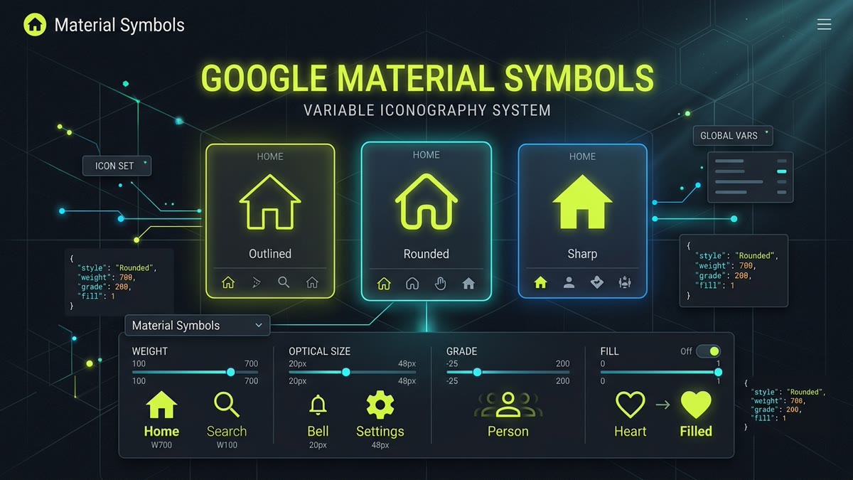
Executive Architectural Takeaway: Google Material Symbols represents the single largest leap forward in modern web typography and iconography since the inception of CSS web fonts. By unifying over 3,300+ vector glyphs into a single WOFF2 variable font engine with 4 parametric axes (wght, opsz, FILL, and GRAD), Material Symbols eliminates rigid multi-font downloads and gives engineers continuous, CSS-driven visual control.
- 3 Unified Styles: Outlined, Rounded, and Sharp variants built on an optical 24px and 20px baseline grid.
- 4 Variable Font Axes: Weight (100–700), Fill (0 or 1), Grade (-25 to 200), and Optical Size (20px–48px).
- Direct SVG & React Support: Zero-runtime tree-shaking with
@material-symbols/svgor@iconify/react. - Permissive License: 100% open-source under Apache 2.0 — completely free for enterprise commercial SaaS.
1. The Evolution of Google Iconography: Material Icons vs Material Symbols
For nearly a decade, Google’s original Material Icons library served as the undisputed workhorse of enterprise SaaS and Android application development. However, the legacy Material Icons suite was constructed on static font architecture: if an engineer needed an icon in both an outlined and a filled state, the browser was forced to download two separate, heavy font files. Fine-tuning stroke weights or compensating for dark mode optical irradiation required cumbersome SVG filter hacks or manual path overrides.
In 2022, Google introduced Material Symbols under the Material Design 3 (Material You) umbrella, completely re-engineering their entire visual glyph library from scratch. Instead of maintaining disconnected static font files, Google consolidated all 3,300+ glyphs into cutting-edge OpenType variable font tables.
On IconStash, we index both Material Symbols and Material Symbols Light, giving developers full access to raw SVG vector paths, optimized React components, and instant copy-paste code snippets.
2. Architectural Deep-Dive: The 4 Parametric Variable Axes
The core breakthrough of Material Symbols is its use of OpenType Font Variations (defined in the CSS Fonts Module Level 4). By declaring values for four standardized 4-character tags in font-variation-settings, you can alter the physical geometry of any glyph in real time without causing layout reflows or downloading additional network assets.
Controls the stroke thickness of the vector outlines. 400 is the standard UI default, 100 provides ultra-clean micro-strokes for dense tables, and 700 creates bold emphatic emphasis.
Toggles or continuously interpolates between an open line drawing (0) and a fully solid glyph silhouette (1). Ideal for active navigation tabs, favoriting buttons, and selection highlights.
Adjusts the visual density and perceptual weight of lines without altering the exterior bounding box of the glyph. Critical for dark mode compensation to prevent dark-on-light optical bleeding.
Alters stroke thickness and interior letterform spacing proportionally to the rendered display size, ensuring crisp legibility at small sizes (20px) and refined balance at large titles (48px).
3. Live Variable Axis Sandbox & Interactive Generator
Use the live sandbox below to test the parametric capabilities of Google Material Symbols. Adjust the weight, optical size, grade, and fill sliders in real time to observe how the glyph paths adapt dynamically, and copy the generated CSS rules for your own stylesheet:
4. Google Fonts CDN Integration & CSS Classes
For projects utilizing web fonts, Google provides high-speed CDN delivery via Google Fonts. When requesting the stylesheet, specify the exact axis ranges you intend to use to optimize the font payload delivered to the client:
<!-- Optimized Google Fonts CDN Request with Variable Axes -->
<link rel="preconnect" href="https://fonts.googleapis.com">
<link rel="preconnect" href="https://fonts.gstatic.com" crossorigin>
<link
  rel="stylesheet"
  href="https://fonts.googleapis.com/css2?family=Material+Symbols+Outlined:opsz,wght,FILL,[email protected],100..700,0..1,-50..200"
/>
Next, define clean reusable utility classes in your global stylesheet:
/* Global Material Symbols CSS Rules */
.material-symbols-outlined {
  font-family: 'Material Symbols Outlined';
  font-weight: normal;
  font-style: normal;
  font-size: 24px;
  line-height: 1;
  letter-spacing: normal;
  text-transform: none;
  display: inline-block;
  white-space: nowrap;
  word-wrap: normal;
  direction: ltr;
  -webkit-font-feature-settings: 'liga';
  -webkit-font-smoothing: antialiased;
  /* Default baseline axis values */
  font-variation-settings:
    'FILL' 0,
    'wght' 400,
    'GRAD' 0,
    'opsz' 24;
}

/* Dynamic Active State: Fluid Fill & Weight Transition */
.nav-tab:hover .material-symbols-outlined,
.nav-tab.active .material-symbols-outlined {
  font-variation-settings:
    'FILL' 1,
    'wght' 600,
    'GRAD' 50,
    'opsz' 24;
  transition: font-variation-settings 180ms ease;
}
In HTML, simply insert the ligaturized identifier inside the element:
<button class="nav-tab active" aria-label="Application Settings">
  <span class="material-symbols-outlined">settings</span>
  <span>Settings</span>
</button>
5. Raw SVG Icons vs Variable Font: Performance & Core Web Vitals
A critical architectural choice when implementing Material Symbols is deciding between the WOFF2 Variable Web Font and Raw Inline SVG Components. The ideal approach depends entirely on your application's size and architecture:
| Evaluation Metric | WOFF2 Variable Font | Raw Inline SVG Components | Architectural Recommendation |
|---|---|---|---|
| Initial Network Payload | ~38KB to 240KB (depending on subsetting) | 0KB initial font overhead; ~400B per rendered SVG | SVGs win for landing pages; Font wins for 200+ icon consoles |
| Core Web Vitals (CLS & FOIT) | Risk of FOIT (invisible flash) before font loads | Zero FOIT; 100% synchronous render during DOM parse | Inline SVG guarantees 0 CLS and optimal LCP |
| Tree-Shaking Efficiency | Requires build-time glyph subsetting (pyftsubset) | Native bundler tree-shaking (Rollup, Vite, Webpack) | SVG components eliminate all unreferenced glyphs |
| Dynamic Weight Transitions | Smooth continuous interpolation in CSS | Requires morphing paths or swapping discrete SVGs | Variable font provides unmatched hover physics |
| Accessibility & AccName | Requires explicit aria-hidden="true" + text labels |
Native <title>, <desc> & ARIA semantics |
Inline SVG provides more robust screen reader support |
When using icon fonts with text ligatures (e.g. <span>favorite</span>), slow networks can cause users to see raw text like "favorite" or "settings" for several seconds before the font file downloads. If you use the web font approach, always declare font-display: block; or pair with preloaded WOFF2 assets.
6. Modern React & Next.js 15 Integration Patterns
For modern React, Next.js, and Vite architectures, importing raw SVG paths as modular React components is the recommended industry standard. This completely avoids font downloading and provides perfect tree-shaking.
Pattern A: Using @iconify/react with Material Symbols
The Iconify React framework provides a clean, battle-tested component wrapper with full offline bundle support:
// 1. Install dependencies
// npm install @iconify/react @iconify-json/material-symbols

import React from 'react';
import { Icon } from '@iconify/react';

export function DashboardHeader() {
  return (
    <header className="flex items-center justify-between p-4 bg-zinc-900 border-b border-zinc-800">
      <div className="flex items-center gap-3">
        {/* Outlined variant */}
        <Icon icon="material-symbols:dashboard-outline" width="24" height="24" className="text-lime-400" />
        <h1 className="text-lg font-bold text-white">Analytics Console</h1>
      </div>

      <div className="flex items-center gap-4">
        {/* Rounded variant */}
        <button aria-label="Notifications" className="p-2 hover:bg-zinc-800 rounded-lg text-zinc-300">
          <Icon icon="material-symbols:notifications-rounded" width="22" height="22" />
        </button>
        {/* Sharp variant */}
        <button aria-label="Account Settings" className="p-2 hover:bg-zinc-800 rounded-lg text-zinc-300">
          <Icon icon="material-symbols:account-circle-sharp" width="22" height="22" />
        </button>
      </div>
    </header>
  );
}
Pattern B: Custom Zero-Dependency React SVG Component
If you prefer zero external dependencies, you can download raw SVGs directly from IconStash Material Symbols and drop them into a unified SVG wrapper:
// components/icons/MaterialSymbolIcon.tsx
import React from 'react';

interface MaterialIconProps extends React.SVGProps<SVGSVGElement> {
  size?: number | string;
  className?: string;
  children: React.ReactNode;
}

export function MaterialSymbolIcon({
  size = 24,
  className = '',
  children,
  ...props
}: MaterialIconProps) {
  return (
    <svg
      xmlns="http://www.w3.org/2000/svg"
      viewBox="0 -960 960 960"
      width={size}
      height={size}
      fill="currentColor"
      className={`inline-block shrink-0 ${className}`}
      aria-hidden="true"
      {...props}
    >
      {children}
    </svg>
  );
}

// Example: Home Symbol Component
export function HomeSymbol(props: Omit<MaterialIconProps, 'children'>) {
  return (
    <MaterialSymbolIcon {...props}>
      <path d="M160-120v-480l320-240 320 240v480H560v-280H400v280H160Z" />
    </MaterialSymbolIcon>
  );
}
7. Tailwind CSS Configuration & Utility Classes
If you are using Tailwind CSS, you can extend your Tailwind configuration to generate clean utility classes for variable font axes:
// tailwind.config.js
module.exports = {
  theme: {
    extend: {
      fontFamily: {
        symbol: ['"Material Symbols Outlined"', 'sans-serif'],
      },
    },
  },
  plugins: [
    function ({ addUtilities }) {
      addUtilities({
        '.symbol-thin': { 'font-variation-settings': "'FILL' 0, 'wght' 200, 'GRAD' 0, 'opsz' 24" },
        '.symbol-regular': { 'font-variation-settings': "'FILL' 0, 'wght' 400, 'GRAD' 0, 'opsz' 24" },
        '.symbol-bold': { 'font-variation-settings': "'FILL' 0, 'wght' 700, 'GRAD' 0, 'opsz' 24" },
        '.symbol-filled': { 'font-variation-settings': "'FILL' 1, 'wght' 400, 'GRAD' 0, 'opsz' 24" },
        '.symbol-filled-bold': { 'font-variation-settings': "'FILL' 1, 'wght' 700, 'GRAD' 0, 'opsz' 24" },
      });
    },
  ],
};
Now in your HTML or JSX markup, you can toggle weights and fill states with simple Tailwind classes:
<span class="font-symbol symbol-regular hover:symbol-filled transition-all text-lime-400 text-2xl">
  star
</span>
8. Migration Guide: Upgrading from Legacy Material Icons
Upgrading an existing production application from legacy Material Icons to Material Symbols is straightforward but requires attention to three key differences:
- Coordinate ViewBox Change: While legacy Material Icons used a
0 0 24 24or0 0 48 48coordinate system, raw Material Symbols SVGs from Google utilize an inverted typography font grid ofviewBox="0 -960 960 960". Ensure any custom path transform math is updated. - Font Family Renaming: The CSS font-family name changes from
'Material Icons'to'Material Symbols Outlined'(or'Material Symbols Rounded'/'Material Symbols Sharp'). - Removal of Two-Tone Class: The old "Two-Tone" style has been deprecated by Google. In Material Symbols, two-tone effects are replaced by applying translucent CSS fills or targeting sub-elements with CSS masks.
9. Comprehensive Library Benchmark Comparison
How does Google Material Symbols compare against other premier open-source icon libraries indexed on IconStash?
| Feature | Google Material Symbols | Lucide Icons | Tabler Icons | Phosphor Icons |
|---|---|---|---|---|
| Total Icon Count | 3,300+ glyphs | 1,500+ icons | 6,100+ icons | 9,000+ glyphs |
| Variable Font Axes | Yes (4 axes: wght, opsz, FILL, GRAD) | No (SVG stroke-width via CSS) | No (SVG stroke-width via CSS) | Yes (Weight axis font option) |
| Visual Styles | Outlined, Rounded, Sharp | Clean Outline | Outline, Filled | 6 weights (Thin, Light, Bold, Duotone) |
| Primary Grid Size | 20px & 24px (scalable 20..48) | 24px (2px stroke) | 24px (2px stroke) | 16px & 24px |
| License | Apache 2.0 | MIT | MIT | MIT |
| Best Fit Use-Case | Android, Google Cloud, Material Design 3 | Next.js, shadcn/ui, Tailwind web apps | High-density SaaS & admin dashboards | Multi-weight enterprise design systems |
Frequently Asked Questions
What is the difference between Material Symbols and legacy Material Icons?
Material Symbols is Google's modern variable font and SVG icon system, replacing the legacy static Material Icons. Symbols consolidates over 3,300 glyphs across 3 core styles (Outlined, Rounded, and Sharp) and provides 4 dynamic variable axes (weight, optical size, grade, and fill) that can be adjusted continuously in CSS via font-variation-settings, whereas legacy Material Icons only offered static font weights and limited predefined sizes.
What are the four variable font axes in Material Symbols?
The four variable axes are: 1. Weight (wght: 100 to 700) controlling stroke thickness; 2. Fill (FILL: 0 or 1) toggling between outline and solid silhouettes; 3. Grade (GRAD: -25 to 200) adjusting visual stroke density without altering exterior bounding dimensions; and 4. Optical Size (opsz: 20px to 48px) adjusting stroke geometry and spacing specifically for display at different rendering resolutions.
Should I use the Material Symbols variable web font or raw SVG icons in production?
If your application requires extensive live icon theming, smooth hover weight transitions, or hundreds of distinct icons across your UI, the WOFF2 variable font (subsetted to ~35-50KB) is extremely fast. However, for modern component-driven React, Next.js, or Vite applications where only 15 to 40 icons are loaded per page, using tree-shaken raw SVG components yields zero FOIT (flash of invisible text), optimal Core Web Vitals (LCP/CLS), and zero unused CSS font downloads.
How do I install and use Material Symbols in React with full tree-shaking?
You can use the official @material-symbols/svg-700 or @iconify/react package. For example, using @iconify/react with npm install @iconify/react @iconify-json/material-symbols: import { Icon } from '@iconify/react'; <Icon icon='material-symbols:settings-rounded' width={24} height={24} />. This bundles only the exact vector paths rendered in the component tree.
What license governs Google Material Symbols and is commercial use free?
Google Material Symbols is released under the permissive Apache License 2.0. You can use, customize, bundle, and redistribute the icons freely in commercial SaaS products, open-source applications, websites, and mobile apps without paying royalties or licensing fees.
Where can I search, preview, and download individual Material Symbols SVGs for free?
You can search and download all Google Material Symbols directly on IconStash at https://iconstash.io/library/materialsymbols/ and https://iconstash.io/library/materialsymbolslight/. IconStash provides instant full-text search, style filtering (Outlined, Rounded, Sharp), live preview, and one-click copy to SVG and React JSX.