How to Use SVG Icons in Tailwind CSS: Complete Modern Guide (v4 & v3)
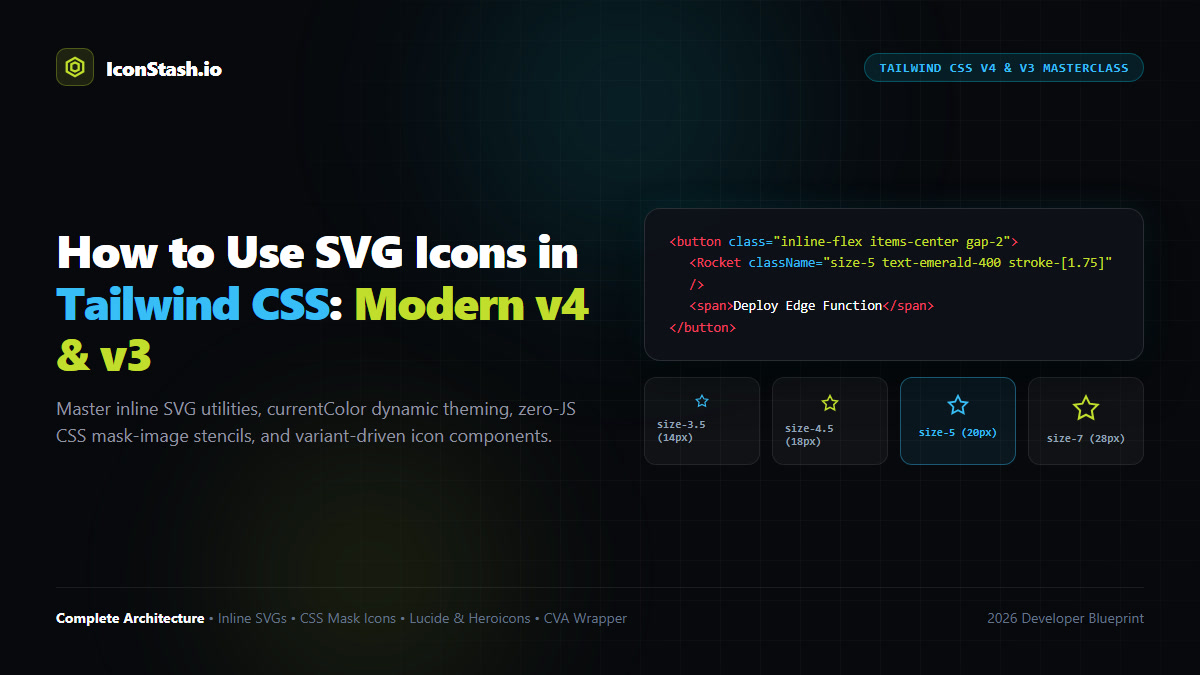
The Tailwind Icon Dilemma: Tailwind CSS does not bundle an icon set. By design, the framework gives you utility primitives—leaving icon selection and rendering strategy to developers. In 2026, with the arrival of Tailwind CSS v4’s oxide engine and modern React 19 RSC architectures, how you integrate SVG icons dictates your final bundle size, paint performance, and theming flexibility.
currentColor, zero-JS CSS mask-image utilities in v4, framework components (Lucide, Heroicons, Phosphor), and SVG symbol sprites.w-5 h-5 classes with Tailwind's unified size-5 utility.<Icon /> component using Class Variance Authority (CVA) with size, color, and animation tokens.Developers coming from UI frameworks like Bootstrap or Semantic UI often search for <t-icon name="user" />. Tailwind deliberately omits built-in icons for three critical architectural reasons:
Tailwind CSS v4 introduces a revolutionary CSS-first configuration model. The traditional tailwind.config.js is replaced by direct CSS directives (@theme, @utility), radically simplifying how custom icon utilities and SVG masks are created:
| Feature / Workflow | Tailwind CSS v3.4 | Tailwind CSS v4.0 (2026) |
|---|---|---|
| Configuration | JavaScript-based tailwind.config.js |
CSS-native @theme and @import "tailwindcss"; |
| Dimension Utility | w-5 h-5 or size-5 |
Native size-5 standard across all elements |
| CSS Mask Icons | Requires custom plugin or complex arbitary values | Native mask-[url(...)] and @utility icon-* |
| Engine & Performance | PostCSS JavaScript compiler | Rust-based Lightning CSS Oxide engine (10x faster) |
The most straightforward approach is copying raw SVG markup directly into HTML or JSX. To make the SVG fully responsive to Tailwind's color and sizing utilities, you must ensure two critical attributes are set inside the SVG markup:
width="currentColor" or remove hardcoded width/height so Tailwind's size-* classes govern dimensions.stroke="currentColor" (for stroke-based icons) or fill="currentColor" (for solid glyphs).<!-- Button with Inline SVG Styled via Tailwind Utilities -->
<button class="inline-flex items-center gap-2 rounded-lg bg-neutral-900 px-4 py-2.5 text-sm font-semibold text-white shadow-sm hover:bg-neutral-800 transition-colors dark:bg-white dark:text-neutral-900">
<svg
class="size-4 text-emerald-400 dark:text-emerald-600 transition-transform duration-200 group-hover:scale-110"
viewBox="0 0 24 24"
fill="none"
stroke="currentColor"
stroke-width="2"
stroke-linecap="round"
stroke-linejoin="round"
aria-hidden="true">
<path d="M12 2v20M17 5H9.5a3.5 3.5 0 0 0 0 7h5a3.5 3.5 0 0 1 0 7H6"/>
</svg>
<span>Instant Checkout</span>
</button>The Magic of currentColor: When stroke="currentColor" is defined, changing the Tailwind text color (e.g., text-neutral-500 hover:text-white) cascades into the vector path automatically. You never need to write custom SVG CSS rules.
In large web applications containing hundreds of icons per view (e.g., data tables, file managers), rendering inline SVG DOM nodes adds measurable DOM overhead and slows hydration. Tailwind CSS v4 enables CSS Mask Image Icons:
/* In your main CSS file (Tailwind v4 @utility) */
@utility icon-rocket {
  display: inline-block;
  background-color: currentColor;
  mask-size: contain;
  mask-repeat: no-repeat;
  mask-position: center;
  mask-image: url('/icons/rocket.svg');
  -webkit-mask-image: url('/icons/rocket.svg');
}
In your HTML or React JSX, you simply render an empty span:
<!-- Renders the SVG purely via CSS without DOM node overhead -->
<span class="icon-rocket size-5 text-indigo-500 hover:text-indigo-400" aria-hidden="true"></span>
The vector graphic is cached permanently by the browser, requires 0 lines of JavaScript, and instantly adopts whatever text color is applied by Tailwind.
For modern React, Next.js, and Vue workflows, official icon component packages offer the best developer ergonomics. Three libraries integrate natively with Tailwind CSS:
import { Rocket, ShieldCheck } from 'lucide-react';

export function FeatureCard() {
  return (
    <div className="flex items-center gap-3 p-4 rounded-xl border border-neutral-200 dark:border-neutral-800">
      <div className="p-2 rounded-lg bg-lime-500/10 text-lime-600 dark:text-lime-400">
        <Rocket className="size-6 stroke-[1.75]" />
      </div>
      <div>
        <h4 className="font-semibold text-neutral-900 dark:text-white">Sub-Millisecond Speed</h4>
        <p className="text-sm text-neutral-500">Client-side indexed search.</p>
      </div>
    </div>
  );
}Crafted by Steve Schoger and the Tailwind core team, Heroicons offers three optical grids: 24px Outline (2px stroke), 20px Mini (solid, optimized for dense inputs), and 16px Micro (solid, optimized for tags and badges).
import { CheckCircleIcon } from '@heroicons/react/24/outline';
import { CheckIcon } from '@heroicons/react/16/solid';

// Mini icon inside a compact badge
<span className="inline-flex items-center gap-1 rounded-full bg-emerald-50 px-2 py-0.5 text-xs font-medium text-emerald-700">
  <CheckIcon className="size-3.5 text-emerald-600" />
  Verified
</span>A common mistake in Tailwind codebases is mixing arbitrary icon sizes. Establish a strict 4-tier icon sizing token system in your design documentation:
| Tailwind Class | Pixel Equivalent | Recommended Use Case | Standard Stroke Width |
|---|---|---|---|
size-3.5 |
14px × 14px | Micro badges, table status dots, tag dismiss crosses | stroke-[2] or Solid |
size-4 |
16px × 16px | Form inputs, small buttons, dropdown menu items | stroke-[2] |
size-5 |
20px × 20px | Default buttons, tab bars, standard list items | stroke-[1.75] or stroke-2 |
size-6 |
24px × 24px | Main navigation links, card headers, dialog actions | stroke-[1.5] |
size-8 to size-10 |
32px – 40px | Feature hero cards, empty states, stat callouts | stroke-[1.25] |
To eliminate duplicate Tailwind strings across large codebases, create a unified Icon wrapper using Class Variance Authority (CVA) and tailwind-merge:
// components/ui/icon.tsx
import * as React from 'react';
import { cva, type VariantProps } from 'class-variance-authority';
import { clsx } from 'clsx';
import { twMerge } from 'tailwind-merge';

export function cn(...inputs: any[]) {
  return twMerge(clsx(inputs));
}

const iconVariants = cva('inline-block shrink-0 transition-colors', {
  variants: {
    size: {
      xs: 'size-3.5',
      sm: 'size-4',
      md: 'size-5',
      lg: 'size-6',
      xl: 'size-8',
    },
    intent: {
      default: 'text-neutral-600 dark:text-neutral-400',
      primary: 'text-lime-500 dark:text-lime-400',
      success: 'text-emerald-500 dark:text-emerald-400',
      danger: 'text-rose-500 dark:text-rose-400',
      muted: 'text-neutral-400 dark:text-neutral-600',
    },
  },
  defaultVariants: {
    size: 'md',
    intent: 'default',
  },
});

export interface IconProps extends React.SVGProps<SVGSVGElement>, VariantProps<typeof iconVariants> {
  icon: React.ComponentType<{ className?: string; 'aria-hidden'?: boolean }>;
}

export function Icon({ icon: Component, size, intent, className, ...props }: IconProps) {
  return (
    <Component
      className={cn(iconVariants({ size, intent }), className)}
      aria-hidden="true"
      {...props}
    />
  );
}
Now anywhere in your application, you can render consistent, accessible icons with zero visual drift:
<Icon icon={Rocket} size="lg" intent="primary" className="hover:rotate-12 transition-transform" />Tailwind CSS deliberately avoids bundling a default icon library to protect your application from runtime bundle bloat and design conformity. Instead, Tailwind provides utility classes designed to style any modern vector format.
Ensure your SVG paths use fill="currentColor" or stroke="currentColor". Then apply Tailwind text color utilities (such as text-indigo-600 dark:text-indigo-400) to the SVG element or its parent wrapper.
Use the unified size-* utility (such as size-4 for 16px, size-5 for 20px) instead of typing separate w-* and h-* classes. This ensures icons always maintain a strict 1:1 square aspect ratio.
Tailwind CSS v4 introduces native arbitrary mask support. Applying mask-[url('/icon.svg')] bg-current size-5 inline-block uses the vector SVG purely as an alpha transparency mask over a background layer, rendering icons without injecting SVG DOM nodes.
Ensure your SVG paths do not have inline stroke-width attributes. In Tailwind, apply stroke-[1.5] or stroke-[2] to change line weight dynamically on different screen breakpoints.