Tabler Icons Complete Guide: Setup, Customization & Best Practices (2026)
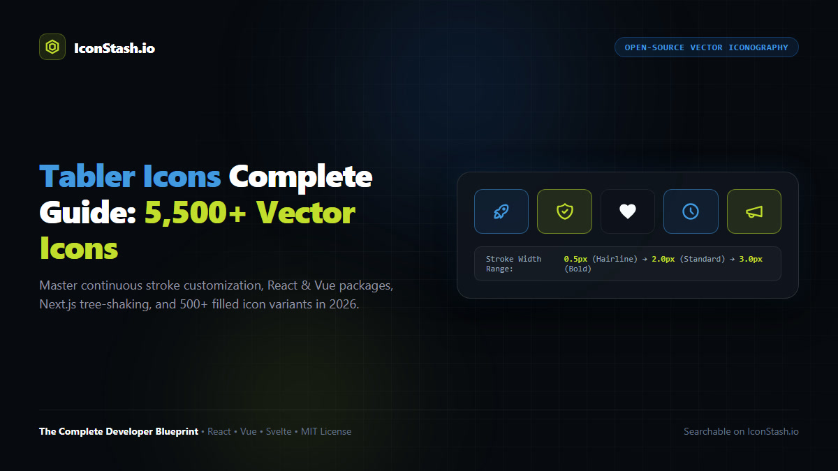
The 5,500+ Icon Open-Source Powerhouse: Created by Paweł Kuna, Tabler Icons has evolved into the most comprehensive, customizable open-source vector icon system on the web. With over 36,000 GitHub stars and a permissive MIT license, it outpaces rival stroke libraries in sheer domain depth—offering over 5,500 icons across technology, e-commerce, cloud architecture, and finance.
In modern web development, icon consistency is paramount. When teams combine icons from different libraries, visual coherence deteriorates: stroke weights clash, corner radii misalign, and grid densities diverge. Tabler Icons solves this challenge through sheer scope:
Tabler Icons is distributed as a modular suite of official npm packages tailored to different frontend architectures:
| Package Name | Target Environment | Bundle Format | TypeScript Support |
|---|---|---|---|
@tabler/icons |
Raw SVG files & build tools | Raw SVG files + JSON metadata | Full types included |
@tabler/icons-react |
React 18 & 19, Next.js 14 & 15 | ESM & CJS with tree-shaking | Full TablerIcon interfaces |
@tabler/icons-vue |
Vue 3 (Composition API) | Vite-compatible SFC wrappers | Full prop typing |
@tabler/icons-svelte |
Svelte 4 & Svelte 5 Runes | Native Svelte components | Native Svelte types |
@tabler/icons-webfont |
Legacy CSS web fonts | WOFF2, TTF, SVG fonts | CSS class definitions |
Install the official React package via your preferred package manager:
npm install @tabler/icons-react
# or pnpm add @tabler/icons-react
# or yarn add @tabler/icons-react
Import specific icons directly into your components:
import { IconRocket, IconShieldCheck, IconFlame } from '@tabler/icons-react';

export function MetricsWidget() {
  return (
    <div className="flex items-center gap-4 p-4 rounded-xl bg-neutral-900 text-white">
      <IconRocket
        size={24}
        color="#C1DD2D"
        stroke={1.75}
        className="transition-transform hover:scale-110"
      />
      <div>
        <h4 className="font-bold text-sm">High-Speed Deployment</h4>
        <p className="text-xs text-neutral-400">Global edge latency < 20ms</p>
      </div>
    </div>
  );
}<script setup>
import { IconSearch, IconBell } from '@tabler/icons-vue';
</script>
<template>
<button class="icon-button">
<IconSearch :size="20" stroke="1.5" color="currentColor" />
<span>Quick Search</span>
</button>
</template>Unlike icon fonts that force a fixed stroke thickness, Tabler Icons allows continuous vector stroke modulation:
// 1. Hairline / Editorial aesthetic (0.75px to 1.25px)
<IconSettings stroke={1} size={28} />

// 2. Standard SaaS UI density (1.5px to 2.0px)
<IconSettings stroke={1.75} size={24} />

// 3. Bold mobile / Touch target density (2.5px to 3.0px)
<IconSettings stroke={2.75} size={20} />A frequent challenge with stroke libraries is indicating active, highlighted, or selected states (such as favoriting an item or active bottom navigation tabs). Tabler includes over 500 pre-crafted filled variants designated with the Filled suffix:
import { IconHeart, IconHeartFilled } from '@tabler/icons-react';

export function FavoriteButton({ isFavorited, onClick }: { isFavorited: boolean; onClick: () => void }) {
  return (
    <button onClick={onClick} className="p-2 rounded-full hover:bg-neutral-800 text-rose-500">
      {isFavorited ? (
        <IconHeartFilled size={22} className="animate-heartbeat" />
      ) : (
        <IconHeart size={22} stroke={1.75} />
      )}
    </button>
  );
}Rather than repeating size={20} stroke={1.5} on every single icon throughout your codebase, configure a global React Context provider at your application root:
// app/providers.tsx
import { IconContext } from '@tabler/icons-react';

export function AppProviders({ children }: { children: React.ReactNode }) {
  return (
    <IconContext.Provider
      value={{
        color: 'currentColor',
        size: 20,
        stroke: 1.75,
        className: 'tabler-icon shrink-0',
      }}>
      {children}
    </IconContext.Provider>
  );
}
Every descendant icon will now automatically inherit these global design tokens while still allowing individual overrides whenever necessary.
Choosing between the top open-source vector icon libraries requires balancing glyph breadth against file weight:
| Criteria | Tabler Icons | Lucide Icons | Phosphor Icons |
|---|---|---|---|
| Total Icons | 5,500+ | 1,500+ | 1,248 base (7,000+ variants) |
| Native Grid Canvas | 24×24 px | 24×24 px | 16×16 to 24×24 px |
| Default Stroke Weight | 2.0px (Continuously tunable) | 2.0px | 6 discrete weight sets |
| Dedicated Filled Glyphs | 500+ *Filled variants |
None (Stroke fill prop only) | Full Fill weight variant |
| GitHub Community | 36,000+ Stars | 16,000+ Stars | 12,000+ Stars |
| License | MIT (100% Free) | ISC (100% Free) | MIT (100% Free) |
Because @tabler/icons-react indexes 5,500+ icons, improper bundler imports can slow local Vite or Turbopack compilation times. To guarantee instantaneous development compilation and clean production tree-shaking, add this configuration to your next.config.js:
// next.config.mjs
/** @type {import('next').NextConfig} */
const nextConfig = {
  experimental: {
    optimizePackageImports: ['@tabler/icons-react'],
  },
};

export default nextConfig;
Next.js will automatically transform top-level named imports (import { IconRocket } from '@tabler/icons-react') into direct module paths during bundling, ensuring zero compilation overhead and minimal bundle payloads.
While npm packages provide code access, searching through 5,500+ icons in an IDE is tedious. On IconStash, we provide an indexed client-side visual search engine across the entire Tabler Icons dataset:
Yes. Tabler Icons is released under the permissive MIT License. You can freely use, modify, distribute, and embed the icons in commercial websites, SaaS applications, mobile apps, and design templates without paying royalties or requiring user-facing attribution.
Tabler Icons contains over 5,500 vector icons, making it more than three times larger than Lucide Icons (which contains approximately 1,500 icons). While both use a 24x24 grid with a default 2px stroke, Tabler provides significantly broader coverage for niche domains.
Pass the stroke prop directly to any Tabler React component (such as <IconRocket stroke={1.5} />). You can also configure a global IconContext provider at the root of your application to set a default stroke width across all icons automatically.
In Next.js 14 and 15, add optimizePackageImports: ['@tabler/icons-react'] to your next.config.js experimental compiler options. This ensures that only the icons you import are bundled into your client assets.
Yes. Tabler Icons includes over 500 dedicated filled variants named with the Filled suffix (such as IconHeartFilled, IconStarFilled). These filled variants share identical 24x24 pixel grids and pair seamlessly with their outline counterparts.