Modern SVG Icons for Web Development: Performance, Customization & Accessibility
A complete technical breakdown of building scalable, crisp, and high-performance SVG vector icon systems for modern web applications.
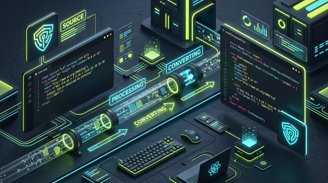
1. Why SVG Vector Icons Dominate Modern Web Architectures
In modern web development, user interface components must render flawlessly across an endless variety of screen densities—from standard 1080p monitors to 4K Retina displays and mobile viewports.
Unlike raster image formats (PNG, WebP) which lose crispness when scaled, scalable vector graphics (SVG) are defined mathematically via geometric XML coordinates. Beyond crisp visual scaling, SVG icons provide unmatched engineering flexibility:
- DOM Accessibility: SVG vector tags become part of the DOM tree, allowing CSS hover, active, and focus transitions.
- CSS Variables Integration: Seamlessly bind icon stroke colors, fills, and opacity to your global design system tokens.
- Performance Optimization: SVGs compress extremely well via Gzip and Brotli, reducing total network payloads.
2. Essential CSS Styling & Customization Techniques
The most effective method to style SVG icons for a website is using currentColor. This CSS keyword binds the SVG vector fill or stroke to the parent container's font color.
<!-- Reusable Inline SVG Icon for Website -->
<svg
  xmlns="http://www.w3.org/2000/svg"
  viewBox="0 0 24 24"
  fill="none"
  stroke="currentColor"
  stroke-width="2"
  stroke-linecap="round"
  stroke-linejoin="round"
  class="ui-icon"
  aria-hidden="true"
>
  <circle cx="11" cy="11" r="8"></circle>
  <line x1="21" y1="21" x2="16.65" y2="16.65"></line>
</svg>

<style>
  .ui-icon {
    width: 20px;
    height: 20px;
    color: var(--text-secondary);
    transition: color 150ms ease, transform 150ms ease;
  }
  .button:hover .ui-icon {
    color: var(--accent-lime);
    transform: scale(1.05);
  }
</style>
3. Understanding SVG viewBox Mathematics
One common issue developers encounter when working with SVG web icons is clipping or awkward padding. This is almost always caused by a fundamental misunderstanding of the viewBox attribute.
The viewBox="min-x min-y width height" defines the internal coordinate system of the vector canvas:
A viewBox of "0 0 24 24" establishes a 24 unit by 24 unit internal grid. Scaling the element in CSS via width: 48px; height: 48px; scales each unit proportionally to 2 physical pixels.
4. Dark Mode & Dynamic CSS Variables
Building a robust dark mode icon system requires zero JavaScript overhead when using CSS custom properties:
:root {
  --icon-color: #333333;
  --icon-hover: #000000;
}
[data-theme="dark"] {
  --icon-color: #A0A0A0;
  --icon-hover: #C1DD2D;
}
.icon-link svg {
  stroke: var(--icon-color);
}
.icon-link:hover svg {
  stroke: var(--icon-hover);
}
5. Accelerating Your SVG Icon Workflow with IconStash
Hand-crafting or tweaking XML coordinates for hundreds of icons slows down product development. IconStash solves this by offering an instant search engine across 134,000+ free SVG icons.
With IconStash, you can customize stroke weight, scale parameters, and stroke colors live in your browser before exporting clean React JSX or pure SVG code directly to your clipboard.