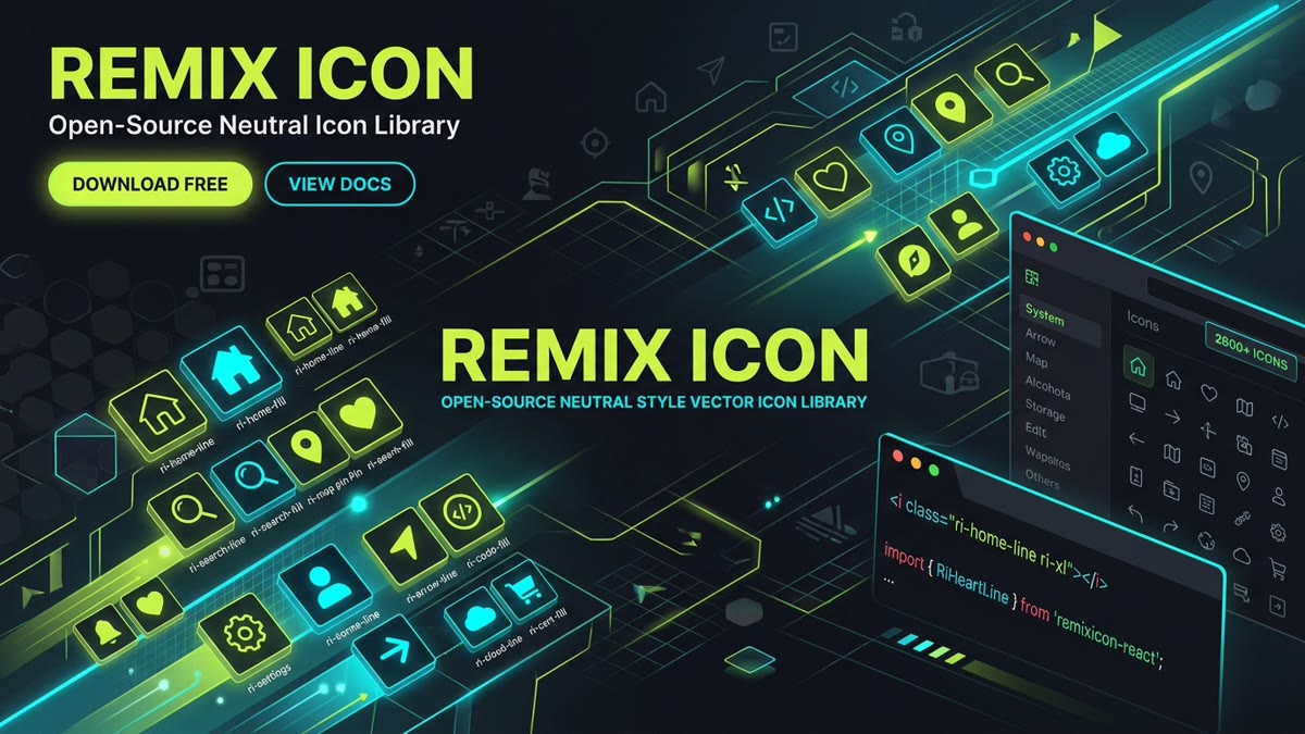
Executive Summary & Key Takeaways:
- Scale & Coverage: Remix Icon is one of the world's most adopted open-source icon sets, containing 3,200+ glyphs (3,244 indexed in IconStash v4.6.0) organized across 16 categories on an exact 24×24 grid.
- Dual Visual States: Every icon ships in paired
-line(outline) and-fill(solid) variants, eliminating the need to mix icon libraries for active navigation states. - Permissive Open-Source Licensing: Licensed under Apache 2.0, allowing unrestricted commercial use, SaaS embedding, modification, and re-distribution without royalties.
- Zero-Bloat Modern Tooling: First-class support for React (
@remixicon/react), Vue, Vite, Tailwind CSS, CDN web fonts, and direct SVG sprite sheets. - Direct IconStash Indexing: Explore and search all 3,244 Remix icons with instant JSX and SVG copy at IconStash Remix Library.
1. What is Remix Icon? Philosophy, Grid & Licensing
In modern web and mobile UI engineering, visual consistency is the difference between a polished enterprise application and an amateur prototype. When buttons, navigation bars, and status pills pull icons from disparate libraries, subtle differences in stroke weight, corner radii, and optical centering create visual discord.
Remix Icon was created to solve this fragmentation. Founded on the principle of neutral, elegant, and consistent design, Remix Icon delivers a massive unified system where every single glyph conforms to precise geometric rules:
- 24×24 Pixel Base Grid: Designed specifically for modern display density, aligning perfectly with 8px and 4px spatial UI grids.
- Balanced Visual Weight: Consistent stroke thickness (equivalent to 1.5px to 2px at native 24px resolution) and corner smoothing across all icon categories.
- Dual State Pairings: Unlike icon sets that only offer stroke outlines or random silhouettes, Remix Icon designs every concept in both a stroke outline (
-line) and a filled silhouette (-fill). - Apache 2.0 License: 100% free for commercial and personal software, client deliverables, mobile apps, and design systems.
2. Visual Aesthetics: The -line vs. -fill Architecture
A frequent anti-pattern in frontend development is toggling stroke width or relying on CSS color fills to denote "active" or "selected" states. For stroke-only libraries like Lucide or Feather, setting a fill color often produces distorted shapes because the SVG paths were never constructed to hold solid fills.
Remix Icon tackles this with dedicated vector geometries for both states:
Because both -line and -fill variants share the exact same bounding box and optical center of gravity, swapping between them on hover, focus, or route activation causes zero layout shift (0 CLS) and zero visual jitter.
| Icon Variant | Suffix | Primary Use Case in Production UI | Visual Characteristic |
|---|---|---|---|
| Outline | -line |
Default navigation, idle toolbar actions, subtle inline table actions | Lightweight, open vector paths, high legibility in dense data grids |
| Filled | -fill |
Active bottom navigation tabs, bookmarked items, favorited toggles, alerts | High contrast, solid vector mass, instant visual focal point |
3. How to Use Remix Icon in React & Next.js (Zero Bundle Bloat)
In modern React and Next.js applications, the official @remixicon/react package provides tree-shakable React components for every icon in the library.
Step 1: Install the Package
# Install via npm
npm install @remixicon/react

# Or via pnpm
pnpm add @remixicon/react

# Or via yarn
yarn add @remixicon/react
Step 2: Correct Named Import (Tree-Shaken)
Each icon is named in PascalCase, combining the concept, variant, and library prefix:
// src/components/DashboardNav.tsx
import React, { useState } from 'react';
import { RiHome5Line, RiHome5Fill, RiSearch2Line, RiHeart3Line, RiHeart3Fill } from '@remixicon/react';

export function DashboardNav() {
  const [isActive, setIsActive] = useState(false);

  return (
    <nav className="flex items-center gap-4 bg-neutral-900 p-4 rounded-xl">
      <button
        onClick={() => setIsActive(!isActive)}
        className="flex items-center gap-2 text-sm font-medium text-neutral-200 hover:text-white transition-colors"
      >
        {isActive ? (
          <RiHome5Fill size={22} className="text-lime-400" />
        ) : (
          <RiHome5Line size={22} className="text-neutral-400" />
        )}
        <span>Dashboard</span>
      </button>

      <a href="/search" className="text-neutral-400 hover:text-white">
        <RiSearch2Line size={20} />
      </a>
    </nav>
  );
}Never write import * as RemixIcons from '@remixicon/react' in client components. While ES build tools attempt tree-shaking, referencing the entire module object forces bundlers like Webpack and Rollup to retain all 2,800+ icons, injecting over 1.4 MB of minified JavaScript into your bundle!
4. Using Remix Icon via CDN & Web Font (Vanilla HTML / CSS)
If you are maintaining a static site, a CMS theme (WordPress, Ghost, Shopify), or a lightweight landing page without a JavaScript build pipeline, Remix Icon provides a high-speed CDN web font distribution.
Step 1: Include the Stylesheet
<!-- Place inside your <head> tag -->
<link
  rel="stylesheet"
  href="https://cdn.jsdelivr.net/npm/[email protected]/fonts/remixicon.css"
/>
Step 2: Render Icons with Class Names
<!-- Render an outline icon -->
<i class="ri-user-smile-line"></i>

<!-- Render a filled icon -->
<i class="ri-user-smile-fill text-lime"></i>

<!-- Sizing utility classes -->
<i class="ri-alarm-warning-line ri-lg"></i>   <!-- 1.33x size -->
<i class="ri-alarm-warning-line ri-xl"></i>   <!-- 1.5x size -->
<i class="ri-alarm-warning-line ri-2x"></i>   <!-- 2.0x size -->
5. Vue 3, Nuxt & Svelte Implementation
For Vue 3 and Vite developers, the recommended ecosystem approach is using unplugin-icons. This compiler plugin transforms SVG icons on demand during compilation, delivering zero bundle waste:
// vite.config.ts
import { defineConfig } from 'vite';
import vue from '@vitejs/plugin-vue';
import Icons from 'unplugin-icons/vite';

export default defineConfig({
  plugins: [
    vue(),
    Icons({
      compiler: 'vue3',
      autoInstall: true, // Automatically installs @iconify-json/ri
    }),
  ],
});
<!-- In your Vue component: template auto-resolves Remix Icon -->
<template>
<div class="icon-badge">
<i-ri-shield-check-line class="text-lime-500" />
<span>Enterprise Security Verified</span>
</div>
</template>
<script setup>
// No manual imports needed; unplugin-icons handles resolution!
</script>6. Styling, Dynamic Theming & CSS currentColor
All Remix Icon SVGs are compiled with fill="currentColor" on their path elements. This adheres to W3C SVG presentation specifications and guarantees frictionless CSS theming.
Tailwind CSS Integration
Because the icons respond to currentColor, you can style color, size, and transitions using native Tailwind utility classes:
<!-- Changing size and color dynamically via Tailwind -->
<RiSettings4Line className="w-5 h-5 text-zinc-400 hover:text-lime-400 transition-colors duration-200" />

<!-- Micro-interaction icon spin animation -->
<RiLoader4Line className="w-6 h-6 text-lime-400 animate-spin" />
7. In-Depth Benchmark: Remix Icon vs. Lucide vs. Tabler vs. Font Awesome
Choosing an icon library for an enterprise design system requires balancing glyph breadth, visual polish, tree-shaking capabilities, and runtime footprint. Here is how Remix Icon compares to leading competitors in 2026:
| Feature / Metric | Remix Icon | Lucide Icons | Tabler Icons | Font Awesome Free |
|---|---|---|---|---|
| Total Icon Count | 3,244 (v4.6.0) | ~1,450 | ~5,200 | ~2,000 |
| Style Variants | Line & Fill (100% paired) | Stroke Only | Stroke (partial Fill) | Solid & Regular (gated) |
| Native Base Grid | 24 × 24 px | 24 × 24 px | 24 × 24 px | 16 × 16 / variable |
| Open Source License | Apache 2.0 | ISC | MIT | CC BY 4.0 / SIL OFL |
| Tree-Shaken React Gzip | ~750 bytes / icon | ~680 bytes / icon | ~850 bytes / icon | ~1.2 KB / icon |
| Web Font CDN Support | Yes (Official CSS) | Community only | Yes | Yes (High CSS weight) |
| Direct Search on IconStash | Indexed (3,244) | Indexed (1,450+) | Indexed (5,200+) | Indexed (Free) |
8. Building a High-Performance SVG Sprite Sheet with Remix Icon
For high-throughput Jamstack sites, e-commerce storefronts, and Astro applications, bundling SVG icons as client-side JavaScript components can add unnecessary hydration overhead. Combining Remix Icons into an external SVG <symbol> sprite sheet allows browser caching and instant rendering.
<!-- 1. SVG Sprite Sheet Definition (public/icons/remix-sprite.svg) -->
<svg xmlns="http://www.w3.org/2000/svg" style="display: none;">
  <symbol id="ri-github-fill" viewBox="0 0 24 24">
    <path fill="currentColor" d="M12 2C6.475 2 2 6.475 2 12a9.994 9.994 0 0 0 6.838 9.488c.5.087.687-.213.687-.476 0-.237-.013-1.024-.013-1.862-2.512.463-3.162-.612-3.362-1.175-.113-.288-.6-1.175-1.025-1.413-.35-.187-.85-.65-.013-.662.788-.013 1.35.725 1.538 1.025.9 1.512 2.338 1.087 2.912.825.088-.65.35-1.087.638-1.337-2.225-.25-4.55-1.113-4.55-4.938 0-1.088.387-1.987 1.025-2.688-.1-.25-.45-1.275.1-2.65 0 0 .837-.262 2.75 1.026a9.28 9.28 0 0 1 2.5-.338c.85 0 1.7.113 2.5.338 1.912-1.288 2.75-1.025 2.75-1.025.55 1.375.2 2.4.1 2.65.637.7 1.025 1.587 1.025 2.687 0 3.838-2.337 4.688-4.562 4.938.362.312.675.912.675 1.85 0 1.337-.013 2.412-.013 2.75 0 .263.188.575.688.475A10.005 10.005 0 0 0 22 12c0-5.525-4.475-10-10-10z"/>
  </symbol>
</svg>

<!-- 2. Referencing the Symbol in HTML -->
<svg class="w-6 h-6 text-white" aria-hidden="true">
  <use href="/icons/remix-sprite.svg#ri-github-fill"></use>
</svg>
9. Searching & Exporting Remix Icons on IconStash
Rather than manually cloning GitHub repositories or hunting for specific SVG files, you can use IconStash to search and inspect the entire Remix Icon collection in real time:
- Navigate to the dedicated IconStash Remix Icon Library.
- Use instant search to query terms like "calendar", "battery", "shopping cart", or "cloud".
- Toggle seamlessly between Line and Fill style categories.
- Click any icon to preview it across various sizes (16px, 24px, 32px, 48px, 64px) and custom brand colors.
- Copy raw SVG, copy JSX component code for React, or download SVGs directly into your project.
Frequently Asked Questions
What license does Remix Icon use, and is it free for commercial projects?
Remix Icon is 100% free and open-source under the Apache License 2.0. You can use, customize, and distribute the icons in commercial SaaS applications, mobile apps, personal websites, client work, and print materials without paying licensing fees or requiring visible on-screen attribution.
How does Remix Icon compare to Lucide and Font Awesome in bundle size?
When properly tree-shaken using @remixicon/react or unplugin-icons, each Remix Icon imports as an isolated SVG component measuring approximately 600 to 900 bytes gzipped. Unlike Font Awesome's massive multi-megabyte webfont bundles, Remix Icon introduces zero unused CSS or font glyph overhead in modern Vite and Next.js builds.
What is the difference between -line and -fill suffixes in Remix Icon?
Every icon in the Remix Icon library is crafted in two distinct optical variants: -line (an outlined stroke aesthetic ideal for default, resting UI states) and -fill (a solid silhouette ideal for active tabs, selected states, and emphasized actions). Both share identical 24×24 pixel grid proportions to avoid layout shifts when toggling states.
How do I fix bundle bloat when importing Remix Icons in React?
Avoid wildcard or entire-package barrel imports like import * as RiIcons from '@remixicon/react'. Instead, use named imports with modern tree-shakers (import { RiHeartLine } from '@remixicon/react') or configure unplugin-icons for automatic per-icon resolution. This ensures only the icons you render end up in your production JavaScript chunks.
Can I search, copy, and export Remix Icons directly on IconStash?
Yes. IconStash indexes the entire Remix Icon collection at https://iconstash.io/library/remix/. You can search 3,244 Remix icons (v4.6.0) by keyword, filter between line and fill styles, copy raw optimized SVGs or React JSX components in one click, and download customized SVG or PNG assets.
How do I change the color of Remix Icons dynamically in CSS?
Remix Icons utilize fill="currentColor" on their vector paths. To recolor an icon, apply the standard CSS color property to the icon element or its parent container (e.g. .icon { color: #C1DD2D; } or Tailwind text-lime-400). The vector graphic automatically inherits the cascading text color.