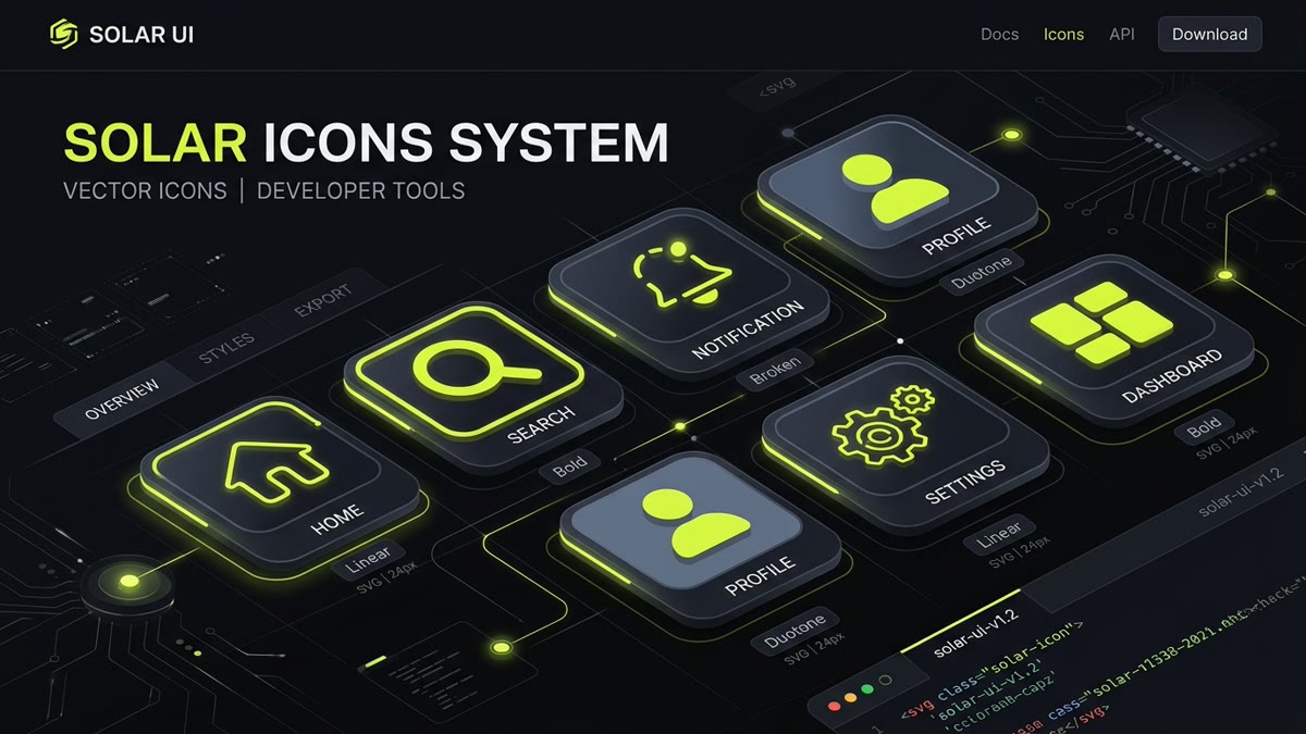
Executive Engineering Summary: Solar Icons by 480 Design is one of the most comprehensive modern icon libraries on the web, boasting 7,410 distinct vector icons across 6 synchronized stylistic treatments.
- 6 Stylistic Variations: Linear (1.5px outline), Bold (solid silhouette), Bold Duotone (solid + 20% accent fill), Broken (interrupted contour stencil), Outline (contoured stroke), and Line Duotone (linear + translucent accent).
- Optimized React Integration: Subpath imports via
@solar-icons/reactdeliver granular tree-shaking (~0.8 KB minified gzipped per icon). - Global Context Theming: The
<SolarProvider>component centralizes default sizes, stroke widths, and colors across enterprise frontend applications. - Design-to-Code Parity: Seamless Figma plugin alignment with variant tokens matching production component exports.
1. What is Solar Icons? Geometry, Heritage & Scale
In modern web software and mobile application design, interface iconography often suffers from a frustrating compromise: libraries offer either a single generic outline style or a fragmented collection of inconsistent glyphs. Solar Icons, crafted by the design studio 480 Design, solves this structural problem by providing an expansive system of 7,410 meticulously drawn vector icons indexed on IconStash.
The defining aesthetic characteristic of Solar Icons is its commitment to squircle geometry and continuous curvature. Rather than sharp polygonal vertices or basic circular fillets, Solar icons utilize cubic Bézier curves (superellipse contours) that blend seamlessly into modern operating system aesthetics, including iOS and contemporary SaaS dashboards.
Built upon a strict 24x24 pixel grid with an optical safe margin of 2px on all edges, every glyph maintains an optical center of gravity that aligns naturally with Latin typography, navigation sidebars, and high-density tabular data grids.
2. The 6 Visual Styles Explained with Vector Mechanics
The foundational superpower of Solar Icons is that every functional concept (such as Home, Bell, Settings, or Shield) is crafted across six parallel visual treatments. This enables seamless state management: a button can render in Linear in its idle state, switch to Broken on active hover, and toggle to Bold Duotone when selected.
Clean, open outline vectors drawn with round stroke caps and smooth joins. Ideal for secondary navigation, settings panels, and subtle inline actions.
Heavy silhouette fills with optimized interior counters. Conveys maximum visual weight, perfect for primary mobile tab bars and active tab indicators.
Splits the glyph into a 100% foreground silhouette and a 20% translucent accent fill layer. Delivers rich visual depth without raster image overhead.
Signature stencil aesthetic featuring strategic 1.5px breaks in the continuous stroke contour. Adds an editorial, high-end architectural feel to modern interfaces.
Outlined vector paths with double boundary lines, providing distinct graphic definition on both dark and light high-contrast surfaces.
Combines standard 1.5px linear stroke perimeters with subtle 20% opacity interior accent shapes, blending clarity with rich color accents.
From an SVG DOM standpoint, Duotone styles operate cleanly via CSS currentColor. The primary path inherits the full font color, while the secondary decorative path applies opacity="0.2" or a CSS token slot, ensuring zero external stylesheet dependencies.
3. Interactive Solar Icons Sandbox & Live Generator
Test the six stylistic treatments of Solar Icons below. Toggle styles to observe how the path coordinates, visual weight, and markup change instantly:
// Live Generated React Import
import { HomeIcon, BellIcon, SettingsIcon, UserIcon } from '@solar-icons/react/linear';

export function Navigation() {
  return <HomeIcon size={24} color="currentColor" strokeWidth={1.5} />;
}
4. React & Next.js Setup: @solar-icons/react & Tree-Shaking
In React and Next.js applications (including Next.js 15 App Router and React 19 Server Components), Solar Icons provides official component wrappers via @solar-icons/react. To install the package:
npm install @solar-icons/react
# or with pnpm
pnpm add @solar-icons/react
# or with bun
bun add @solar-icons/react
To ensure perfect bundle isolation and eliminate unused styles, always use subpath imports targeting the specific visual style required:
// Optimal Tree-Shaking: Import directly from the style subpath
import { HomeIcon, MagnifierIcon } from '@solar-icons/react/linear';
import { BellIcon } from '@solar-icons/react/broken';
import { UserCircleIcon } from '@solar-icons/react/bold-duotone';

export function DashboardHeader() {
  return (
    <header className="flex items-center justify-between p-4">
      <div className="flex items-center gap-2">
        <HomeIcon size={24} className="text-zinc-400 hover:text-white transition-colors" />
        <span className="font-semibold">Command Center</span>
      </div>

      <div className="flex items-center gap-4">
        <button aria-label="Search" className="p-2 rounded-lg bg-zinc-900">
          <MagnifierIcon size={20} color="currentColor" />
        </button>
        <button aria-label="Notifications" className="p-2 rounded-lg bg-zinc-900 relative">
          <BellIcon size={20} color="#C1DD2D" />
        </button>
        <UserCircleIcon size={28} color="currentColor" />
      </div>
    </header>
  );
}Because @solar-icons/react outputs standard pure SVG elements without client-side React hooks or event listeners, Solar components execute on the server during SSR. In static Next.js App Router pages, they contribute 0 KB of client-side JavaScript to your first-load bundle.
5. Centralized Theming with <SolarProvider>
In large design systems, passing size, color, and strokeWidth to dozens of individual icon instances creates maintenance friction. Solar Icons resolves this with SolarProvider, which injects global defaults across the component tree:
import React from 'react';
import { SolarProvider } from '@solar-icons/react';
import { HomeIcon, SettingsIcon, BellIcon } from '@solar-icons/react/linear';

export function AppRoot({ children }: { children: React.ReactNode }) {
  return (
    <SolarProvider
      size={20}
      color="currentColor"
      strokeWidth={1.5}
    >
      <div className="app-shell">
        <nav className="sidebar">
          {/* All child icons automatically inherit size={20} and strokeWidth={1.5} */}
          <HomeIcon />
          <SettingsIcon />
          <BellIcon />
        </nav>
        <main>{children}</main>
      </div>
    </SolarProvider>
  );
}
6. Vue 3 & Vanilla SVG Workflows
For Vue 3 and Nuxt applications, Solar provides @solar-icons/vue. Icons can be installed and utilized with the Composition API:
<script setup lang="ts">
import { HomeIcon, BellIcon } from '@solar-icons/vue/linear';
</script>

<template>
  <div class="nav-bar">
    <HomeIcon :size="24" color="currentColor" :stroke-width="1.5" />
    <BellIcon :size="24" color="#C1DD2D" />
  </div>
</template>
If you prefer zero dependencies or are developing in Astro or Hugo, you can export raw SVG code straight from IconStash. Clean Solar SVGs require only the viewBox="0 0 24 24" and fill="currentColor" or stroke="currentColor":
<!-- Raw 0-Dependency Solar SVG: Bell Linear -->
<svg width="24" height="24" viewBox="0 0 24 24" fill="none" stroke="currentColor" stroke-width="1.5" stroke-linecap="round" stroke-linejoin="round" aria-hidden="true">
  <path d="M18 8A6 6 0 0 0 6 8c0 7-3 9-3 9h18s-3-2-3-9M13.73 21a2 2 0 0 1-3.46 0"/>
</svg>
7. Figma Component Token Architecture
Design teams building UI component libraries in Figma benefit from the official Solar Icons Figma Plugin. Solar is structured natively with Figma component properties:
- Variant: Style: Seamlessly toggle between
Linear,Bold,Bold Duotone,Broken,Outline, andLine Duotonewithout resetting component overrides. - Stroke Preservation: Linear and Broken variants utilize live vectors with configurable outline thickness (1px, 1.5px, 2px).
- Color Tokens: Layer names are normalized to
PrimaryandSecondaryacross all 7,410 glyphs, allowing instant batch binding to Figma Design Tokens or CSS Variables.
8. Solar Icons vs Lucide, Phosphor & Tabler Benchmark
How does Solar Icons compare against the other leading open-source icon libraries indexed on IconStash? Here is the architectural comparison:
| Library | Icons Indexed | Distinct Styles | Grid Base | License | Best For |
|---|---|---|---|---|---|
| Solar Icons | 7,410 | 6 (Linear, Bold, Duotone, Broken...) | 24px | CC BY 4.0 | Fintech, crypto & multi-state SaaS UI |
| Lucide | 1,979 | 1 (Uniform Outline) | 24px | ISC (Permissive) | Minimalist general SaaS & shadcn/ui |
| Phosphor | 9,198 | 6 (Thin, Light, Regular, Bold, Fill, Duotone) | 24px | MIT | Variable weight typography systems |
| Tabler Icons | 6,324 | 2 (Outline & Filled) | 24px | MIT | Developer admin templates & dashboards |
| Hugeicons | 5,115 (Free) | 5 (Stroke, Solid, Bulk, Duotone...) | 24px | MIT | Modern product apps & React/Vue setups |
9. Accessibility (ARIA) & Touch Target Doctrine
Whenever icons are placed in production web apps, strict accessibility rules must be followed to avoid confusing assistive technologies:
- Purely Decorative Icons: When an icon accompanies visible label text (such as a 'Download CSV' button with a download icon), hide the icon from the accessibility tree by specifying
aria-hidden="true". - Icon-Only Action Buttons: When an icon serves as an interactive button with no text (e.g., a bell notification trigger), provide an explicit
aria-labelon the parent button:<button aria-label="View unread notifications" className="btn-icon"> <BellIcon size={20} aria-hidden="true" /> </button> - Touch Target Sizing: While Solar icons are designed on a 24px grid, interactive buttons must meet the WCAG 2.2 AA minimum target size of 24x24 CSS pixels and the recommended AAA target of 44x44 CSS pixels. Wrap the 24px icon in a padded interactive hit area rather than scaling the icon itself.
10. Frequently Asked Questions
What makes Solar Icons unique compared to other vector icon libraries?
Solar Icons features 7,410 vector icons designed on a 24px grid with signature squircle geometry and smooth corner curvature. Unlike single-style libraries, Solar provides 6 synchronized stylistic treatments per symbol: Linear, Bold, Bold Duotone, Broken, Outline, and Line Duotone, making it especially popular in fintech, crypto, and modern SaaS dashboards.
How do I install and import Solar Icons in React with subpath tree-shaking?
Install the official package with npm install @solar-icons/react. Import specific styles using direct subpath imports such as import { HomeIcon } from '@solar-icons/react/linear' or import { HomeIcon } from '@solar-icons/react/broken'. This isolates the imports to only the required vector glyphs and guarantees zero bundle bloat.
What is the purpose of the SolarProvider component in @solar-icons/react?
The SolarProvider component provides React context for defining global default icon attributes across an entire application. By wrapping your app in <SolarProvider size={24} color='currentColor' strokeWidth={1.5}>, every child Solar icon inherits consistent dimensions, colors, and line weights without having to pass manual props to each instance.
What license governs Solar Icons and can I use them in commercial SaaS products?
Solar Icons is published under the Creative Commons Attribution 4.0 International license (CC BY 4.0). You are permitted to use, modify, and distribute Solar Icons in commercial SaaS apps, client projects, and mobile applications, with a simple attribution note in your credits, documentation, or legal page.
How do the Broken and Duotone styles in Solar Icons work under the hood?
The Broken style uses intentional vector gap paths to create a modern architectural stencil silhouette, rendering as a single stroke path with 0.5px to 1.5px gaps. The Bold Duotone and Line Duotone styles split the vector into two sub-paths: a primary 100% opacity foreground layer and a secondary 20% to 30% translucent accent fill layer, both inheriting currentColor.
Where can I search, preview, and download all 7,410 Solar Icons for free?
You can search, filter by style, compare, and copy clean SVG code for all 7,410 Solar Icons directly on IconStash at https://iconstash.io/library/solar/. IconStash provides instant full-text search, light/dark mode previews, and one-click copy to SVG and React JSX.