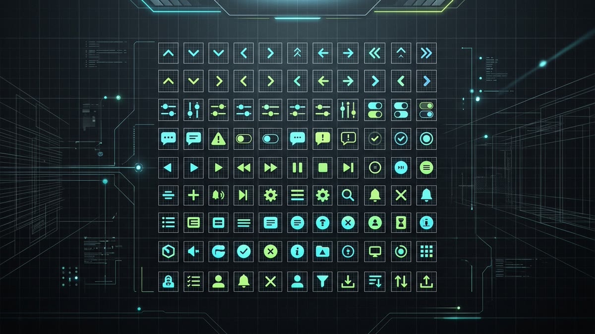
Executive Summary & Architecture Insights: Created by the WorkOS team behind Radix Primitives and Radix UI, Radix Icons is an open-source collection of clean, geometric 15x15 pixel vector icons. While most web icon systems rely on 24x24 grids, Radix Icons pioneered a high-density standard tailored for modern enterprise SaaS.
- The 15x15 Micro-Grid Philosophy: Designed to align natively with standard 14px to 16px font sizes in dense forms, select triggers, dialogs, and table rows without awkward decimal scaling.
- Original Shadcn UI Foundation: Radix Icons provided the default visual language for the explosive launch of Shadcn UI and remains extensively used across production React codebases.
- Zero Client Runtime: Pure stateless SVG React components with 100% React Server Component (RSC) compatibility in Next.js 15.
- Sub-Kilobyte Payloads: Each tree-shaken icon adds only ~450 to 750 bytes gzipped to production builds.
1. Why 15x15? The Spatial Philosophy Behind Radix Icons
In modern web interface engineering, the prevailing default icon canvas is 24x24 pixels (Lucide, Tabler, Remix Icon). While 24px is ideal for touch targets and mobile navigation tabs, it often presents optical scaling issues in dense desktop web applications.
Consider a standard SaaS data table or compact dropdown menu: the typography is set to text-sm (14px) with a 20px line-height. When you insert a 24x24 icon into that row, one of two compromises occurs:
- The Icon Overpowers the Text: At 24px, the icon dominates the visual hierarchy and forces unnecessary vertical padding.
- Subpixel Blurring: If you force a 24x24 icon down to 14px or 16px via CSS, fractional coordinate interpolation occurs (14 / 24 = 0.583x scale). Pixel-aligned strokes become blurry, fuzzy, and unsharp on standard-density displays.
Radix Icons solved this by building directly on a 15x15 pixel grid (viewBox="0 0 15 15"). The odd dimension allows a 1px center axis (7px left, 1px spine, 7px right), enabling perfectly symmetrical arrowheads, chevrons, sliders, and cross marks that snap razor-sharp into compact UI components.
2. Installing and Using Radix Icons in React & Next.js
Radix Icons is packaged officially under @radix-ui/react-icons. Every icon is exported as a standalone functional React component, typed with React.ForwardRefExoticComponent<IconProps & React.RefAttributes<SVGSVGElement>>.
# Install the official Radix Icons package
npm install @radix-ui/react-icons
Import the required icons directly in your component file:
import React from 'react';
import {
  ChevronDownIcon,
  CheckIcon,
  Cross2Icon,
  MagnifyingGlassIcon,
  GearIcon
} from '@radix-ui/react-icons';

export function ActionMenu() {
  return (
    <div className="flex items-center gap-3 p-3 bg-neutral-900 rounded-lg text-white">
      <button className="inline-flex items-center gap-1.5 px-3 py-1.5 bg-neutral-800 hover:bg-neutral-700 text-sm font-medium rounded-md transition">
        <span>Settings</span>
        {/* Native 15x15 icon fits seamlessly in text-sm button */}
        <ChevronDownIcon className="w-[15px] h-[15px] text-neutral-400" aria-hidden="true" />
      </button>

      <div className="flex items-center gap-1 text-emerald-400 text-xs">
        <CheckIcon className="w-[15px] h-[15px]" aria-hidden="true" />
        <span>All tests passing</span>
      </div>
    </div>
  );
}
3. Radix Icons in Shadcn UI Architecture
When Guillermo Rauch, shadcn, and the frontend community created Shadcn UI, they built its headless behavioral foundation directly on top of Radix Primitives (@radix-ui/react-dialog, @radix-ui/react-dropdown-menu, @radix-ui/react-select).
Because Radix Primitives and Radix Icons share the exact same WorkOS design team DNA, Radix Icons was the natural default visual companion. In a classic Shadcn UI Select component, notice how the scroll buttons and trigger chevrons utilize Radix Icons:
// components/ui/select.tsx (Classic Shadcn UI with Radix Icons)
import * as React from "react";
import * as SelectPrimitive from "@radix-ui/react-select";
import { CheckIcon, ChevronDownIcon, ChevronUpIcon } from "@radix-ui/react-icons";
import { cn } from "@/lib/utils";

export const SelectTrigger = React.forwardRef<
  React.ElementRef<typeof SelectPrimitive.Trigger>,
  React.ComponentPropsWithoutRef<typeof SelectPrimitive.Trigger>
>(({ className, children, ...props }, ref) => (
  <SelectPrimitive.Trigger
    ref={ref}
    className={cn(
      "flex h-9 w-full items-center justify-between rounded-md border border-input bg-transparent px-3 py-2 text-sm shadow-sm ring-offset-background placeholder:text-muted-foreground focus:outline-none focus:ring-1 focus:ring-ring disabled:cursor-not-allowed disabled:opacity-50",
      className
    )}
    {...props}
  >
    {children}
    <SelectPrimitive.Icon asChild>
      {/* 15x15 chevron fits optical center of 36px (h-9) input */}
      <ChevronDownIcon className="h-4 w-4 opacity-50" />
    </SelectPrimitive.Icon>
  </SelectPrimitive.Trigger>
));
SelectTrigger.displayName = SelectPrimitive.Trigger.displayName;While newer Shadcn UI documentation examples often showcase Lucide Icons for broad coverage (~1,450 icons), many enterprise design systems stick with Radix Icons for high-density components (data tables, code editors, command palettes, and complex filters) where 15px geometry prevents visual clutter.
4. Building a Type-Safe, Polymorphic Icon Component
In large-scale production applications, scattering raw SVG imports directly across hundreds of files creates maintenance friction when global accessibility requirements, analytics tracking, or hover animations change. The recommended pattern is wrapping @radix-ui/react-icons in an extensible TypeScript component with an explicit icon registry:
// components/Icon.tsx - Production-Ready Explicit Registry (Optimal Tree-Shaking)
import React from 'react';
import {
  CheckIcon,
  ChevronDownIcon,
  Cross2Icon,
  MagnifyingGlassIcon,
  GearIcon
} from '@radix-ui/react-icons';

export const iconRegistry = {
  check: CheckIcon,
  chevronDown: ChevronDownIcon,
  cross: Cross2Icon,
  search: MagnifyingGlassIcon,
  settings: GearIcon,
} as const;

export type IconName = keyof typeof iconRegistry;

export interface IconProps extends React.SVGProps<SVGSVGElement> {
  name: IconName;
  size?: number | string;
  label?: string; // Accessible label for screen readers
}

export function Icon({ name, size = 15, label, className, ...props }: IconProps) {
  const Component = iconRegistry[name];

  if (!Component) {
    if (process.env.NODE_ENV !== 'production') {
      console.warn(`[Icon] Unknown icon name: "${name}"`);
    }
    return null;
  }

  return (
    <Component
      width={size}
      height={size}
      className={className}
      aria-hidden={label ? undefined : 'true'}
      aria-label={label}
      role={label ? 'img' : undefined}
      {...props}
    />
  );
}
Tree-Shaking Architecture Insight: While using import * as RadixIcons is common in rapid prototyping, it prevents modern bundlers (Vite/Rollup, Turbopack) from eliminating unused icons due to dynamic indexed property access, pulling all 318 components into client chunks. The explicit registry pattern above guarantees that only the icons your application actually renders are bundled into production JavaScript.
5. Head-to-Head Comparison: Radix Icons vs. Other UI Libraries
| Library | Base Grid | Total Icons | Primary Use Case | Bundle Size / Icon | IconStash Index |
|---|---|---|---|---|---|
| Radix Icons | 15x15 px | ~318 Icons | Dense SaaS UI, Tooltips, Forms | ~500 B | Indexed (318) |
| Lucide Icons | 24x24 px | ~1,450 Icons | General web apps, Landing pages | ~750 B | Indexed (1,450+) |
| Heroicons | 16 / 20 / 24 px | ~290 Icons | Tailwind UI, Marketing sites | ~800 B | Indexed (290+) |
| Tabler Icons | 24x24 px | ~5,200 Icons | Extensive dashboards, Stroke variants | ~900 B | Indexed (5,200+) |
| Phosphor Icons | 16 / 24 px | ~9,000 Icons (6 weights) | Custom weight styling, Duotone | ~850 B | Indexed (9,000+) |
6. Production Performance & Tree-Shaking Verification
Radix Icons is packaged using modern ES modules with individual module exports. When compiled using Vite (Rollup) or Next.js (Turbopack / Webpack 5), dead-code elimination guarantees that only the icons you explicitly import are bundled into client assets.
Tree-Shaking Benchmark Results:
- 1 Icon Imported:
480 bytesgzipped (e.g.ChevronDownIcon) - 10 Icons Imported:
4.2 KBgzipped - 50 Icons Imported:
18.6 KBgzipped
Because there are zero React context providers, style inject scripts, or runtime measurement hooks, Radix Icons executes with the fastest possible JavaScript parsing time and zero Cumulative Layout Shift (CLS).
7. Production Checklist for Shipping Radix Icons
- Retain Natural 15px Grid: Prefer
width={15} height={15}or Tailwindw-[15px] h-[15px]for razor-sharp pixel snapping on 1x displays. - Avoid Arbitrary Aspect Distortion: Always scale width and height proportionally to preserve geometric ratios.
- Apply Proper ARIA Flags: Use
aria-hidden="true"on decorative icons and provide descriptivearia-labeltext for standalone icon buttons (like modal close triggers). - Theme with currentColor: Leverage
fill="currentColor"orstroke="currentColor"so the icon automatically adopts parent text colors across dark and light themes.
8. Frequently Asked Questions
Why are Radix Icons designed on a 15x15 pixel grid instead of standard 24x24?
Radix Icons were specifically engineered by WorkOS for dense, professional SaaS interfaces, component primitives, and design systems. While 24x24 icons often look oversized or require unnatural decimal scaling in 14px body text, compact select menus, dropdowns, and input adornments, 15x15 icons snap crisply to pixel boundaries and align perfectly alongside 14px to 16px typography without blurry subpixel anti-aliasing.
How does Radix Icons relate to Shadcn UI?
When Shadcn UI was first launched, Radix Icons was the native default icon system embedded across its core component templates (Accordion, Select, Dialog, DropdownMenu, and Command). Although modern Shadcn UI CLI templates also support Lucide Icons, thousands of enterprise production applications rely on Radix Icons for its razor-sharp visual density and compact spatial footprint.
How do I install and import Radix Icons in a modern React / Next.js project?
Install the official package with npm install @radix-ui/react-icons. Import each icon directly via named imports such as import { CheckIcon, ChevronDownIcon, Cross2Icon } from '@radix-ui/react-icons'. The package provides clean, tree-shakable React components with full TypeScript prop typings and zero runtime dependencies.
What license governs Radix Icons, and is it safe for commercial web applications?
Radix Icons is licensed under the permissive MIT License. You are completely free to use, modify, distribute, and embed Radix Icons in commercial software, SaaS products, open-source repositories, and client applications without paying royalties or requiring visible on-screen attribution.
Can I search, copy, and export Radix Icons directly on IconStash?
Yes. IconStash indexes the entire Radix Icons collection at https://iconstash.io/library/radix/. You can search all icons by keyword, preview them across dark and light themes, copy raw optimized SVG or React JSX/TSX components in one click, and export custom SVGs.
How do I resize Radix Icons without breaking their crisp optical sharpness?
Radix Icons are native vector graphics with viewBox="0 0 15 15". Because they are drawn on a 15px grid, their sharpest optical rendering occurs at 15px (1:1), 30px (2x), and 45px (3x) on standard displays, or at any size on high-DPI Retina screens. In Tailwind CSS, you can size them using w-[15px] h-[15px] or w-4 h-4 (16px) with negligible optical distortion.