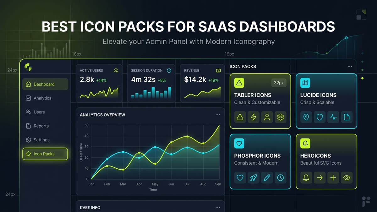
Why It's Ranked #1: Tabler Icons is the gold standard for data-heavy administrative dashboards. Built on a strict 24px grid with a uniform 2px stroke, Tabler covers virtually every conceivable enterprise concept—including currency exchange, cryptographic hashing, server topology, firewall filters, and database clusters—where smaller libraries hit a dead end. Furthermore, Tabler provides synchronized filled versions for active states and official packages for React, Vue, Svelte, and React Native.
Executive Architectural Takeaway: Designing user interfaces for SaaS analytics dashboards, enterprise admin consoles, and data-dense web apps imposes radically different technical demands than designing marketing landing pages. Icons in dashboards must render with razor-sharp optical clarity at 16px to 24px micro-sizes, maintain strict geometric grid alignment across dense tables and navigation sidebars, support seamless active/inactive state pairs, and provide tree-shakeable modern React and Tailwind CSS packages.
- Overall Champion: Tabler Icons — 6,100+ icons on a strict 24px grid with unmatched administrative and financial coverage.
- Modern Web Default: Lucide Icons — The de facto standard for Next.js, Tailwind CSS, and shadcn/ui admin templates.
- State Hierarchy Winner: Phosphor Icons — 9,000+ glyphs across 6 distinct weights for effortless active tab styling.
- 100% Permissive: All 12 ranked libraries are completely open-source under MIT, Apache 2.0, or CC BY 4.0 licenses.
1. The 5 Core Criteria for Evaluating SaaS Dashboard Icon Packs
When selecting an iconography library for enterprise SaaS or complex web portals, superficial aesthetics are secondary to technical rigor. We evaluated over 28 open-source libraries indexed on IconStash using five non-negotiable architectural benchmarks:
- Optical Grid Rigor (16px & 24px Alignment): Does the library align all primary path nodes to pixel boundaries? Sub-pixel anti-aliasing blur that looks acceptable on a 64px feature hero becomes an illegible muddy smudge inside a 16px table cell.
- Category Depth & Admin Domain Coverage: Does the library have native symbols for audit logs, database shards, webhooks, multi-tenant billing, and role-based access control (RBAC), or will you be forced to mix disparate sets?
- Active vs Inactive State Pairing: Does the set offer synchronized Outline and Solid/Filled pairs so selected tabs provide high-contrast visual affordance without altering text alignment?
- Tree-Shaking & Bundler Zero-Bloat: Can you import individual vector components in Vite, Next.js, and Rollup without shipping the library's entire 10MB SVG payload to clients?
- Permissive Commercial Licensing: Is the library licensed under MIT, Apache 2.0, or CC BY 4.0, protecting your SaaS from legal infringement or royalty claims?
2. Live Interactive Dashboard Icon Sandbox
Test how different icon libraries render inside an authentic SaaS dashboard navigation sidebar and metrics console. Toggle between Tabler, Lucide, and Phosphor to observe stroke balance, optical sizing, and visual hierarchy:
Live SaaS Dashboard Layout Preview
Monthly Revenue
$128,490
Active Nodes
1,429
Avg Latency
28ms
3. The 12 Best SaaS Dashboard Icon Packs Ranked
Why It's Ranked #2: As the default icon library bundled with shadcn/ui and modern Vercel-style Next.js templates, Lucide has become the modern web developer's favorite toolkit. Born as a vibrant community fork of Feather Icons, Lucide resolves Feather's abandoned repository while preserving its friendly, balanced geometry. Its stroke width is fully configurable via CSS or component props, and its React tree-shaking guarantees near-zero bundle footprint.
Why It's Ranked #3: Phosphor stands in a class of its own for design systems requiring sophisticated state machines. Every single icon in its 1,500-symbol library is manually crafted across six distinct weights: Thin, Light, Regular, Bold, Fill, and Duotone. In complex SaaS navigation bars, engineers can map inactive links to weight="regular", hover states to weight="bold", and active selections to weight="fill" without switching icon libraries or modifying SVG paths.
Why It's Ranked #4: Handcrafted by Steve Schoger and the Tailwind CSS core team, Heroicons represents optical perfection for utility-first layouts. Unlike libraries that simply scale a 24px icon down with CSS transforms, Heroicons provides dedicated 16px Mini and 20px Micro sets with simplified path nodes specifically tuned for high-density data tables, compact badge pills, and dropdown menu rows.
Why It's Ranked #5: Carbon Icons powers IBM Cloud, Red Hat, and thousands of enterprise infrastructure consoles worldwide. Engineered on architectural grid systems with distinct optical paths for 16px, 20px, 24px, and 32px scales, Carbon provides unmatched depth in cloud architecture, DevOps pipelines, containerization, and data science diagrams.
Why It's Ranked #6: Google's flagship Material Symbols library offers unparalleled parametric flexibility. Through OpenType font variation settings, you can adjust stroke weight (100–700), fill status, and dark mode optical grade continuously via CSS. For developers preferring raw components, IconStash hosts the entire catalog in raw SVG vector format ready for instant zero-runtime React imports.
Why It's Ranked #7: If your SaaS product requires an ultra-modern aesthetic that moves away from sterile corporate lines, Solar Icons is the premiere choice. Featuring signature squircle geometry, continuous curve fillets, and high-style Broken and Bold Duotone variants, Solar gives fintech dashboards and customer-facing analytics a distinct, premium visual character.
Why It's Ranked #8: Hugeicons has rapidly gained massive traction due to its colossal free catalog of over 5,100 icons across stroke, two-tone, and bulk solid treatments. Its decoupled architecture provides dedicated React, Vue, and Svelte component packages with native Next.js 15 Server Component (RSC) compatibility.
Why It's Ranked #9: While limited in total icon count, Radix Icons is uniquely engineered on a strict 15x15 pixel micro-grid. In ultra-dense editing canvases, WYSIWYG toolbars, and compact context dropdown menus where 24px icons feel overwhelmingly bloated, Radix renders with crisp 1px optical lines and zero blurry sub-pixel bleeding.
10
Iconoir
Why It's Ranked #10: Iconoir is built for developers who prize minimalist elegance. Featuring over 2,000 icons drawn on a 24px grid with a refined 1.5px stroke width, Iconoir provides a lighter, more air-filled aesthetic than standard 2px libraries. It also includes first-class support for single-element CSS mask rendering.
11
Octicons
Why It's Ranked #11: Created by GitHub for the Primer design system, Octicons is the industry standard for developer-facing tools, code repositories, and DevOps consoles. Every glyph is independently drafted at both 16px and 24px optical scales, guaranteeing that commit hashes, branch forks, and pull request icons remain instantly identifiable in monospace environments.
12
Remix Icon
Why It's Ranked #12: Remix Icon is celebrated for its exceptional symmetry, geometric rhythm, and consistent visual weight. Every glyph in its 2,800-icon library comes in perfectly synchronized Line and Fill styles, making it effortless to implement active navigation states across large corporate SaaS applications.
4. Exhaustive Technical Feature Matrix & Benchmark
Compare the key technical specifications of all 12 ranked SaaS dashboard icon libraries:
| Icon Pack | Total Icons | Native Grid Size | Visual State Pairs | React NPM Package | License |
|---|---|---|---|---|---|
| Tabler Icons | 6,100+ | 24x24 (2px stroke) | Outline & Filled | @tabler/icons-react |
MIT |
| Lucide Icons | 1,500+ | 24x24 (2px stroke) | Dynamic Stroke Weight | lucide-react |
MIT |
| Phosphor Icons | 9,000+ | 16x16 & 24x24 | 6 Weights (Thin to Fill) | @phosphor-icons/react |
MIT |
| Heroicons | 288+ | 16x16, 20x20, 24x24 | Outline & Solid | @heroicons/react |
MIT |
| Carbon Icons | 2,600+ | 16, 20, 24, 32px | Scaled Multi-Grid | @carbon/icons-react |
Apache 2.0 |
| Material Symbols | 3,300+ | 20x20 & 24x24 | Variable FILL & wght | @material-symbols/svg |
Apache 2.0 |
| Solar Icons | 7,410+ | 24x24 | Linear, Bold, Duotone | @solar-icons/react |
CC BY 4.0 |
| Hugeicons | 5,100+ | 24x24 | 10 Distinct Styles | hugeicons-react |
MIT |
| Radix Icons | 318 | 15x15 (1px stroke) | Micro-outline | @radix-ui/react-icons |
MIT |
| Iconoir | 2,000+ | 24x24 (1.5px stroke) | Clean Outline | iconoir-react |
MIT |
| Octicons | 920+ | 16x16 & 24x24 | Dual Optical Paths | @primer/octicons-react |
MIT |
| Remix Icon | 2,800+ | 24x24 | Line & Fill Synchronized | remixicon |
Apache 2.0 |
5. Architectural Decision Framework: Selecting Your Pack
Use this architectural rule of thumb to choose the single best icon library for your SaaS application stack:
- Choose Tabler Icons if you are building an enterprise ERP, CRM, or infrastructure management console where you will need hundreds of highly specialized domain icons.
- Choose Lucide Icons if you are building a modern SaaS MVP using Tailwind CSS, Next.js, and shadcn/ui components.
- Choose Phosphor Icons if your UI relies heavily on state-driven visual feedback (e.g., active tabs, favorited rows, muted channels) using weight changes rather than color swaps.
- Choose Heroicons or Radix Icons if you are building compact data grids, dense spreadsheet-like tables, or precision toolbars where icons must stay sharp under 16px.
Frequently Asked Questions
What is the best overall icon pack for SaaS dashboards in 2026?
For data-dense enterprise dashboards requiring massive categorical coverage (finance, analytics, user management, and device monitoring), Tabler Icons is the overall champion due to its 6,100+ icons built on a strict 24px grid. For modern Next.js and Tailwind SaaS applications built with shadcn/ui, Lucide Icons is the undisputed community standard.
Why do dashboards require different icon specifications than marketing landing pages?
Marketing landing pages use large (32px to 64px) expressive icons for visual flair. In contrast, SaaS dashboards require high information density: icons must remain legible inside tight 16px table cells, 20px breadcrumbs, and 24px sidebar menus without cluttering the screen. Dashboards also demand extensive coverage for niche operations (batch filters, webhooks, audit logs) and clear active/inactive visual states.
How should active vs inactive navigation states be handled in SaaS sidebars?
The cleanest industry pattern is using paired outline and filled icons (such as Phosphor's Regular vs Fill, Remix's Line vs Fill, or Solar's Linear vs Bold). This provides high-contrast, unambiguous selection feedback without relying solely on subtle text color shifts that can fail WCAG accessibility contrast ratios.
Can I mix icons from two different libraries in one dashboard?
No. Mixing libraries (e.g. combining Heroicons with Lucide or Tabler) creates optical dissonance due to mismatched corner radii, stroke weights (1.5px vs 2px), and bounding box paddings. Stick to a single comprehensive set or create a strict internal design token mapping.
Are all 12 featured dashboard icon packs free for commercial SaaS use?
Yes. Every icon pack in this ranking is released under permissive open-source licenses: MIT (Tabler, Lucide, Phosphor, Heroicons, Radix, Iconoir, Octicons), Apache 2.0 (Carbon, Material Symbols, Remix Icon), or CC BY 4.0 (Solar Icons), guaranteeing unrestricted commercial use.
Where can I search, compare, and test all these dashboard icon packs?
You can search all 12 libraries across 134,000+ vector icons simultaneously on IconStash at https://iconstash.io/. IconStash lets you search by keyword, preview in light and dark mode, and copy clean SVG or React component code in one click.